

Client
GuestCentric
Role
Product design & UX (IBE)
Sector
UX/UI · Design systems · Front-end aligned
Industry
Hospitality · Travel Tech
Year
2025
Most guests book on mobile with little patience for long forms. Yet booking engines still bury pricing behind filters, stack unnecessary steps, and offer no feedback when something goes wrong. I redesigned and optimized GuestCentric’s IBE around one principle: every step should have only essential information, a clear CTA, and predictable navigation.
There was no existing process for this — it was a from-scratch initiative, so I set one up myself.
- Hotel booking engines
- Airlines
- Car rentals
- Short-term rentals
- Business goals with stakeholders
- Complaint volume and patterns with support
- Technical direction with engineering
Reduce cognitive effort and increase the fluidity of the booking process.
The mobile guest
Books on smartphone, often late at night or between meetings. Has little patience for long forms, confusing filters, or unclear pricing. Expects speed, clarity, immediate total cost, and dates that are easy to change. Abandons quickly when there's no visual feedback or too many steps between intent and confirmation.
Where booking engines lose guests — and why.
- Too many steps is the primary abandonment trigger
- Guests need total stay cost, not nightly mental math
- No availability without alternatives causes frustration
- Lack of visual feedback after each action erodes trust
- Analysis of typical online guest browsing behaviors
- IBE native flow audit and mental journey redesign
- Layout evaluation — Horizontal, Vertical, Link
- Exploratory mobile-first usability testing
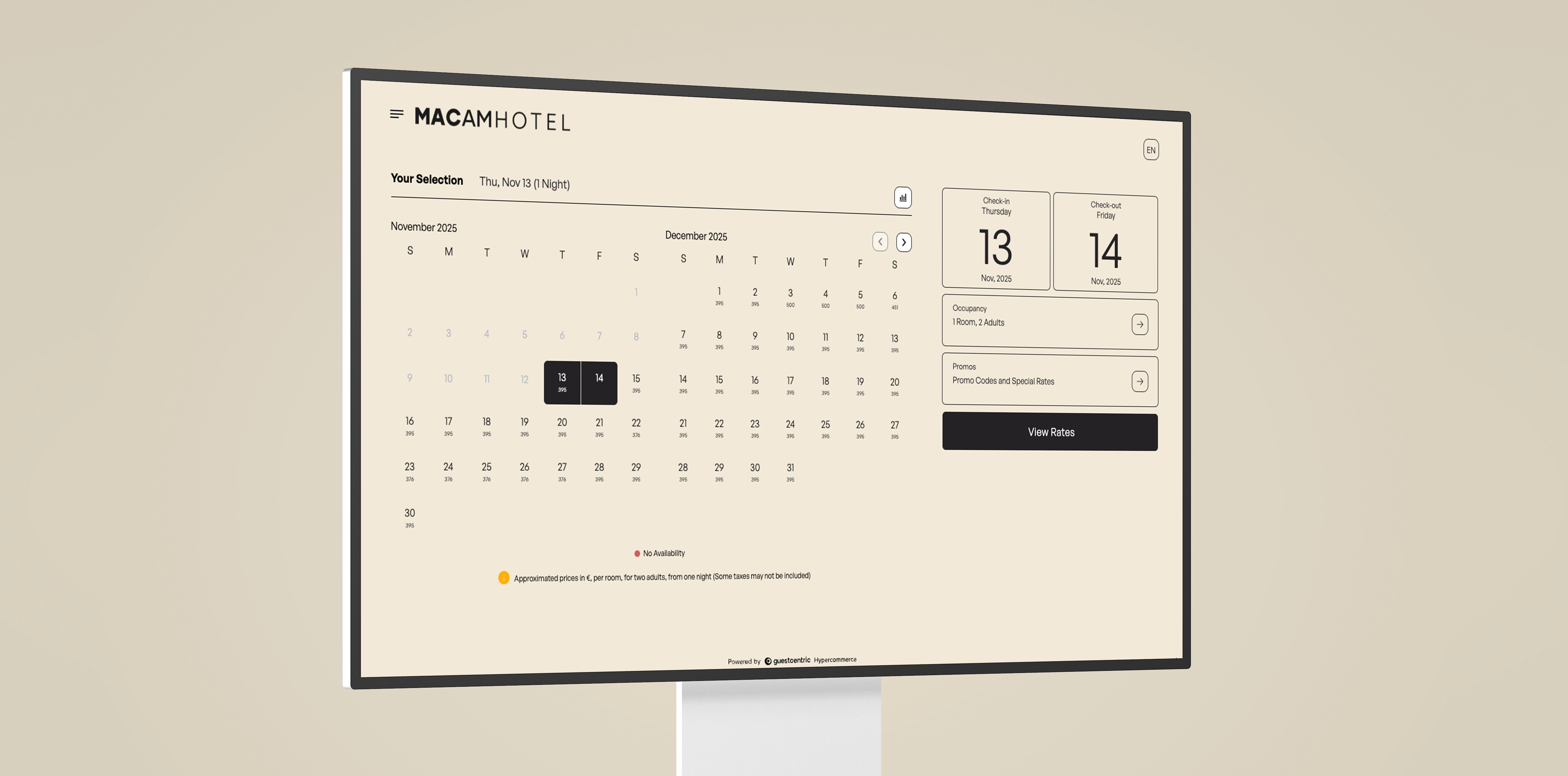
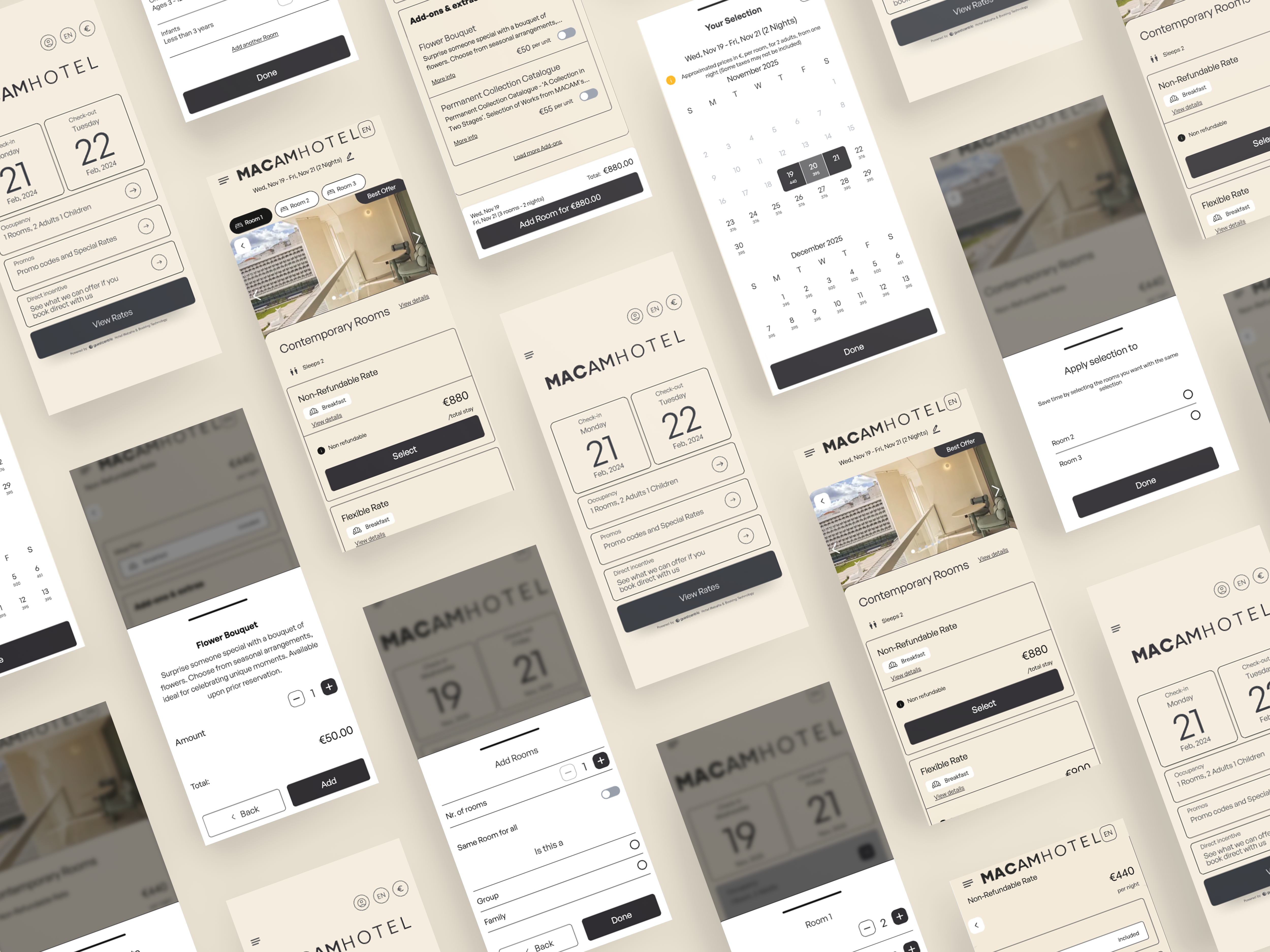
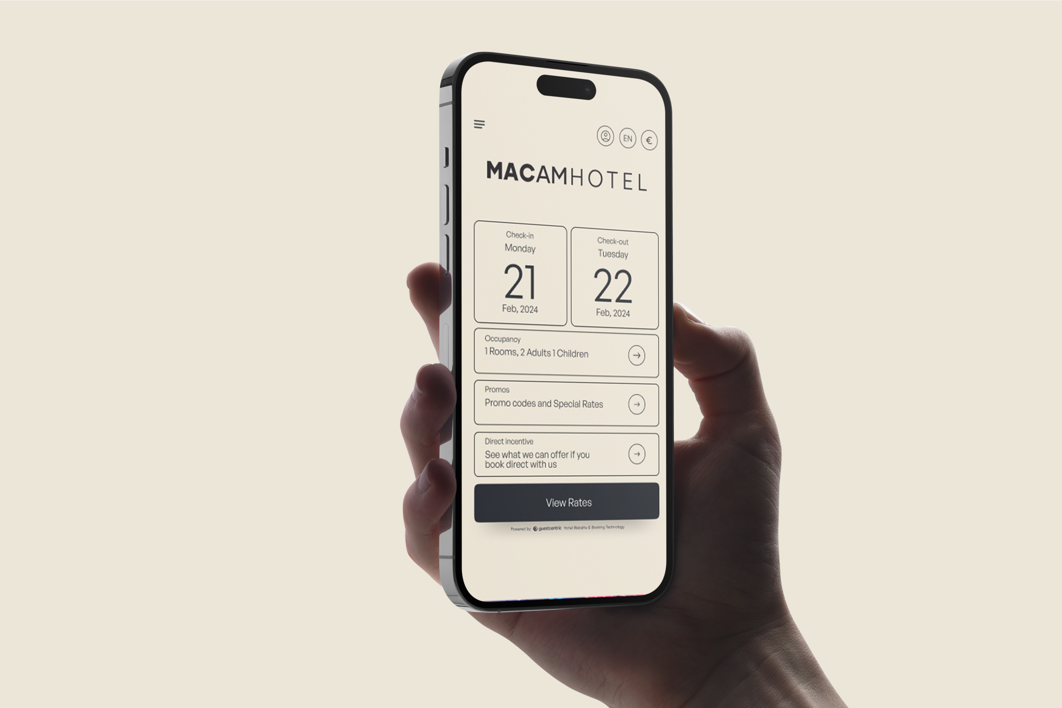
Stakeholders wanted a two-month calendar view on both mobile and desktop. Testing showed it didn't hold up on mobile. I proposed large single dates followed by room, guest count, and promo code — keeping the two-month view on desktop, where there was room for it.
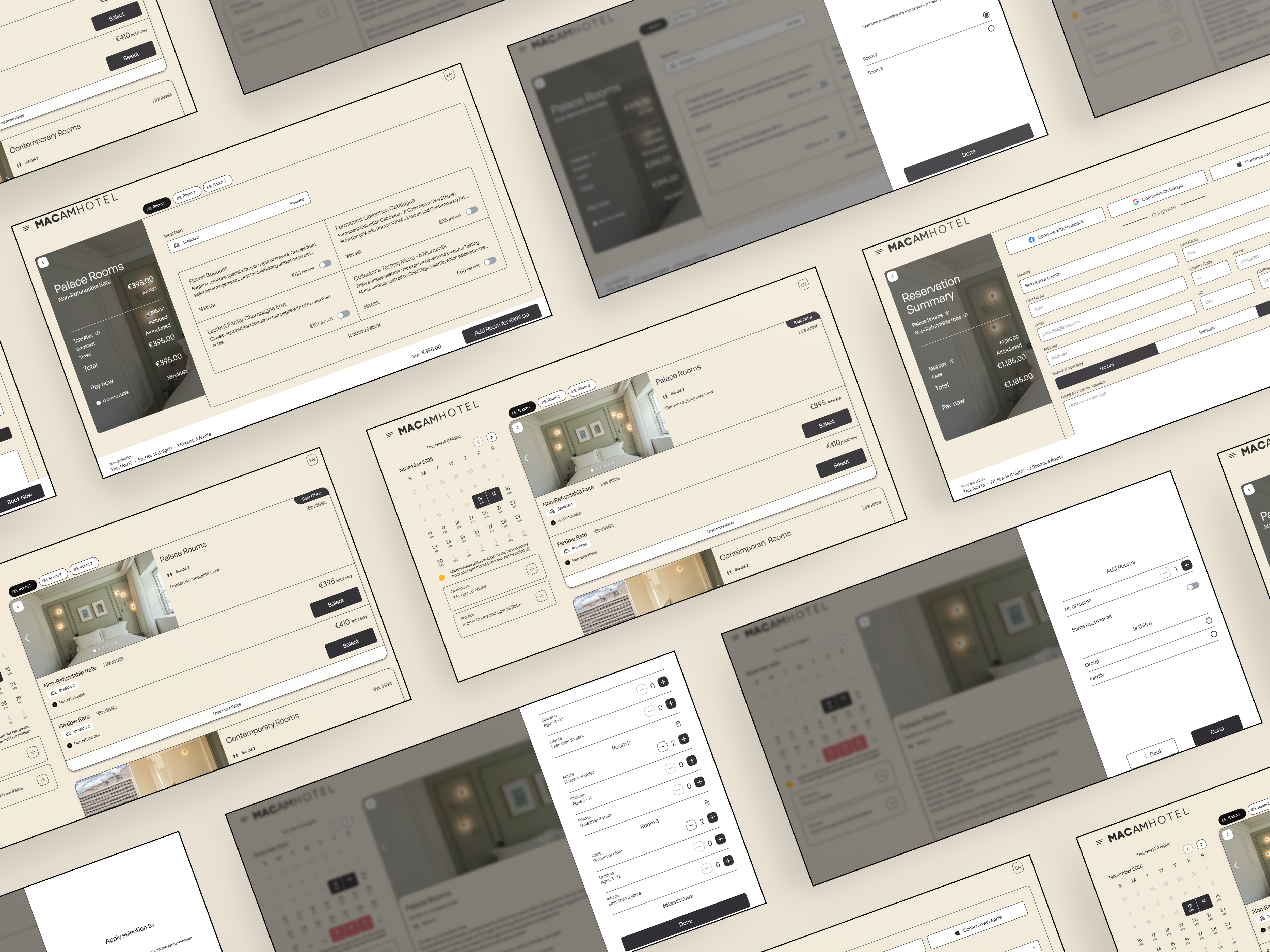
Stakeholders wanted room add-ons at the end of the flow. I made the case for moving them right after room selection — the same logic as a car configurator: you choose your trim and sunroof while building the car, not after it's already configured.
Create an interface that conveys trust, modernity, and simplicity — without adding a single unnecessary step.
Flexible Mode lets guests see options even when they don't fully match the initial search — reducing abandonment. Search Next automatically suggests alternatives when there's no availability. Prices display as total cost of stay, and promotions are highlighted using visibility heuristics, not buried in fine print.
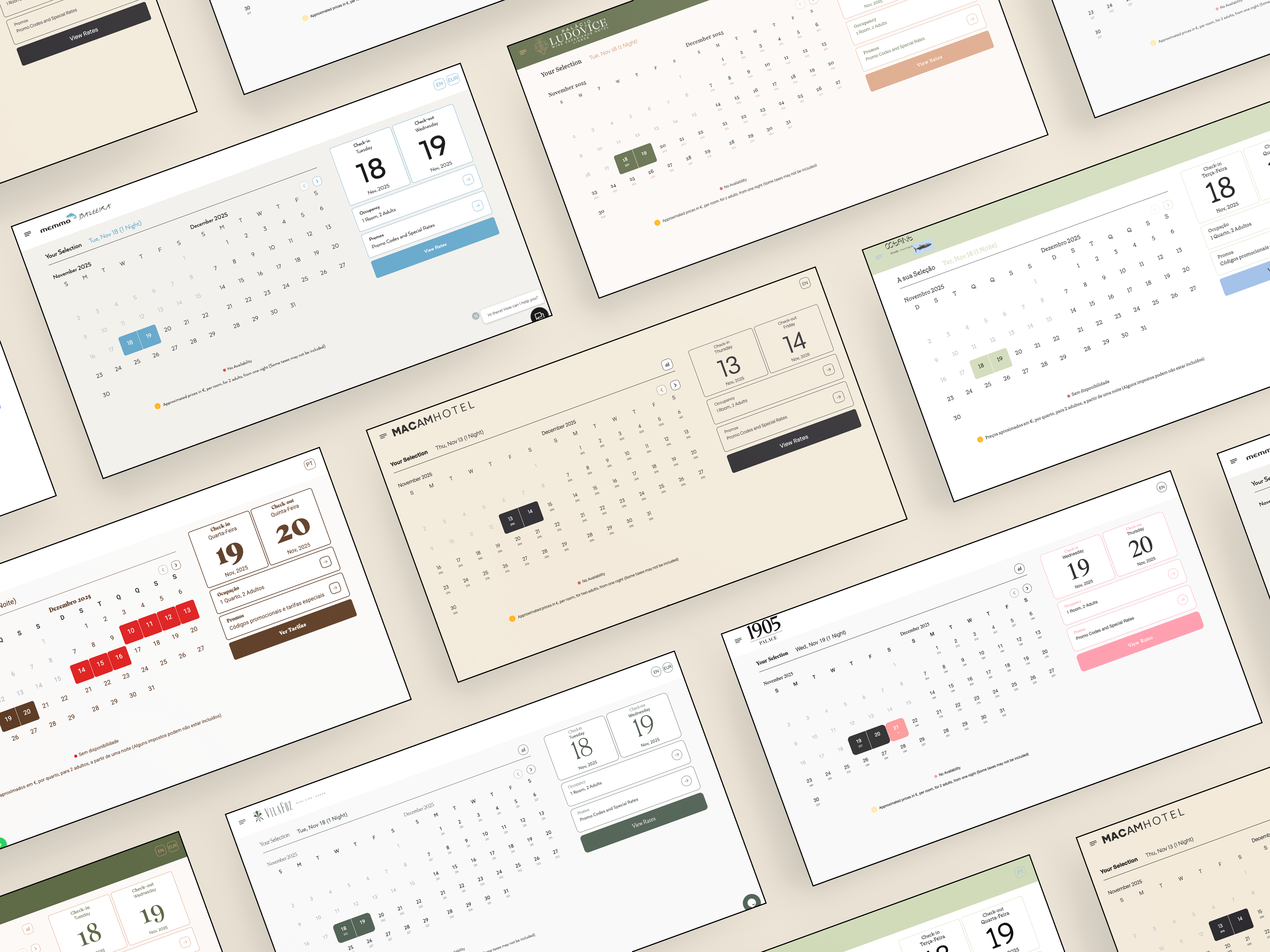
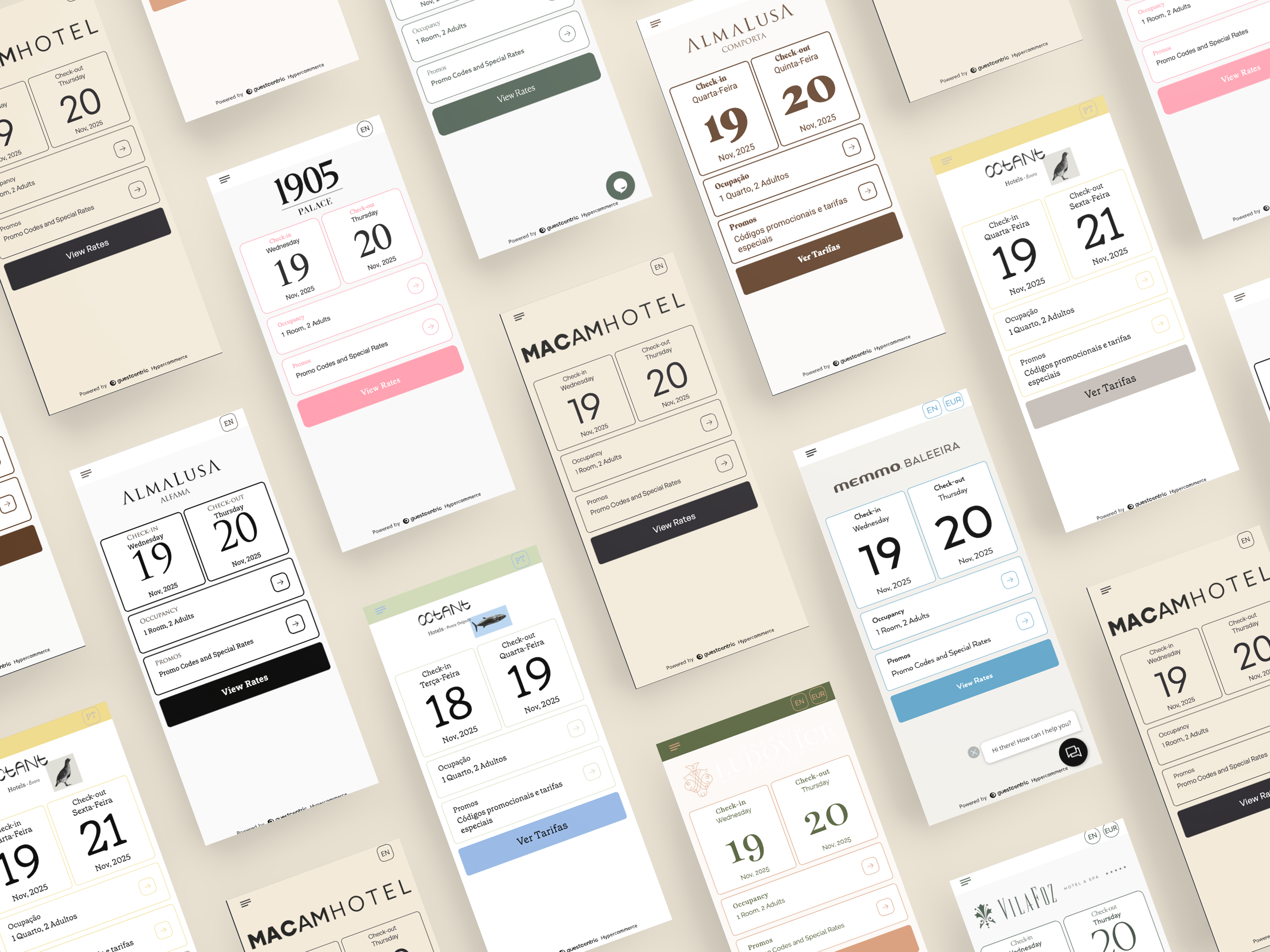
The visual skin was aligned with the hotel's branding — contrast and readability tuned, spacing reduced to avoid overload, CTAs positioned for scannability. Calendar, bed, and guest icons improve comprehension at a glance. Usability tests surfaced pre-fill opportunities, clearer error messages, and stronger post-action feedback.
A booking engine that feels like the hotel — not a generic widget dropped onto a page.
Theme skin customized to match hotel branding. Consistent visual hierarchy across all 7 flow steps. CTAs always visible and predictable. Iconography for calendar, bed, and guest count improves scannability without adding copy.
Horizontal · homepage impact
Vertical · dedicated booking pages
Link · pop-up/modal focus
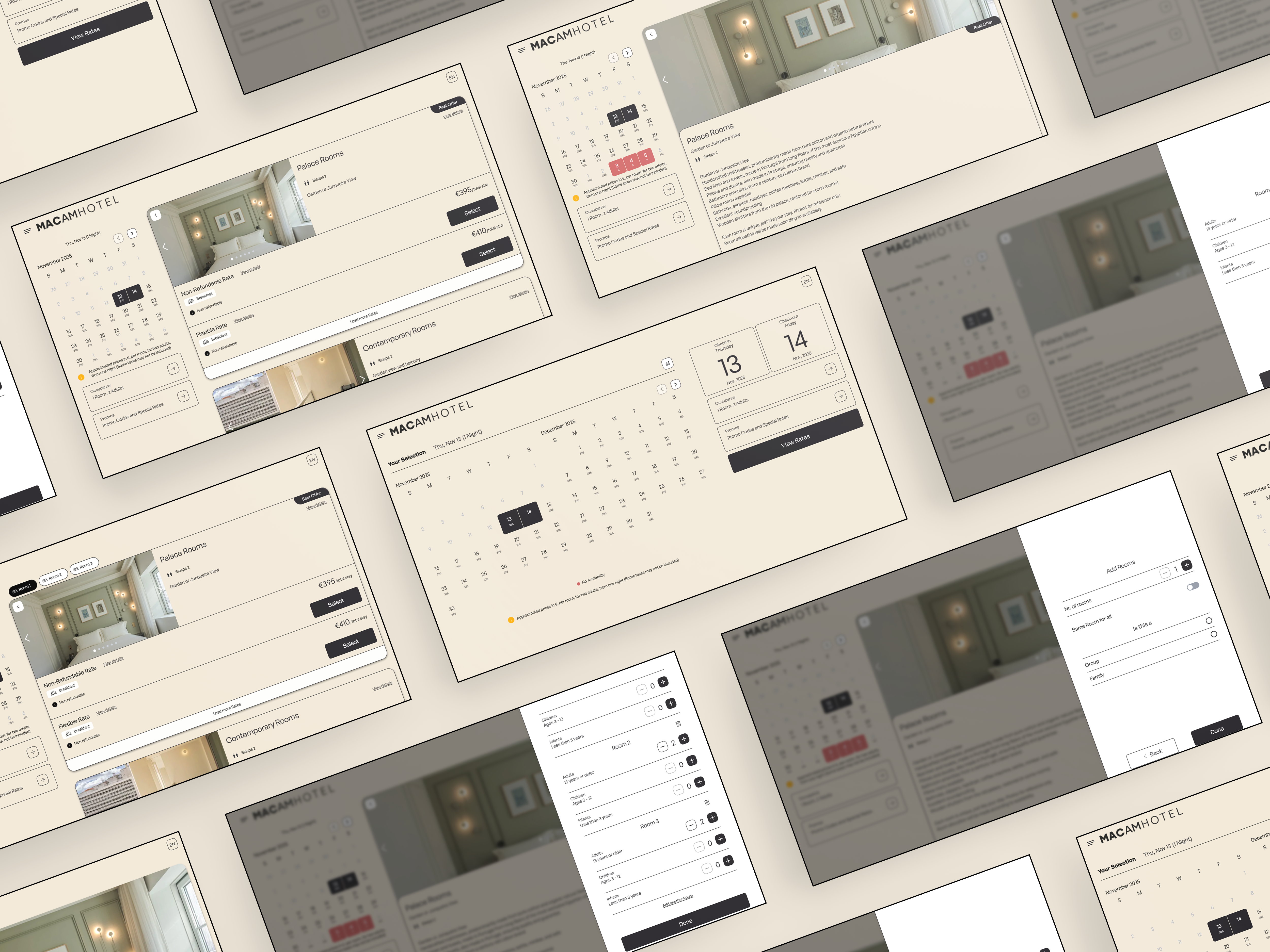
Dates → Guests → Rooms → Pricing → Extras → Details → Confirm. Each step: essential info only, one clear CTA, predictable back navigation.
Flexible Mode · Search Next · Total cost pricing · Promotion highlighting. Each setting chosen to reduce friction, not add features.
One engine, 150+ hotels — what's fixed, what's open.
Deployed across many clients, each with their own branding and guest profile. The line: behavior and structure stay fixed to protect conversion logic. Presentation stays open so every hotel still feels like itself.
Fixed: 7-step flow · CTA placement · information hierarchy.
Customizable: theme skin · branding · layout mode · UX settings — as toggles, not forks.
Large buttons, compact menus, smooth transitions. Contrast and minimum tap size tested for basic accessibility. Essential information above the fold.
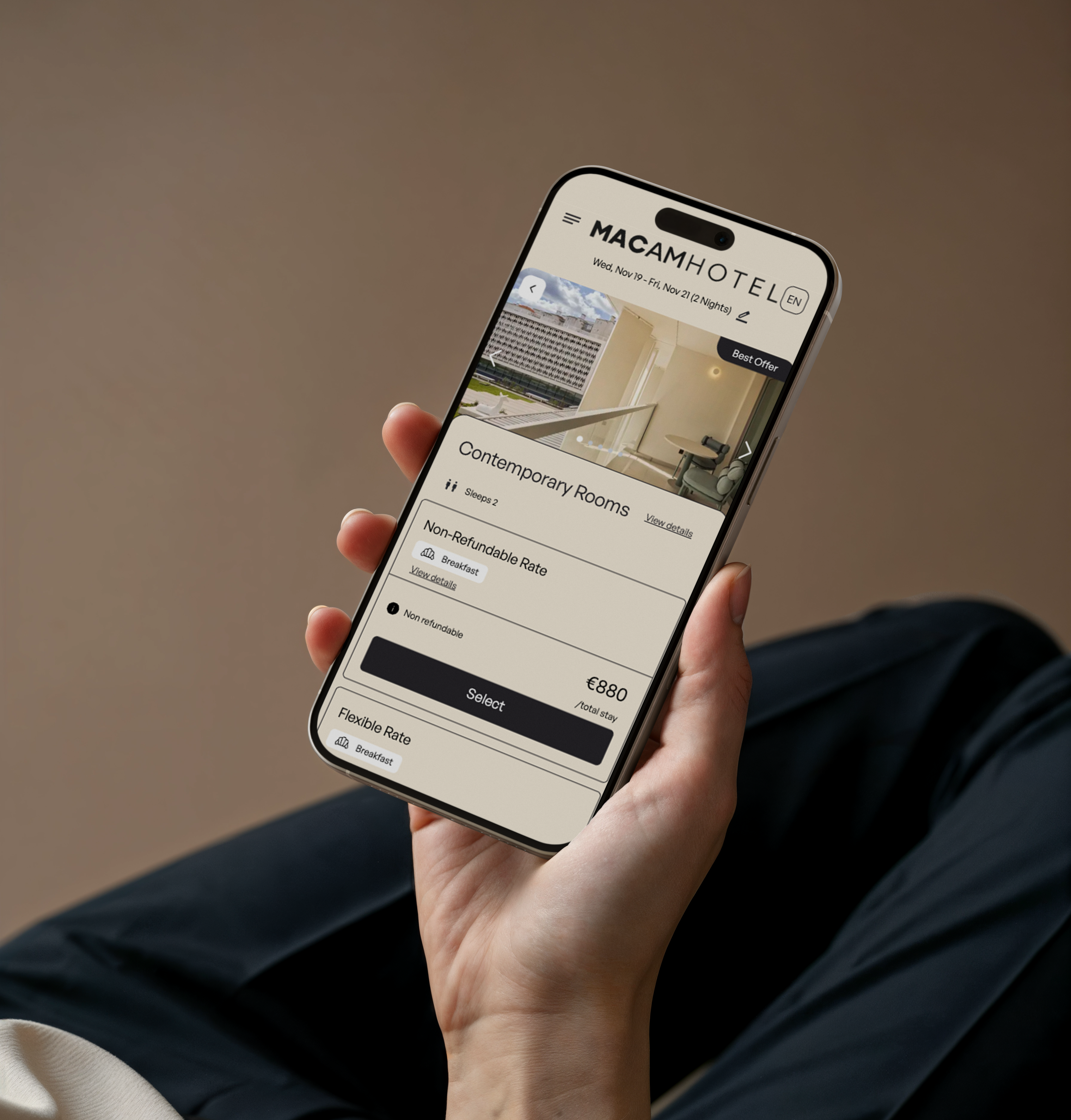
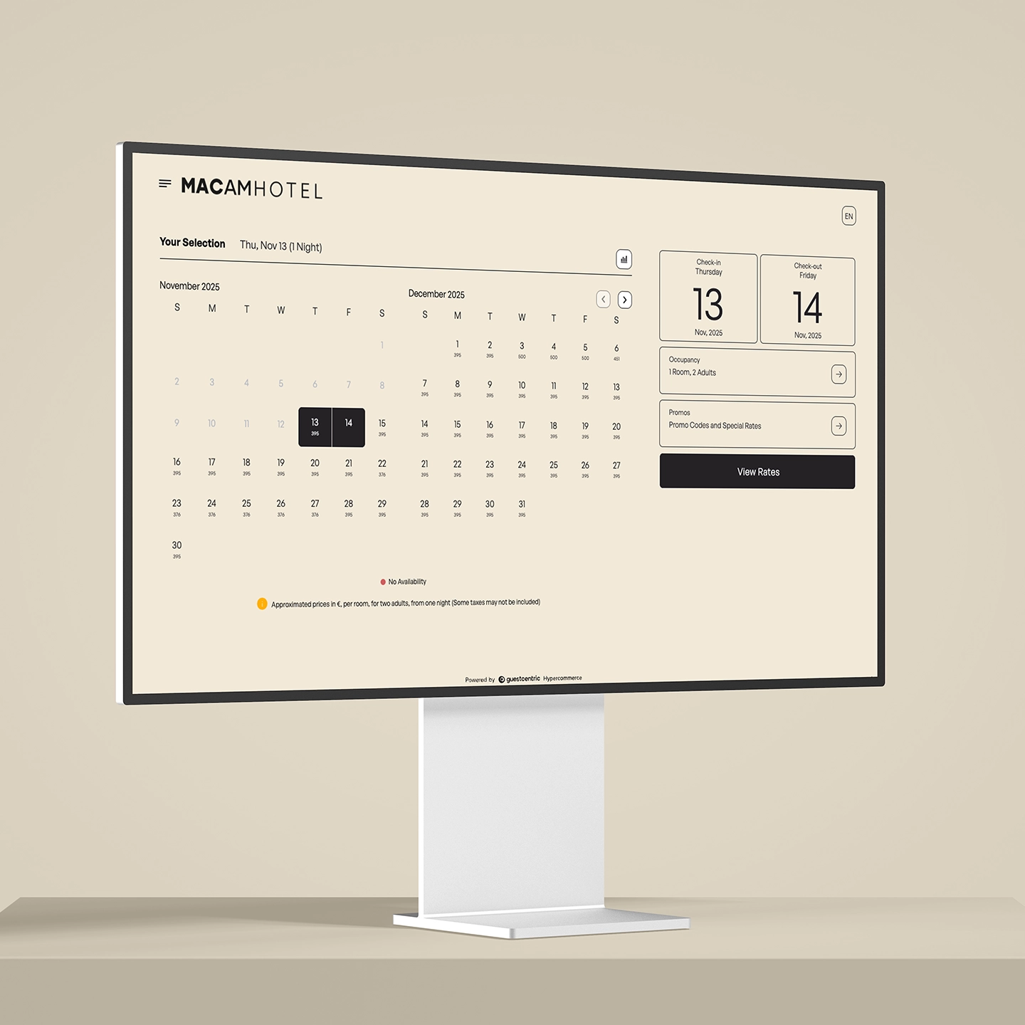
The result was a simpler, clearer booking engine — centered on guest needs, not the platform default. Direct booking conversion rose by ~75%. Some clients who had left the platform returned. The update also prepared the ground for an AI agent that now handles common reservation questions without waiting on a front-desk call.
