Type
Concept case study
Brand
Carioca Coffee Shop
Role
Branding · graphic · web
Sector
Brand identity · F&B
Industry
Specialty Coffee
Year
2024
Related
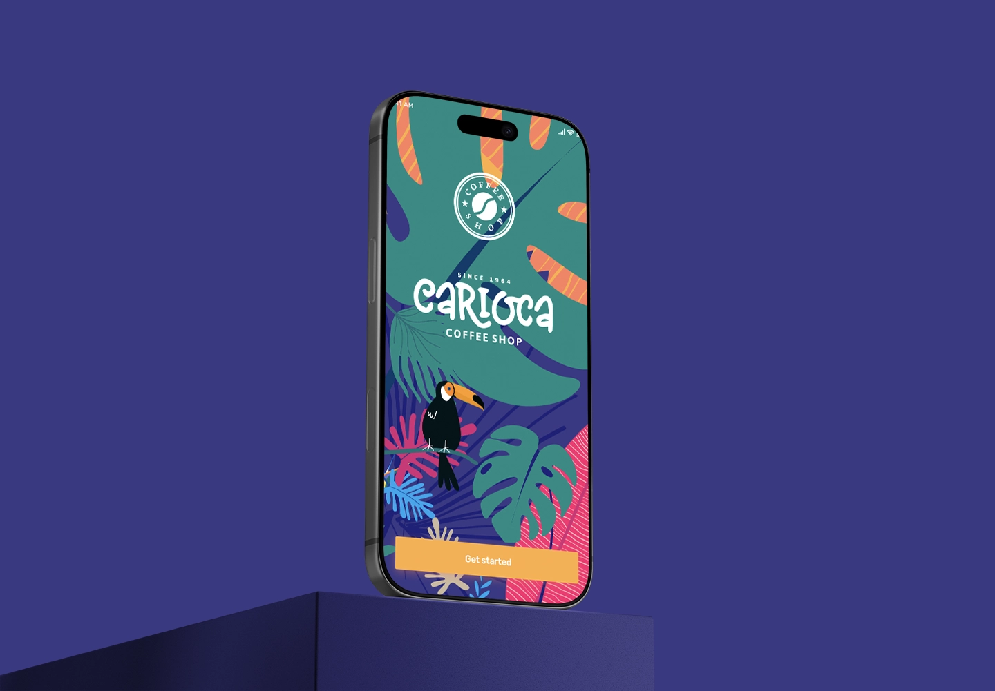
Carioca App →
Creativity is discovering a question that has never been asked. For Carioca, that question was: how does a coffee brand feel like a place you'd want to stay — not just buy from? The identity pairs a hand-lettered wordmark with a lush tropical world of toucans, monstera, and saturated colour. Heritage since 1964 grounds it. Joy carries it forward across packaging, signage, apparel, and digital.
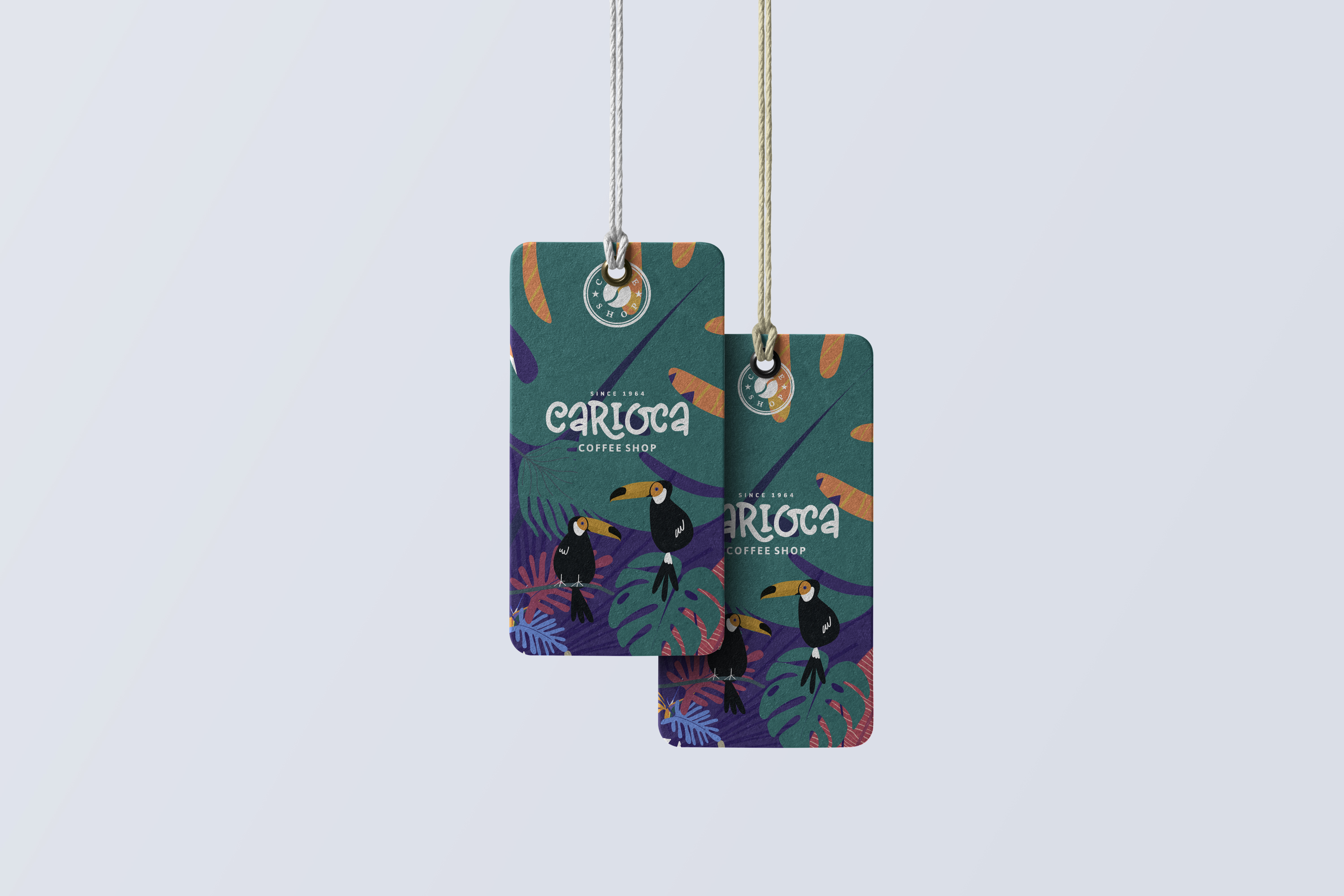
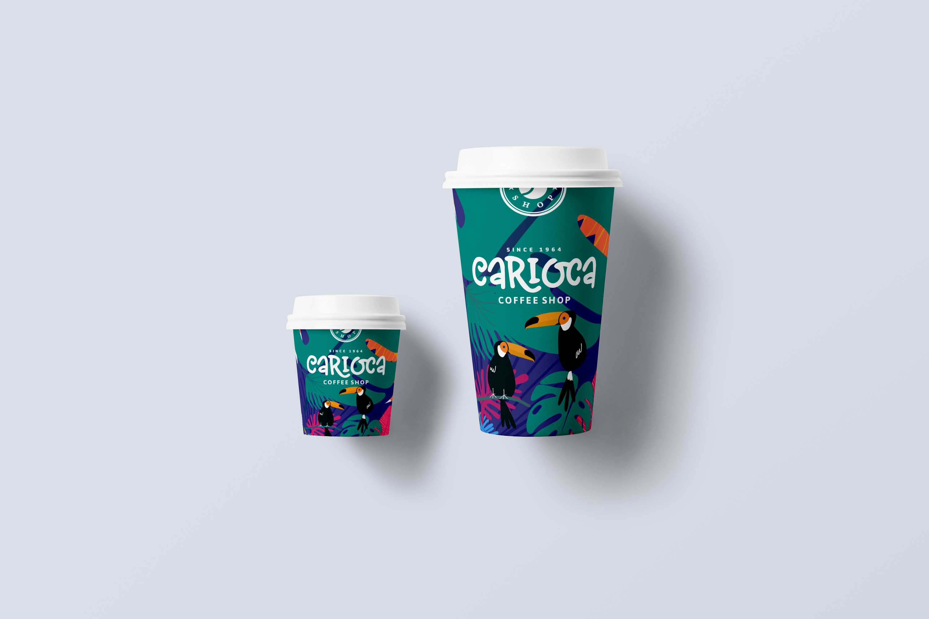
Products must bring joy, emotion, pleasure, and fun — not just function.
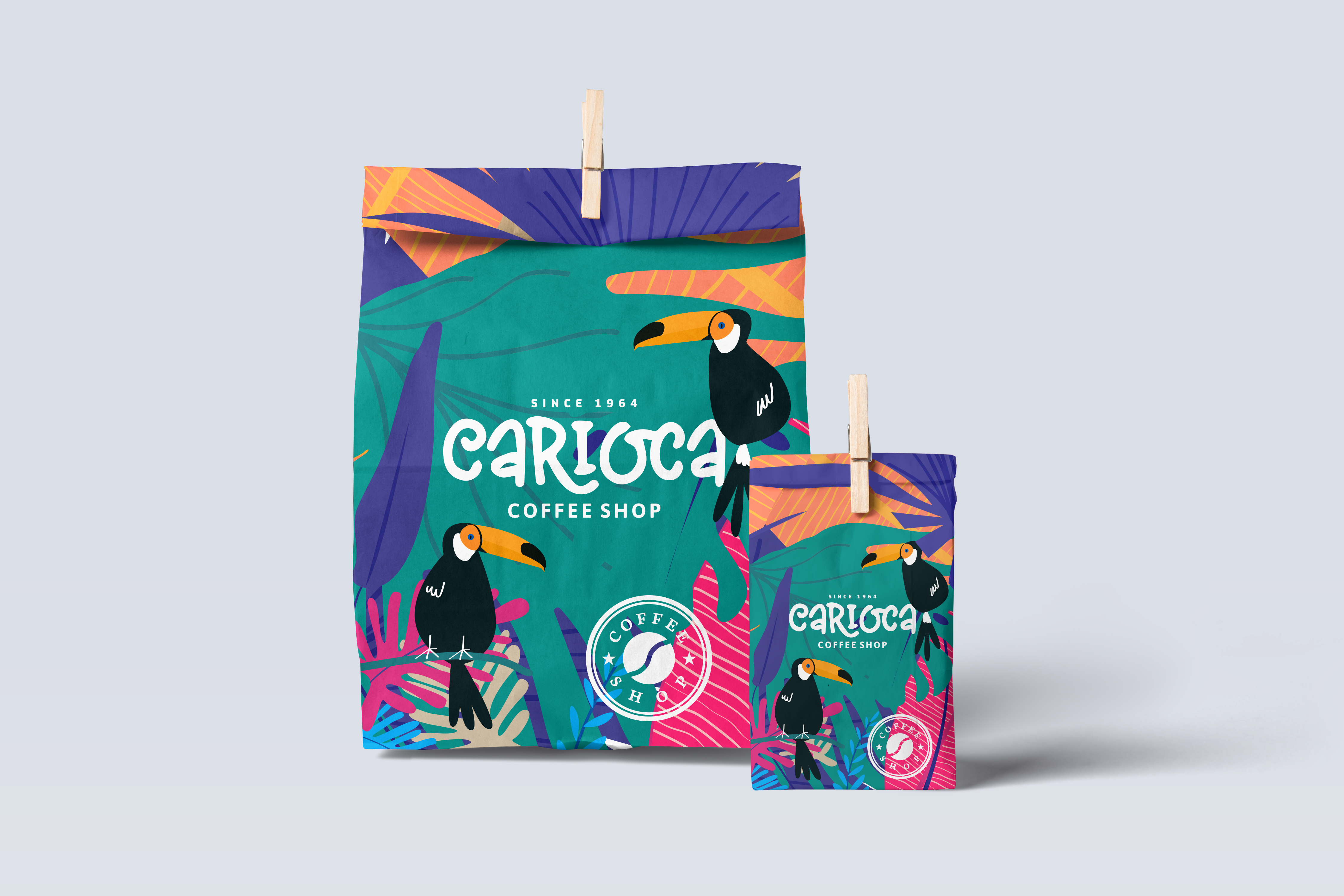
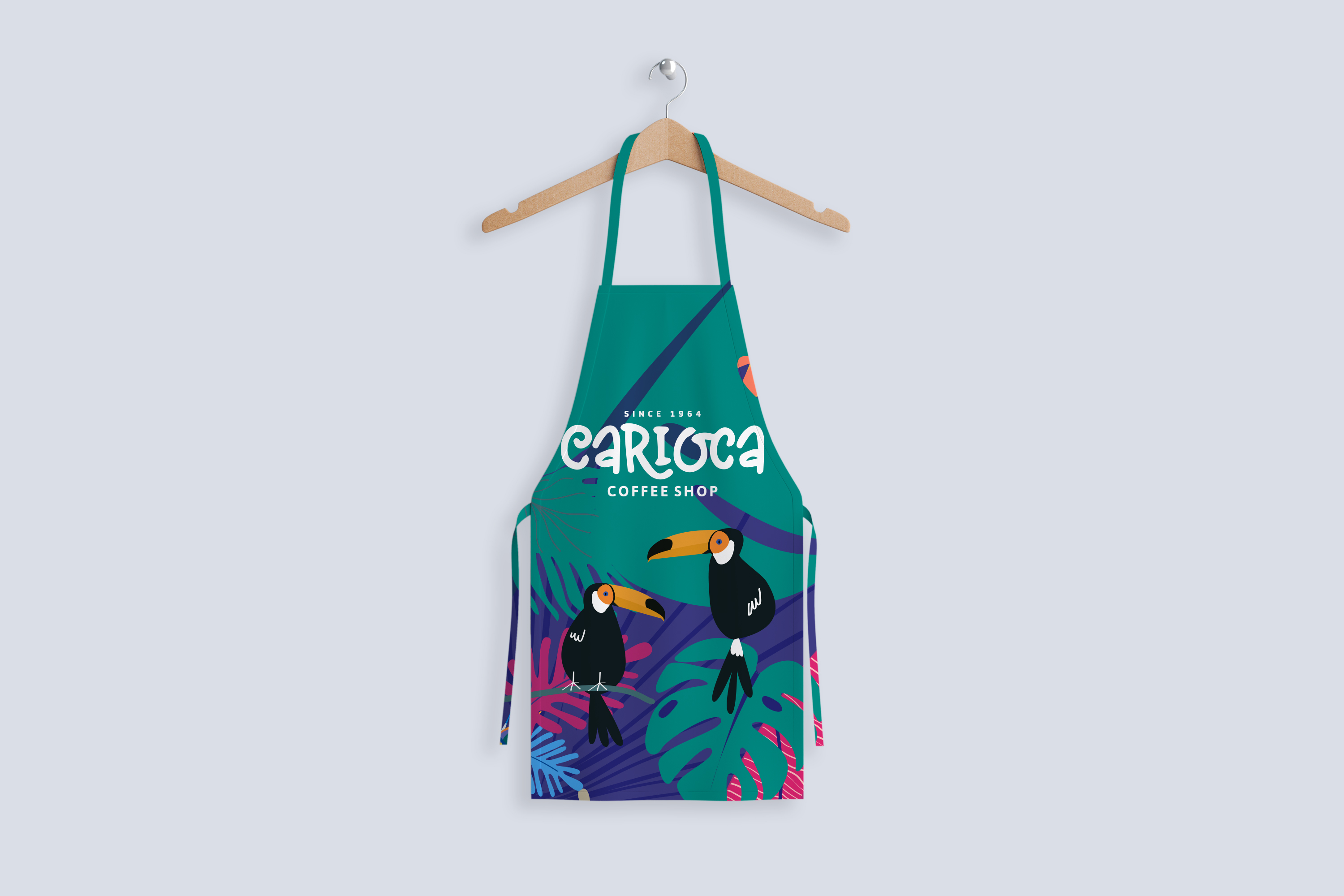
Heritage meets tropical energy — a question no one else was asking.
Carioca carries decades of coffee craft. The brand had to honour that without feeling dated. The hand-lettered wordmark and toucan-filled illustration world create a distinctive position: premium specialty coffee with the warmth and colour of Rio — not another minimalist third-wave clone.
Signage · Packaging · Cups · Tags · Aprons · Vehicle · Displays · Stationery · Website · Social
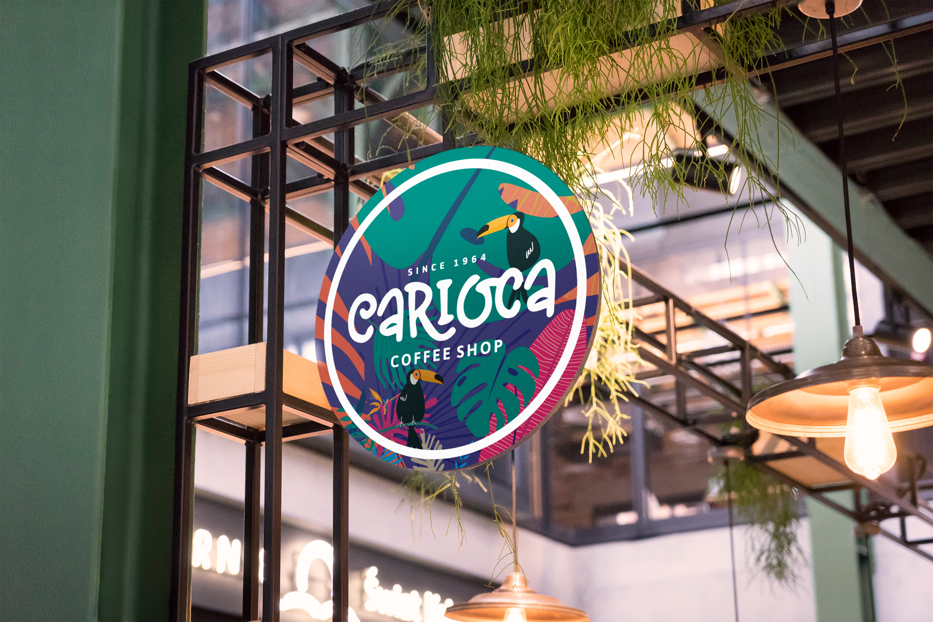
- Hanging sign for market and retail environments
- Product packaging across bag sizes and origins
- Barista apparel and delivery vehicle livery
- Point-of-sale displays and promotional stands
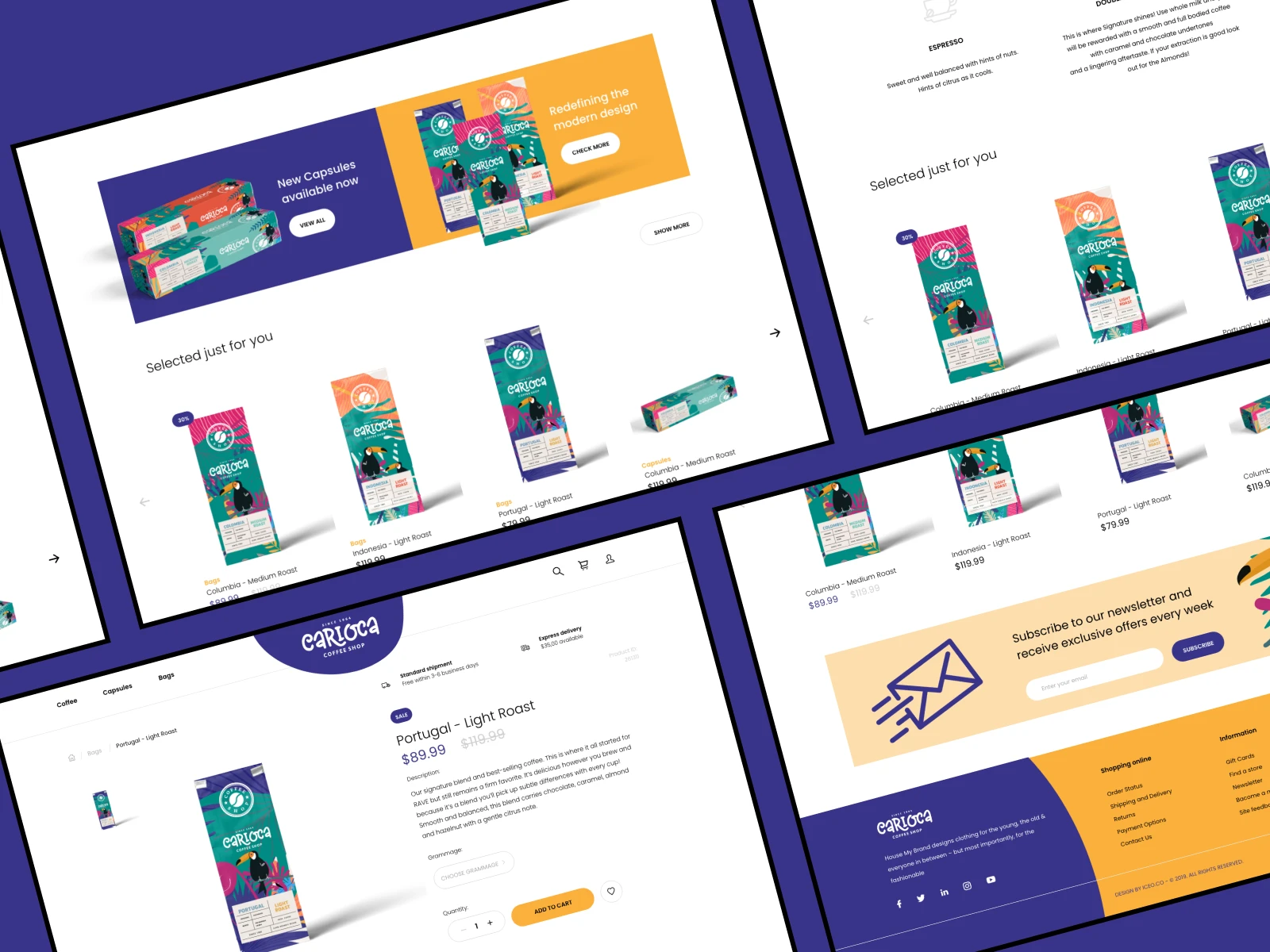
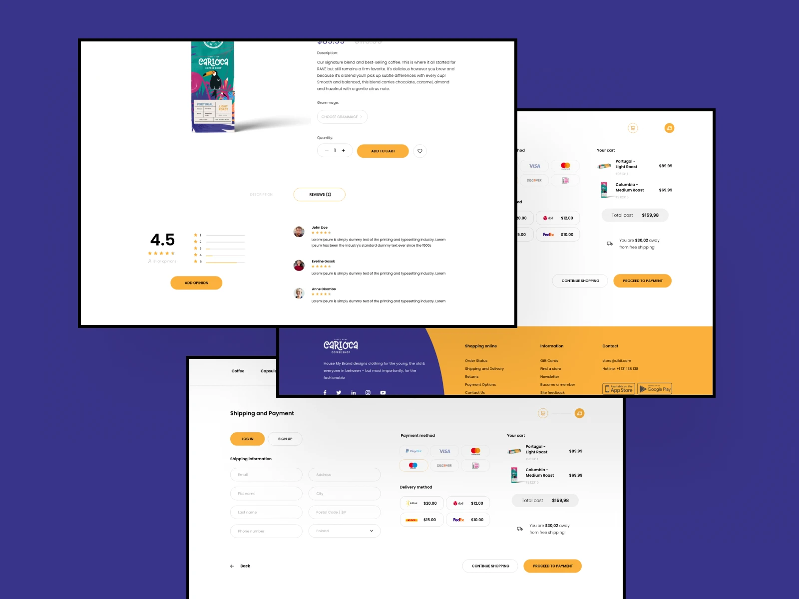
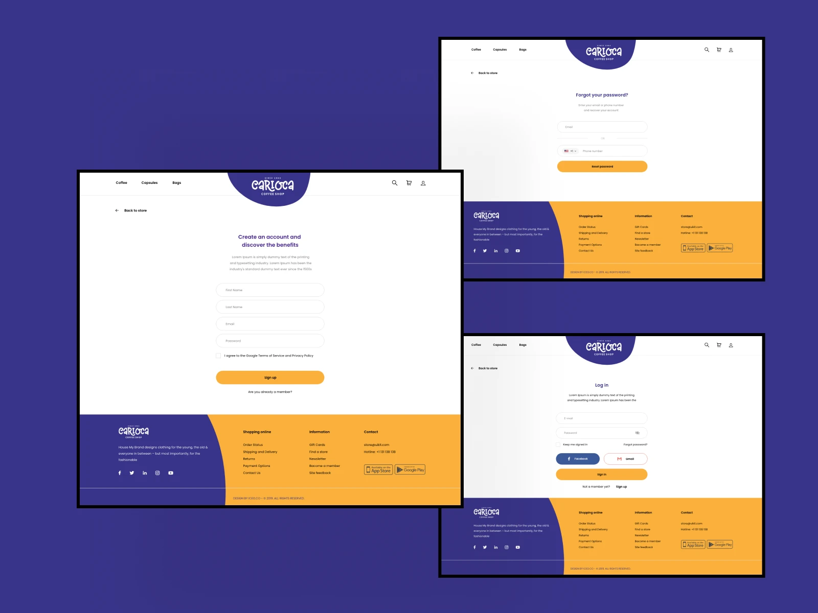
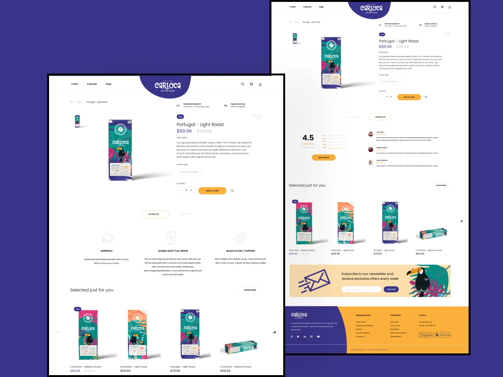
- Website design extending the tropical visual system
- Social media templates with graphic pattern library
- Consistent logo lockups across digital surfaces
- Foundation for the dedicated ordering app
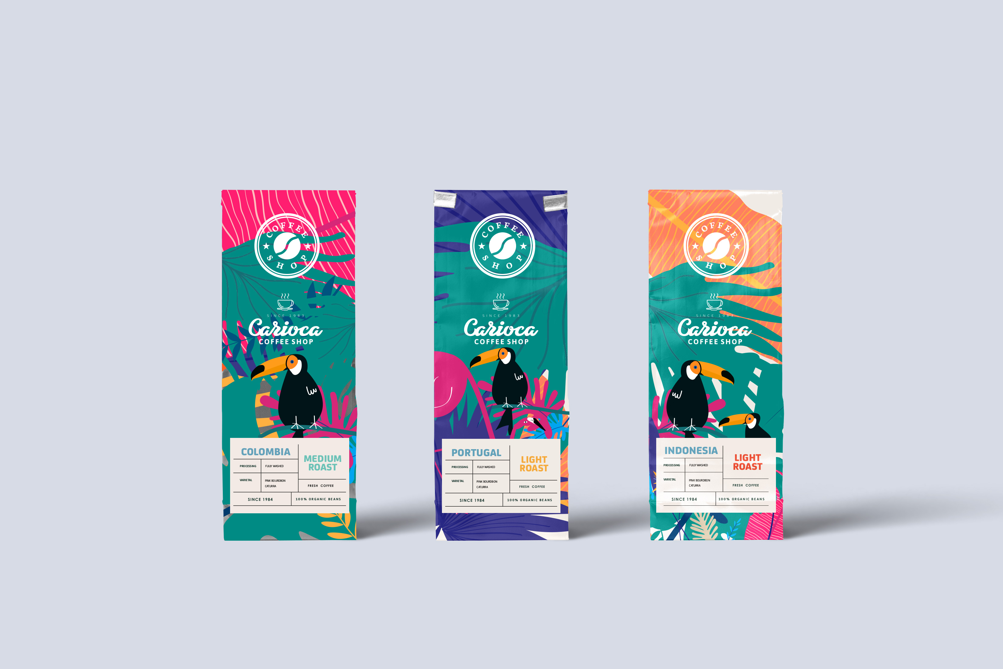
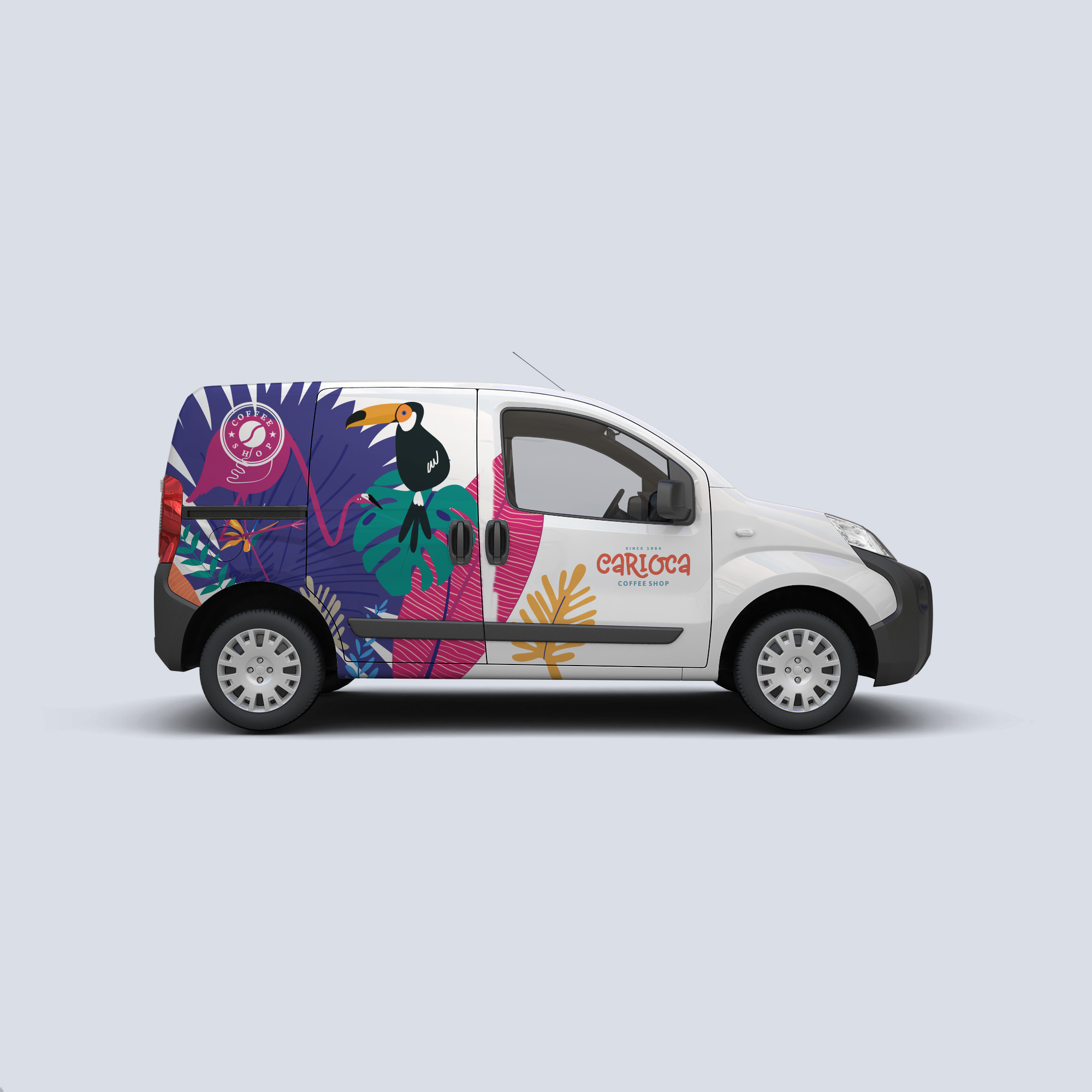
If someone asks an idiosyncratic question, the answer will be necessarily unique.
Tropical illustration meets mid-century wordmark — saturated, playful, unmistakable.
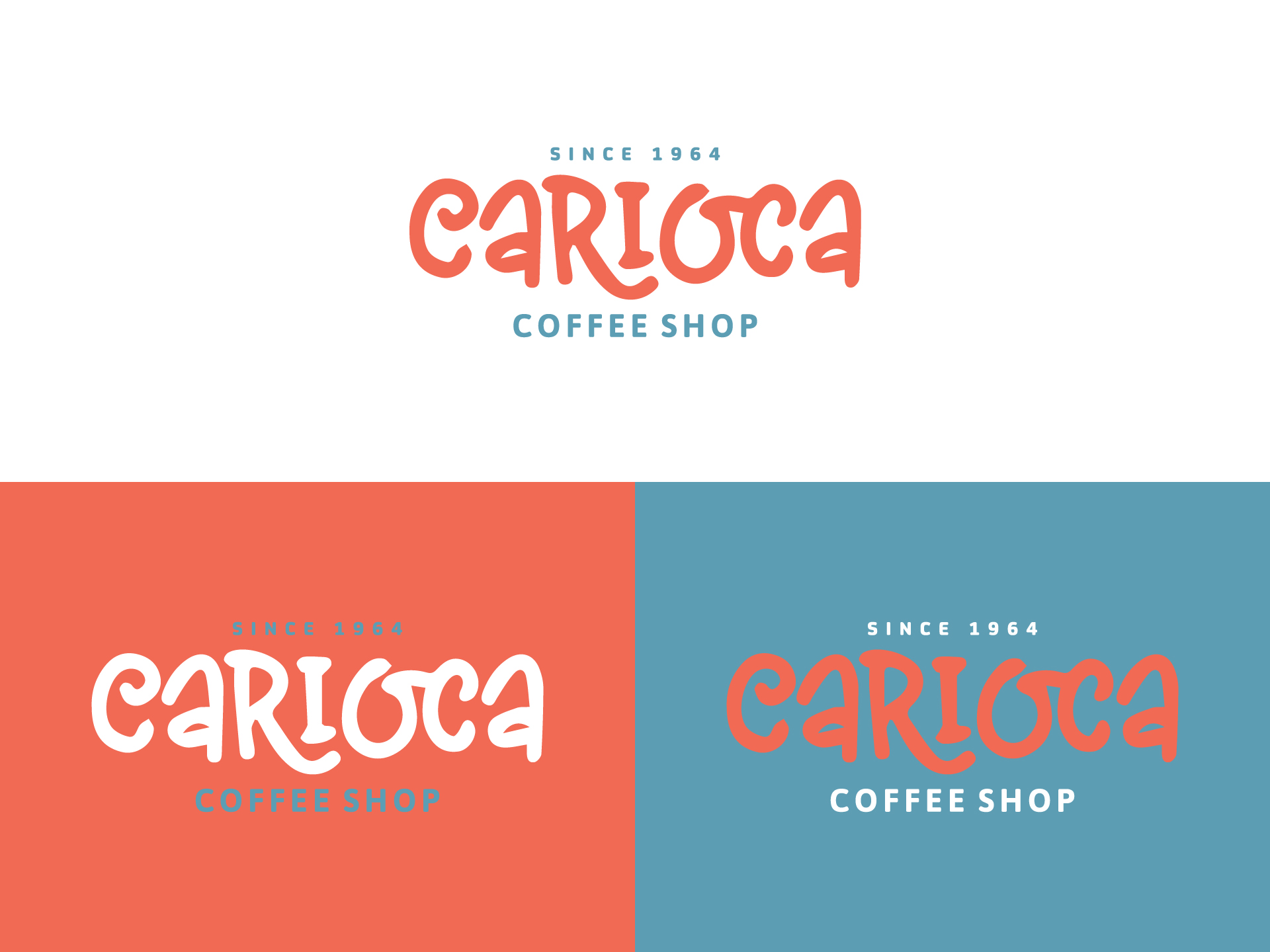
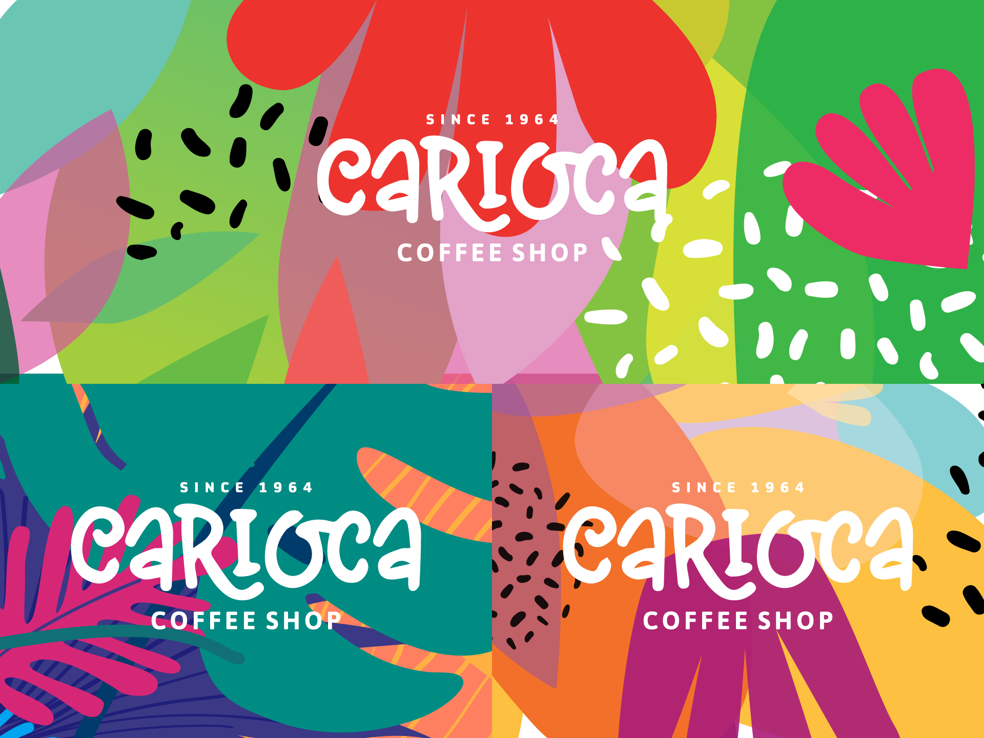
The CARIOCA logotype is hand-lettered with rounded, expressive strokes. SINCE 1964 and COFFEE SHOP sit in clean tracked caps. Toucans, monstera, palm fronds, and abstract colour blocks form a repeatable pattern library for packaging, signage, and campaigns.
Coral · #E86F5C
Slate Blue · #4A6B8A
Teal · #1A6B6B
Lime · #A4D65E
Magenta · #D63384
Custom hand-lettered CARIOCA for display. Clean sans-serif for SINCE 1964, COFFEE SHOP, and product labels. High contrast between expressive headline and restrained supporting type.
Flat tropical scenes — toucans as brand mascots, layered foliage in teal, purple, orange, and pink. Circular coffee bean seal as secondary mark across packaging.
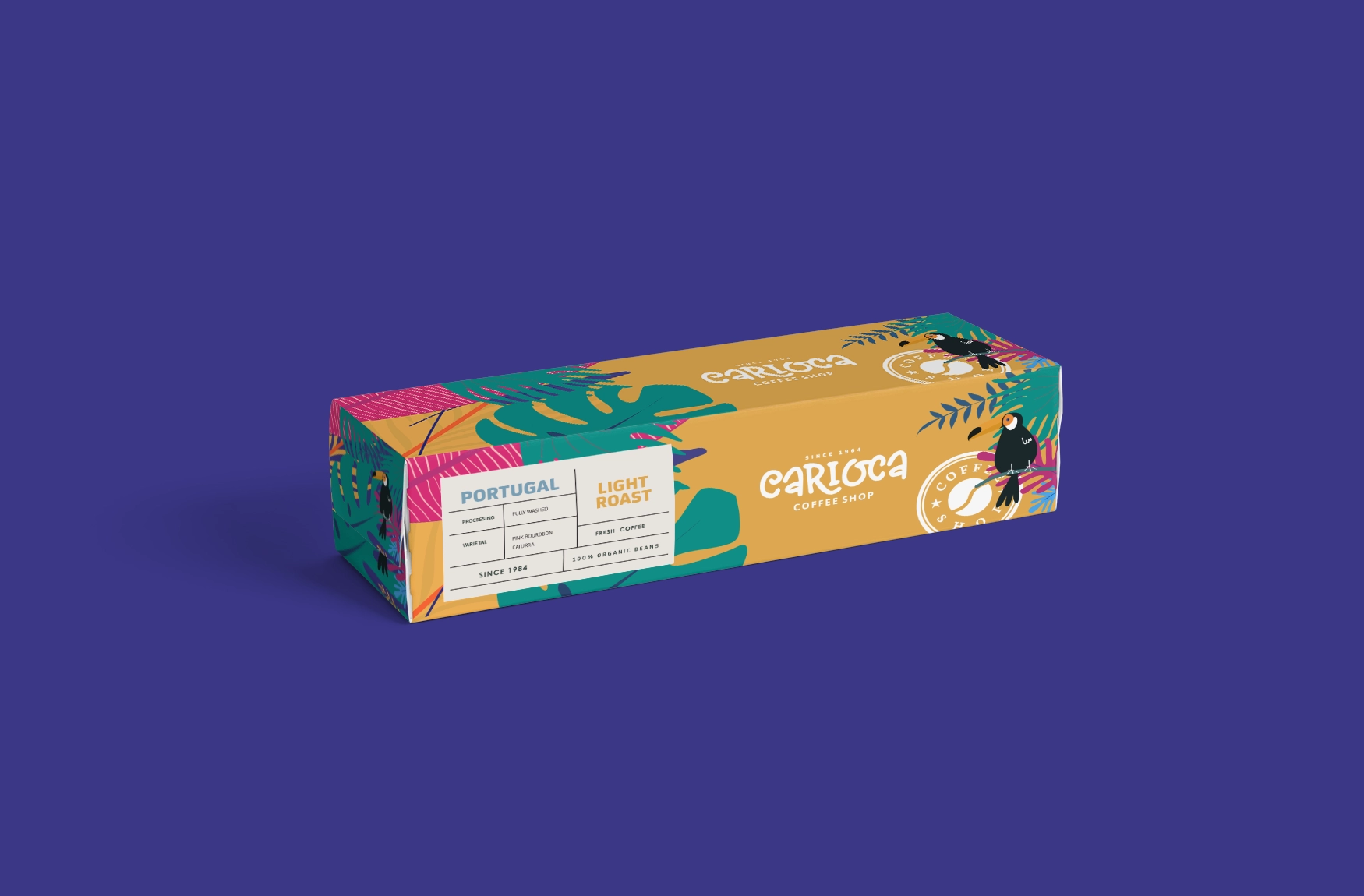
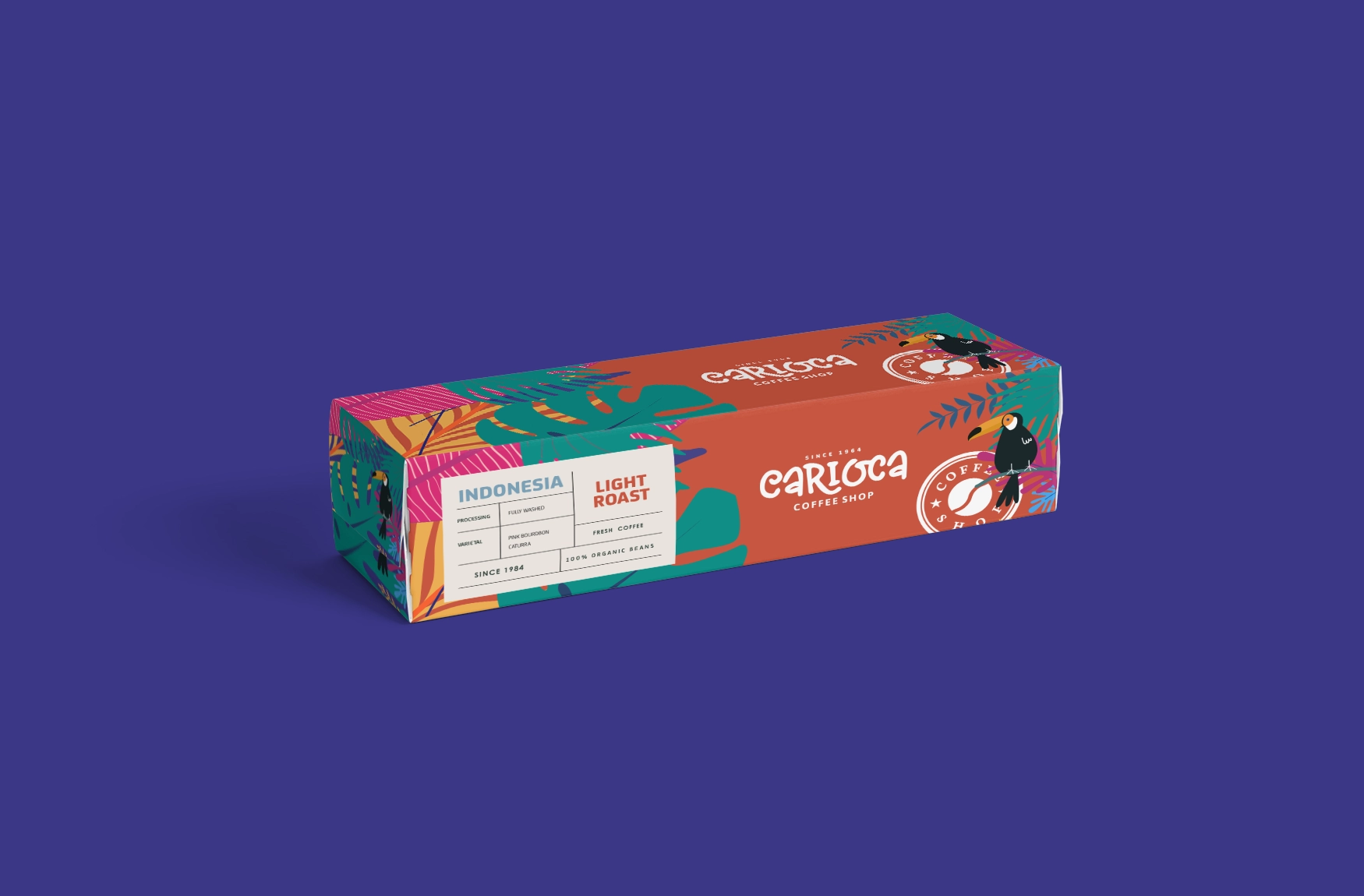
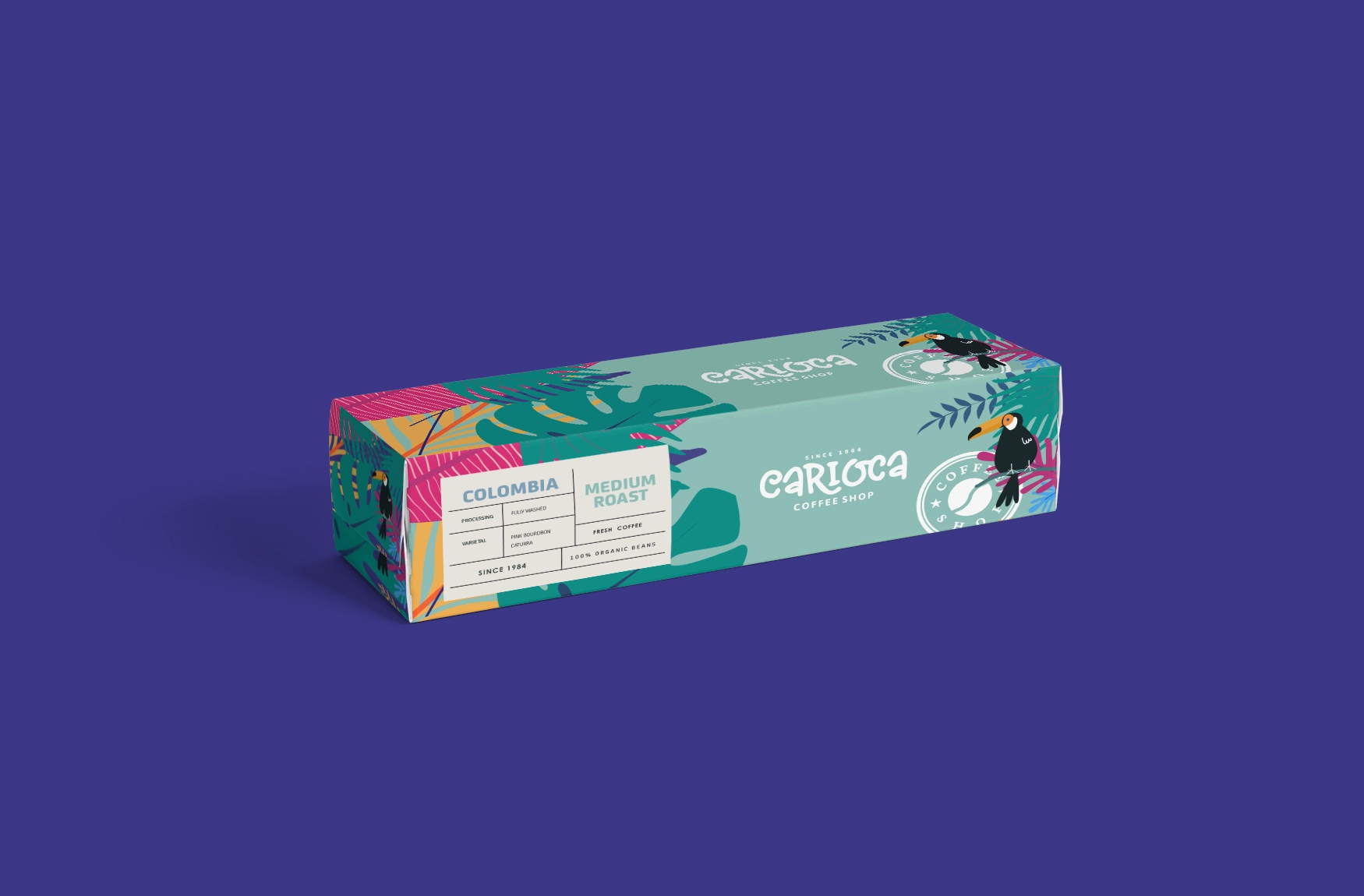
From the hanging sign to the website — one world, every touchpoint.
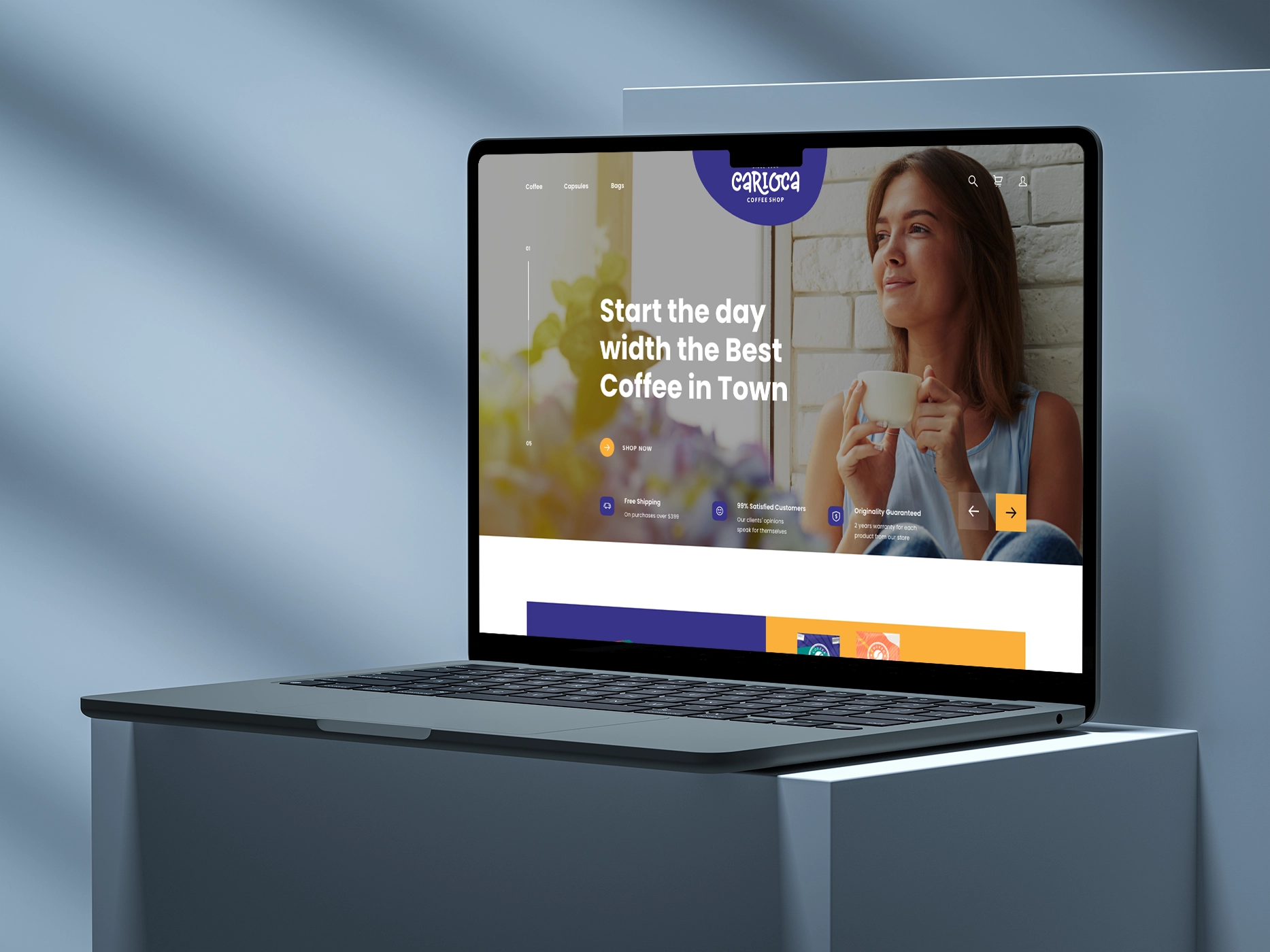
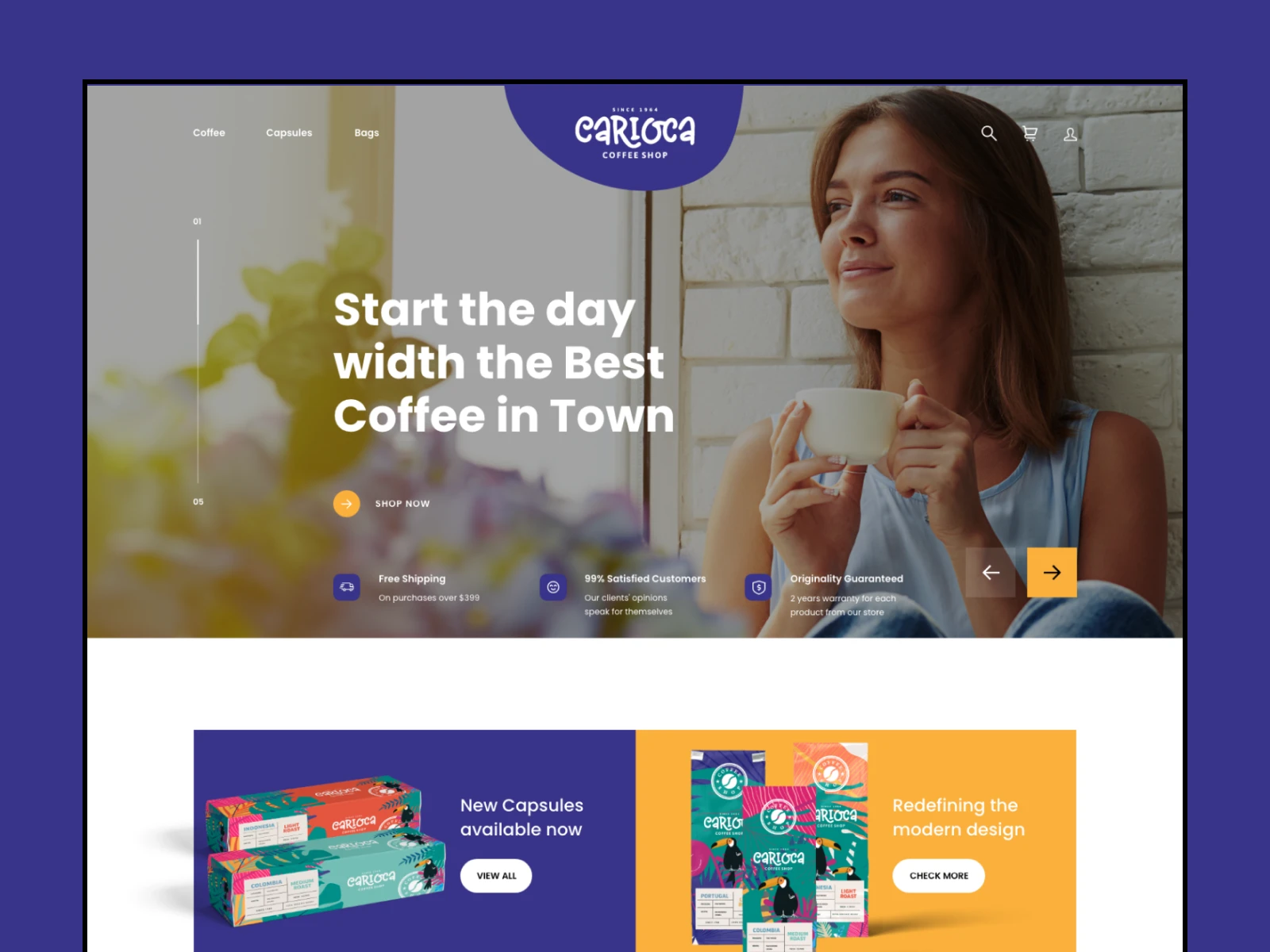
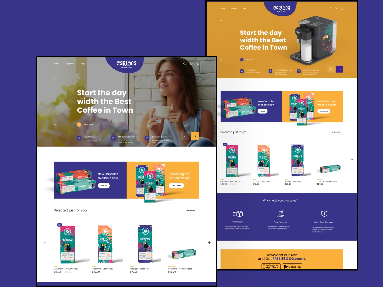
The physical brand carries the most emotional weight — the cup in hand, the bag on the counter, the sign above the stall. Each application uses the same illustration vocabulary so Carioca feels like one place, whether you're in the market or on the delivery route.
The website translates the tropical system to screen without losing warmth. Colour blocks, toucan motifs, and the hand-lettered mark create continuity between offline craft and online presence — and set the foundation for the dedicated ordering app.
Concept case study: a brand system that works across cup, van, website, and the app that followed. Shows how I connect identity design to product UX so the digital experience inherits the same warmth as the physical one.