Type
Concept case study
Brand
Carioca Coffee Shop
Role
Product design & UX
Sector
UX/UI · Mobile · F&B
Industry
Specialty Coffee · Retail
Year
2024
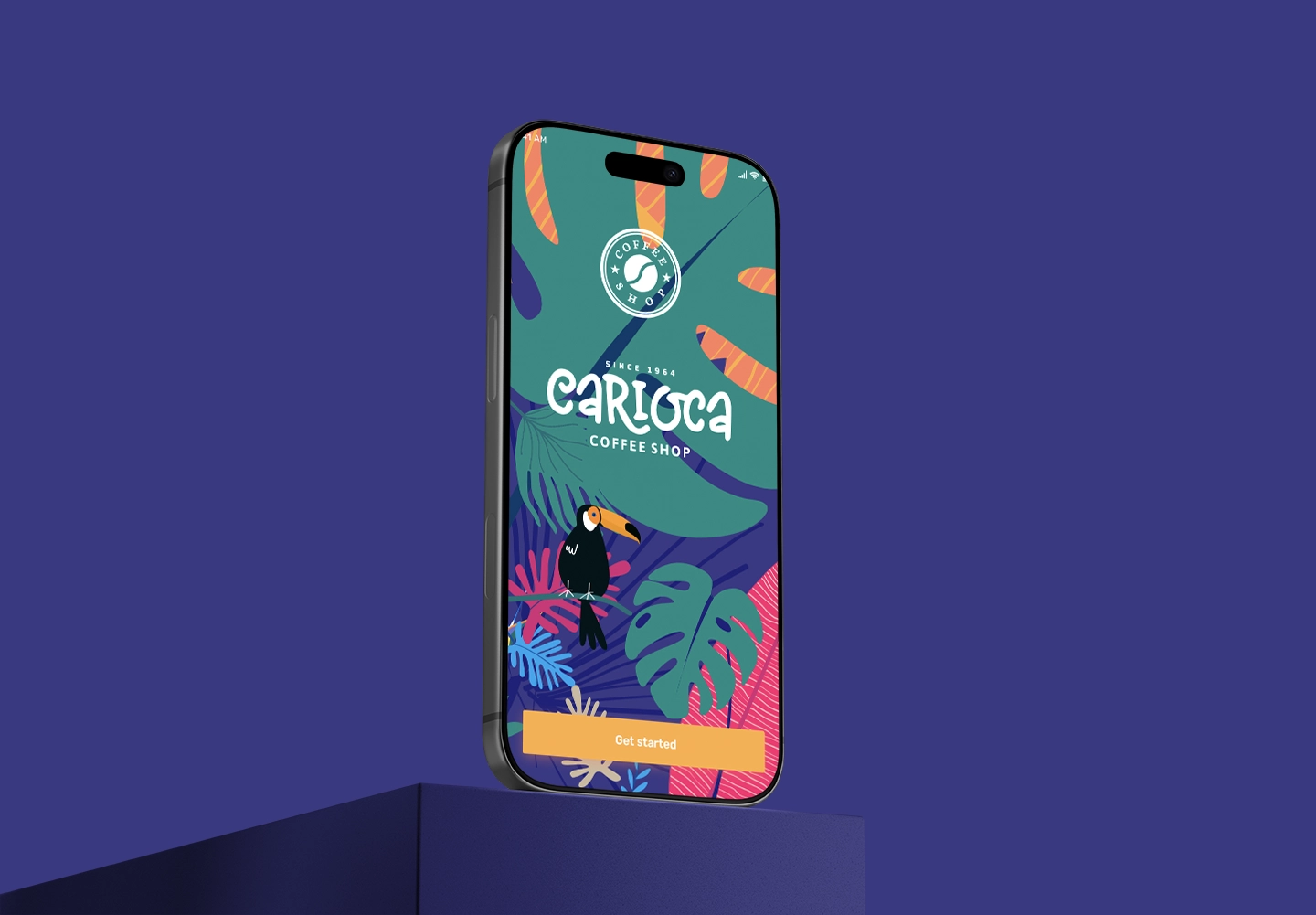
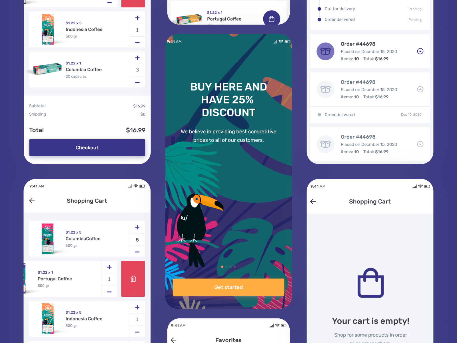
Carioca’s brand felt distinctive in-store, but ordering sat on a generic third-party platform that erased that personality. In this concept redesign I built a dedicated native flow that makes Carioca feel as considered digitally as it does at the counter — with reorder as a two-tap habit, not a form.
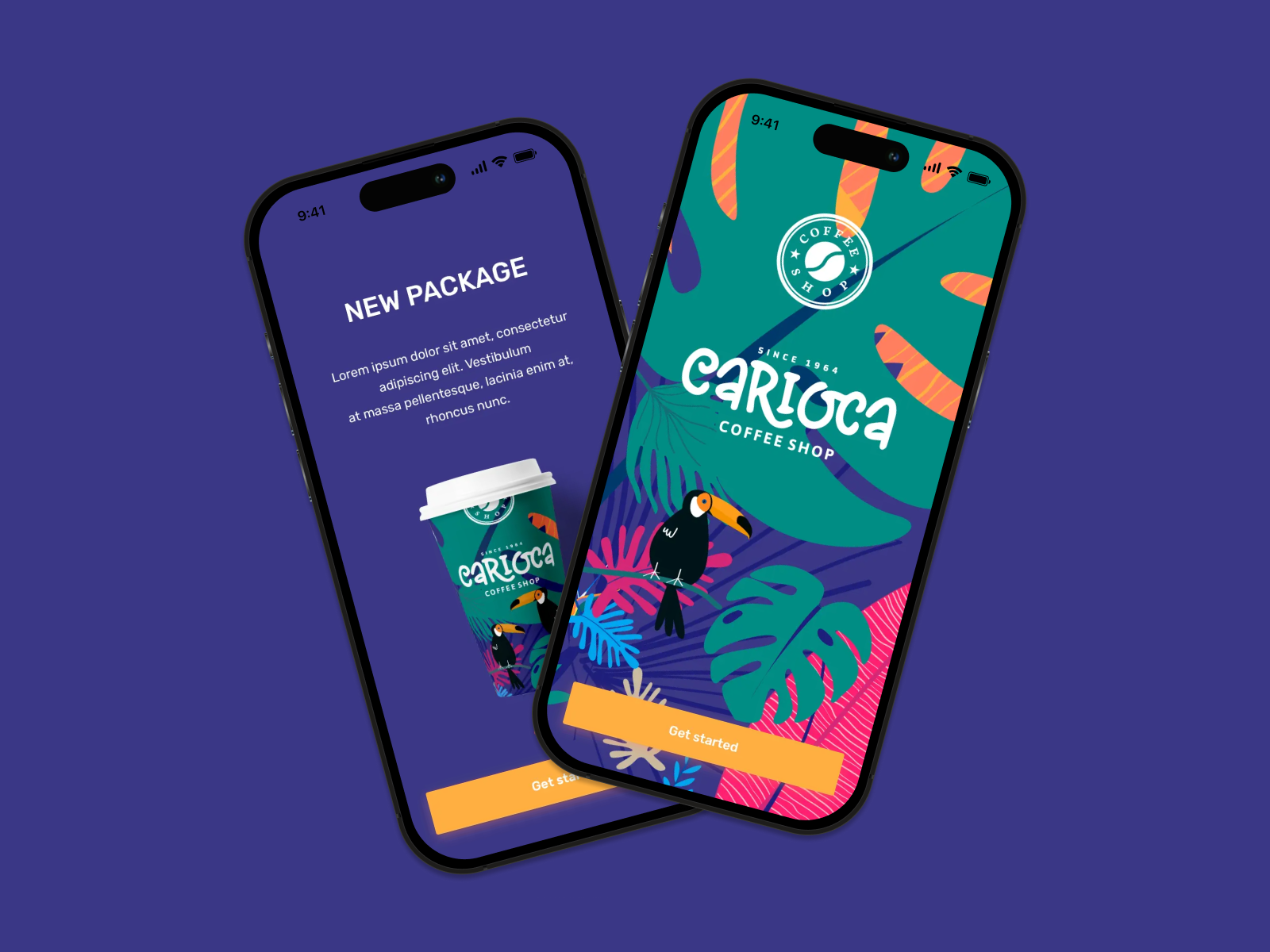
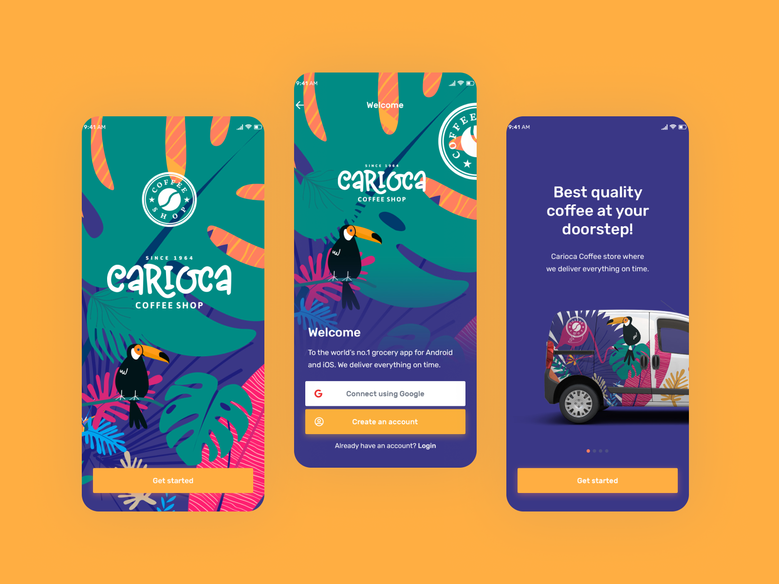
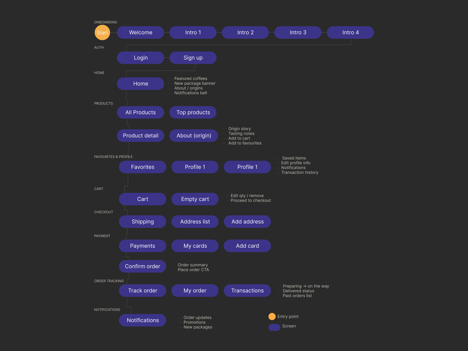
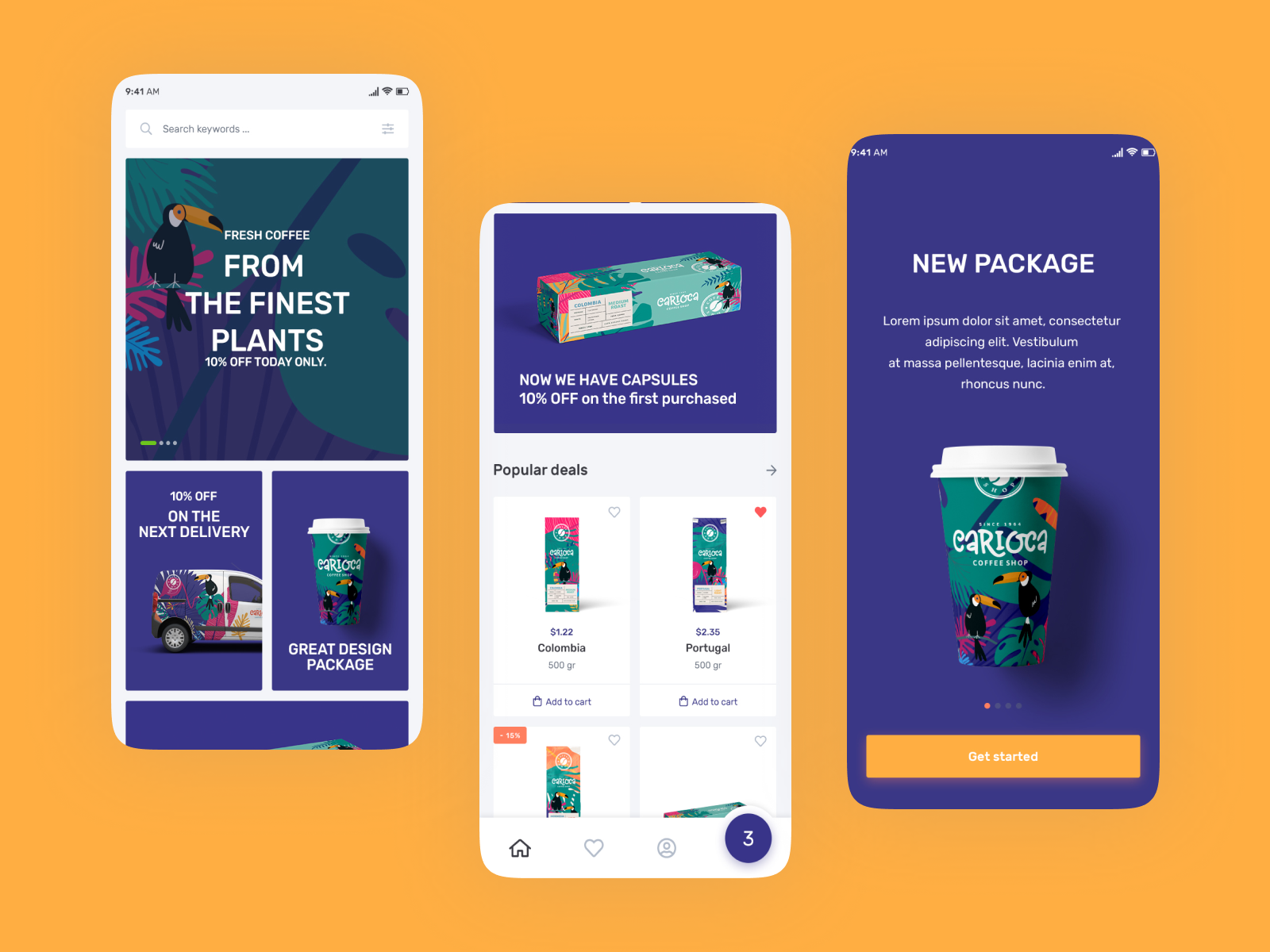
A coffee shop experience as good as the coffee itself — where the brand lives in every tap, not just the packaging.
Inês Costa, 29
UX Designer · Lisbon — Príncipe Real · Specialty Coffee Fan
Orders her usual oat flat white for collection on the way to work. On weekends explores new single origins. Values brands that feel considered and authentic. Frustrated that generic delivery apps don't show origin info. Can't reorder in under 2 taps. Loyalty cards are physical and easily lost.
What coffee lovers actually want from an app.
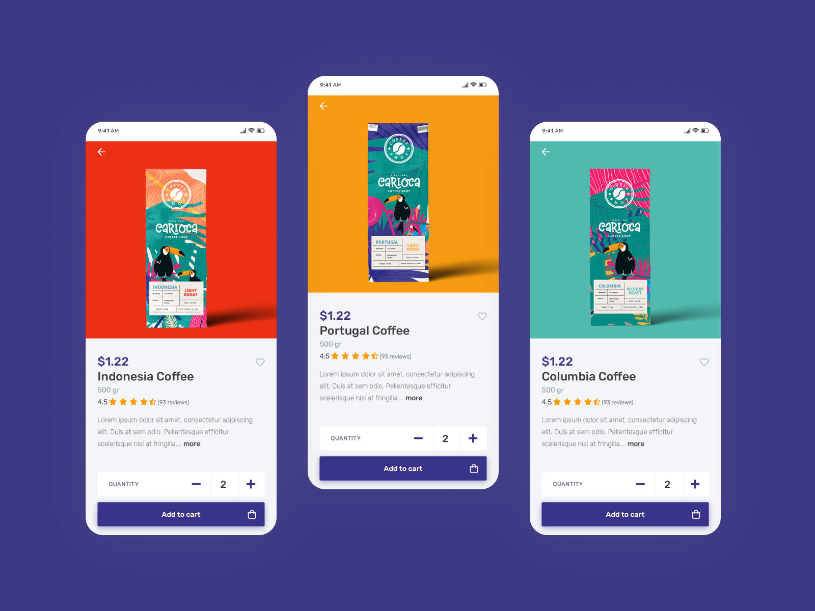
Specialty buyers care about origin and story — so product photography and tasting notes belong in the browse flow, not buried after checkout.
Customisation must be available but never feel mandatory. Checkout past three steps creates drop-off on mobile — keep path short, sheet-based, and reversible.
- Audit of Starbucks, Blue Bottle, Nespresso apps
- App Store review analysis — F&B ordering apps
- User interviews — 6 specialty coffee customers in Lisbon
- Basket abandonment analysis — comparable F&B brands
Warmth in a digital product comes from micro-decisions: copy tone, transition timing, the weight of a button press.
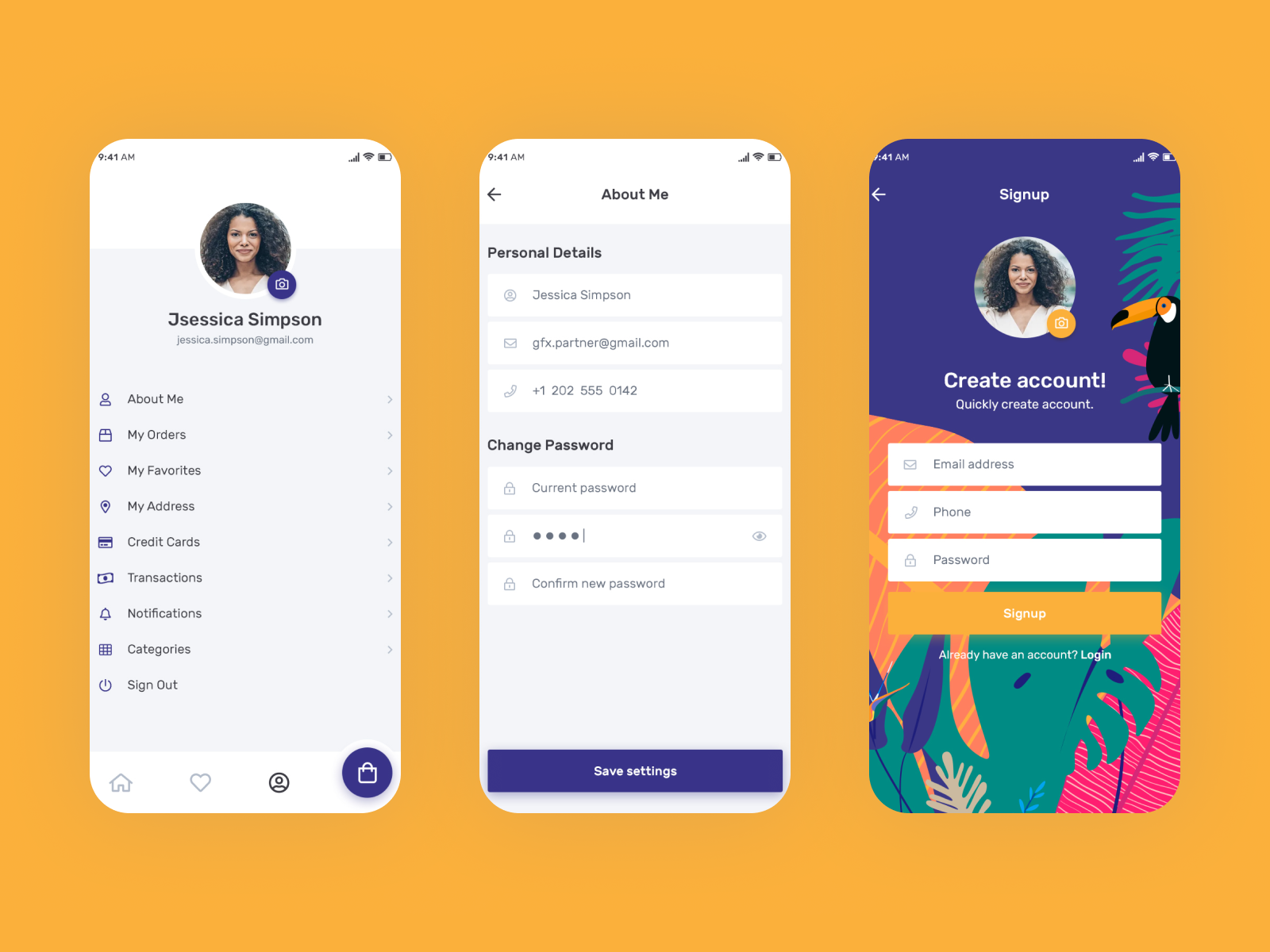
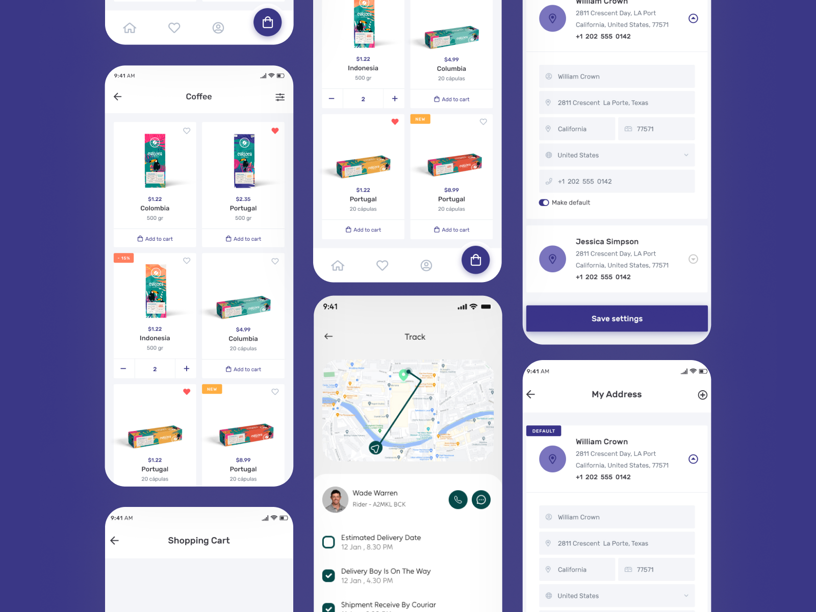
Returning users reach their usual order in 2 taps from the home screen. Customisation opens in a bottom sheet — never interrupting the browse flow. The basket is a persistent floating icon. Loyalty stamps live in the core product, not a separate section, and animate on earn.
The palette was drawn from the sensory world of specialty coffee — espresso, caramel, cream, linen. Photography direction called for warm overhead shots with natural light. No stock imagery. The digital space had to feel as warm as the physical one.
A visual identity as rich as the product — drawn from the sensory world of specialty coffee.
Warm overhead shots, natural light. Product isolation on cream for menu cards. Lifestyle imagery for homepage banners. No stock photography — brand-owned assets required throughout.
Espresso · #1A0A00
Caramel · #C17A2E
Dark Roast
Cream
Linen
Inter
Display 900
Body 300
Label 600
Warm overhead, natural light. Product on cream for menu cards. Lifestyle for banners. No stock — brand-owned assets only.
Every component designed to feel like Carioca. Warmth comes from micro-decisions: copy tone, transition timing, the weight of a button tap.
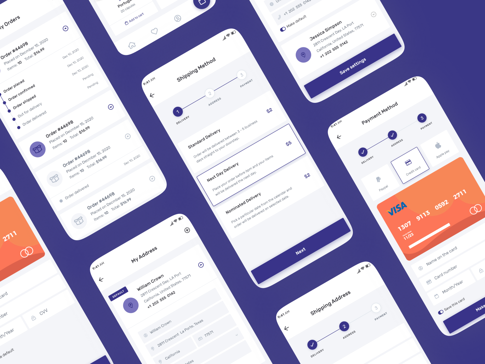
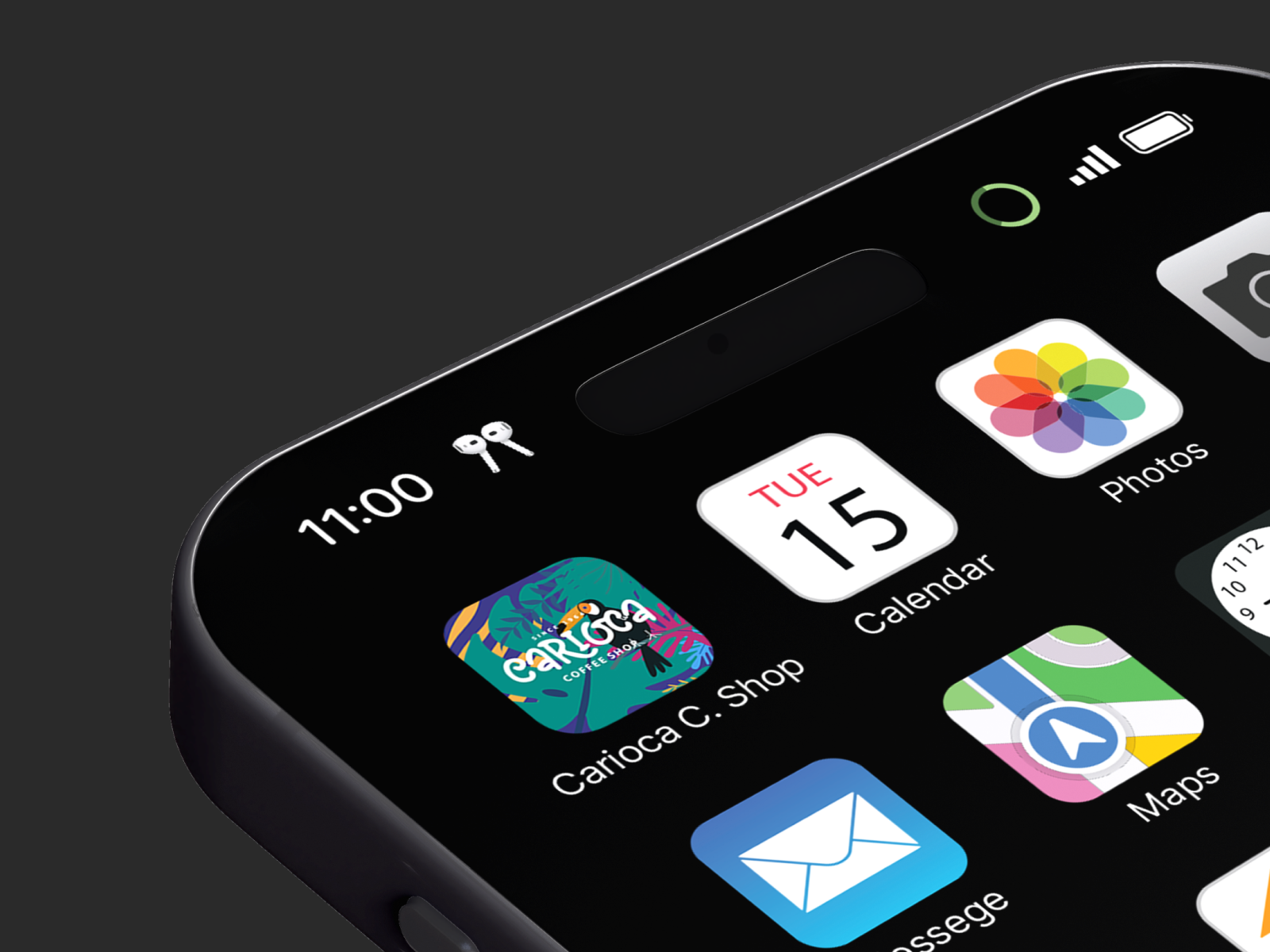
This concept case study shows how I design branded commerce products: loyalty inside the core flow (not bolted on), two-tap reorder for returning guests, and a visual system that feels as warm as the shop. The point isn’t a prettier menu — it’s a brand-owned habit competitors on generic platforms can’t copy.