Type
Personal project
Role
Brand identity & design system
Sector
Brand · Design systems
Industry
FinTech · Personal finance
Year
2025
Related
Moneyflow App →
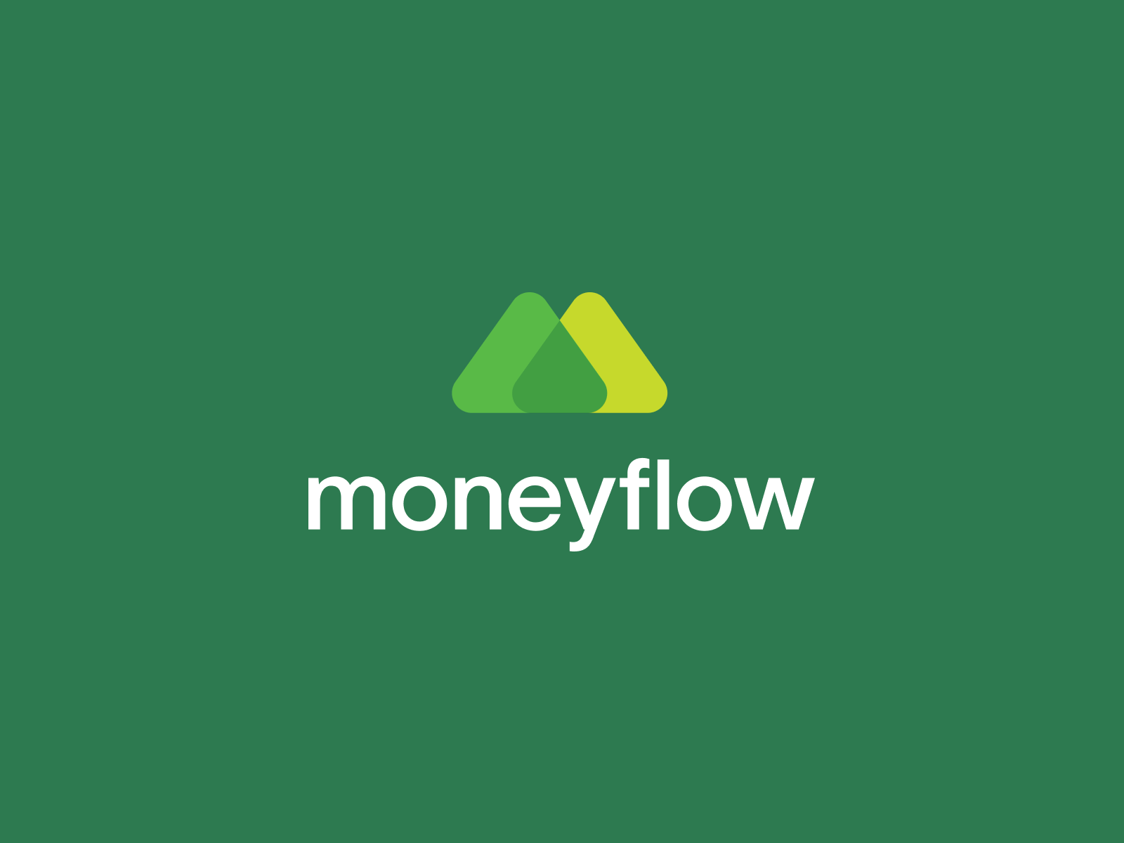
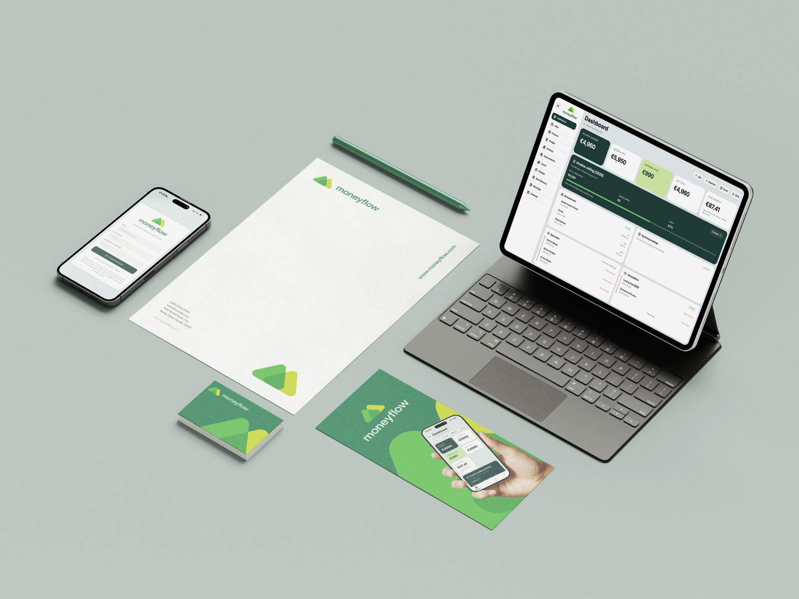
Finance apps default to blue and anxiety. Moneyflow starts from mint — a colour system built around growth without shouting. Forest green carries authority on hero cards and titles. Lime marks income, progress, and active states. The guidelines document every token, lockup, type scale, and component spec so the app and the brand speak the same language.
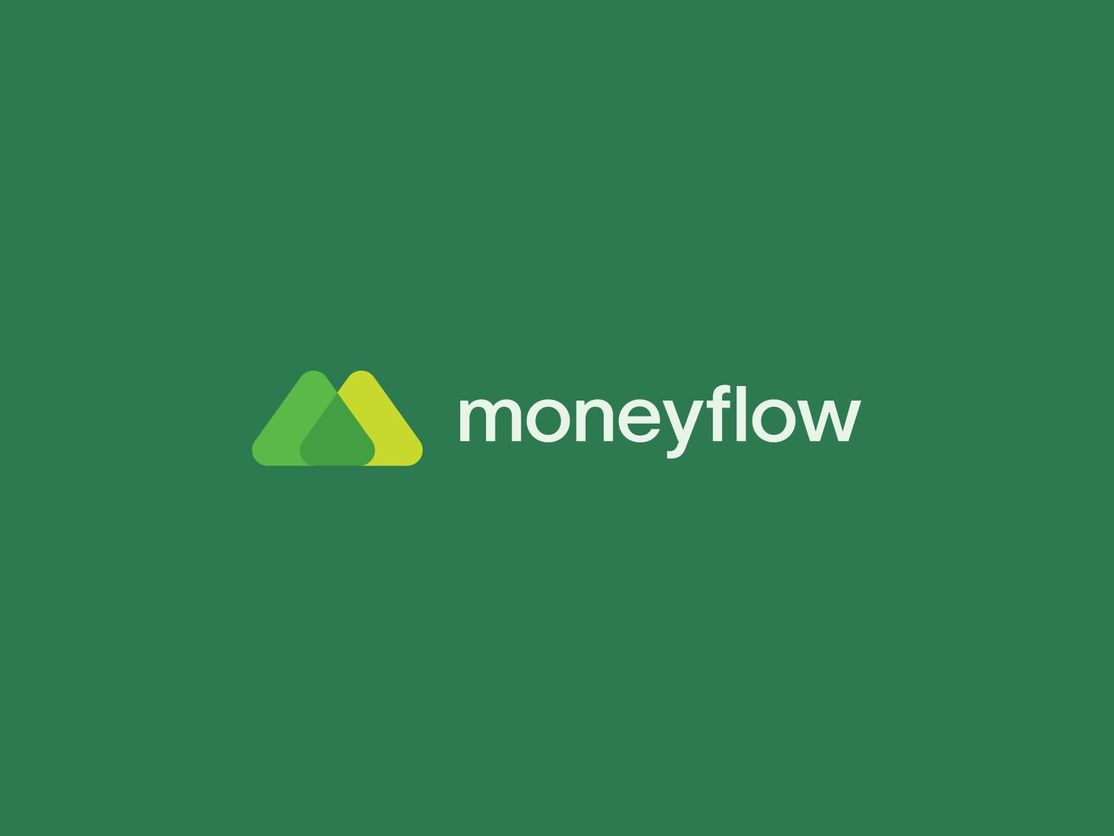
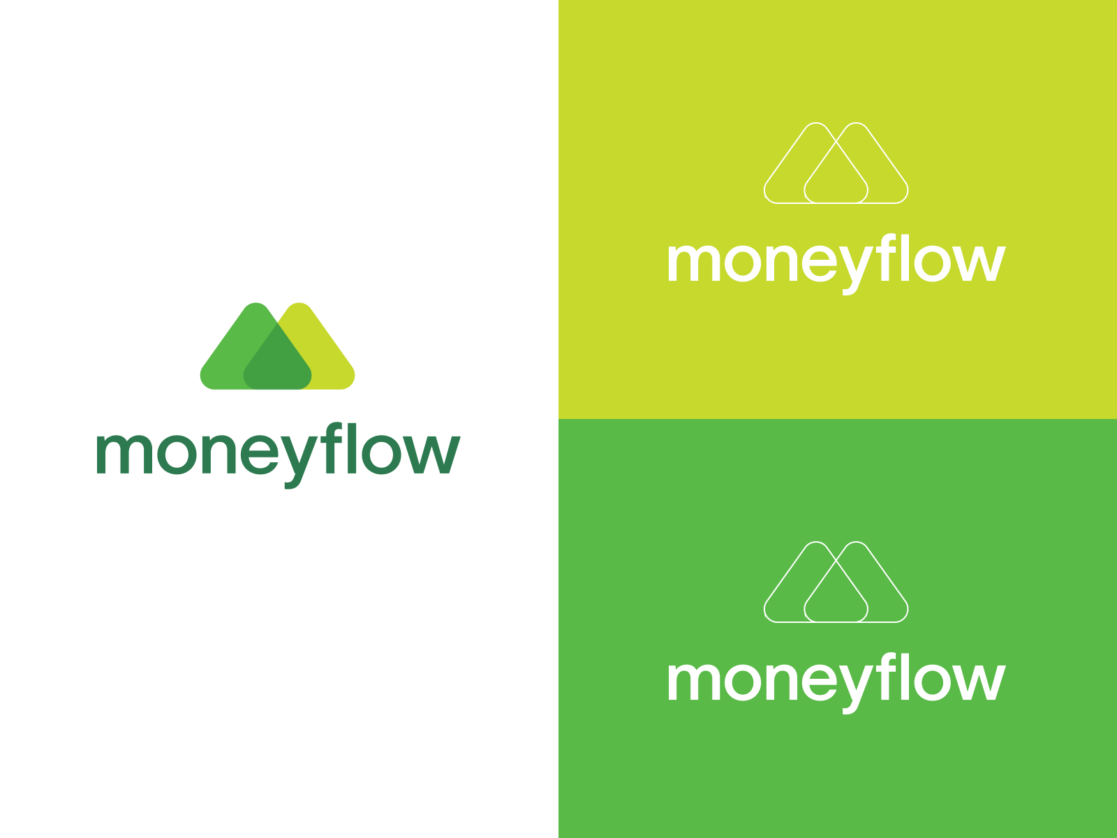
Light mode is the default. Dark mode is a preference — same brand, different surface.
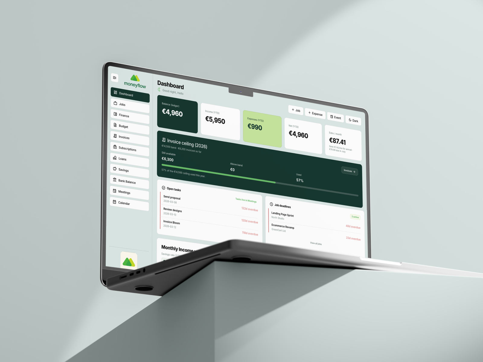
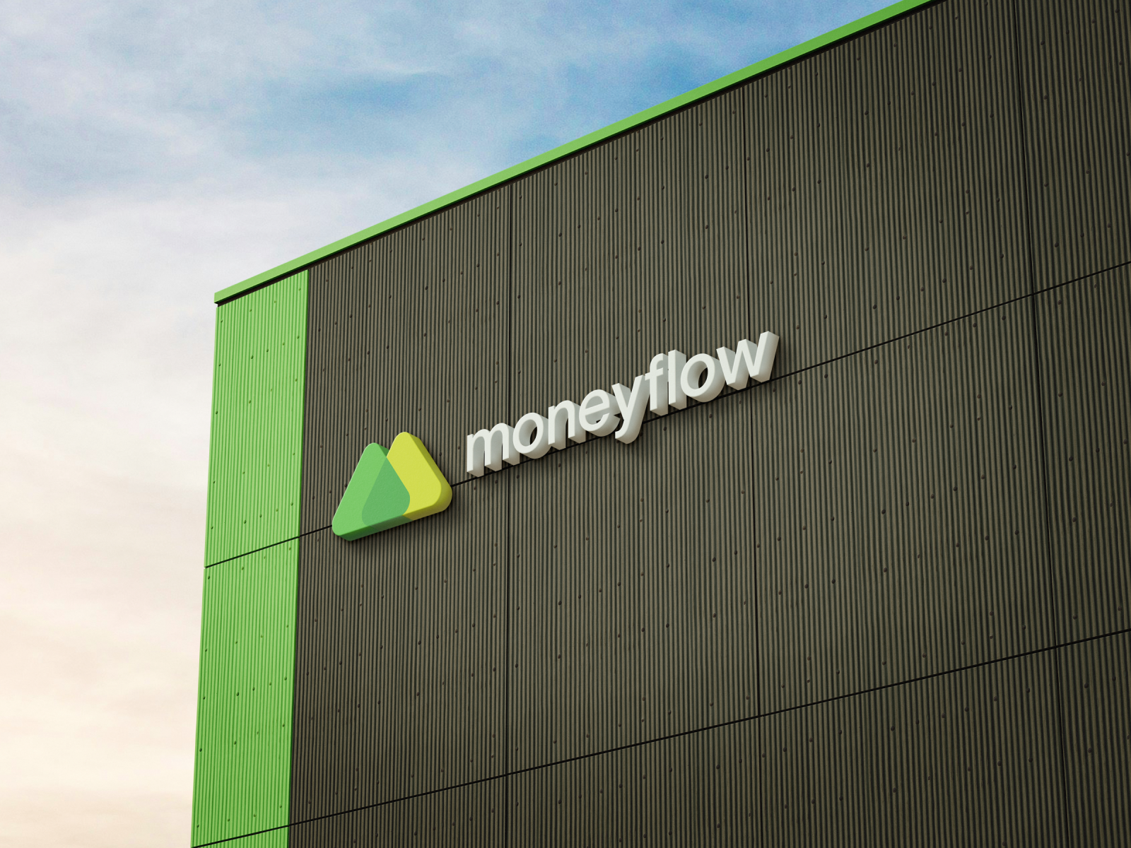
Mint backgrounds, forest authority, lime momentum.
Mint 50 #F0FAF0 for page background. Bright Lime #C8FB00 for income, progress bars, active nav, and primary CTAs. Forest #00331A for hero cards, page titles, and primary text. Alert Red #D94040 for expenses and destructive actions. White #FFFFFF cards float on mint with a 0.5px Mint 100 border.
Mint 50 · #F0FAF0
Mint 100 · #DCF5DC
Bright Lime · #C8FB00
Forest · #00331A
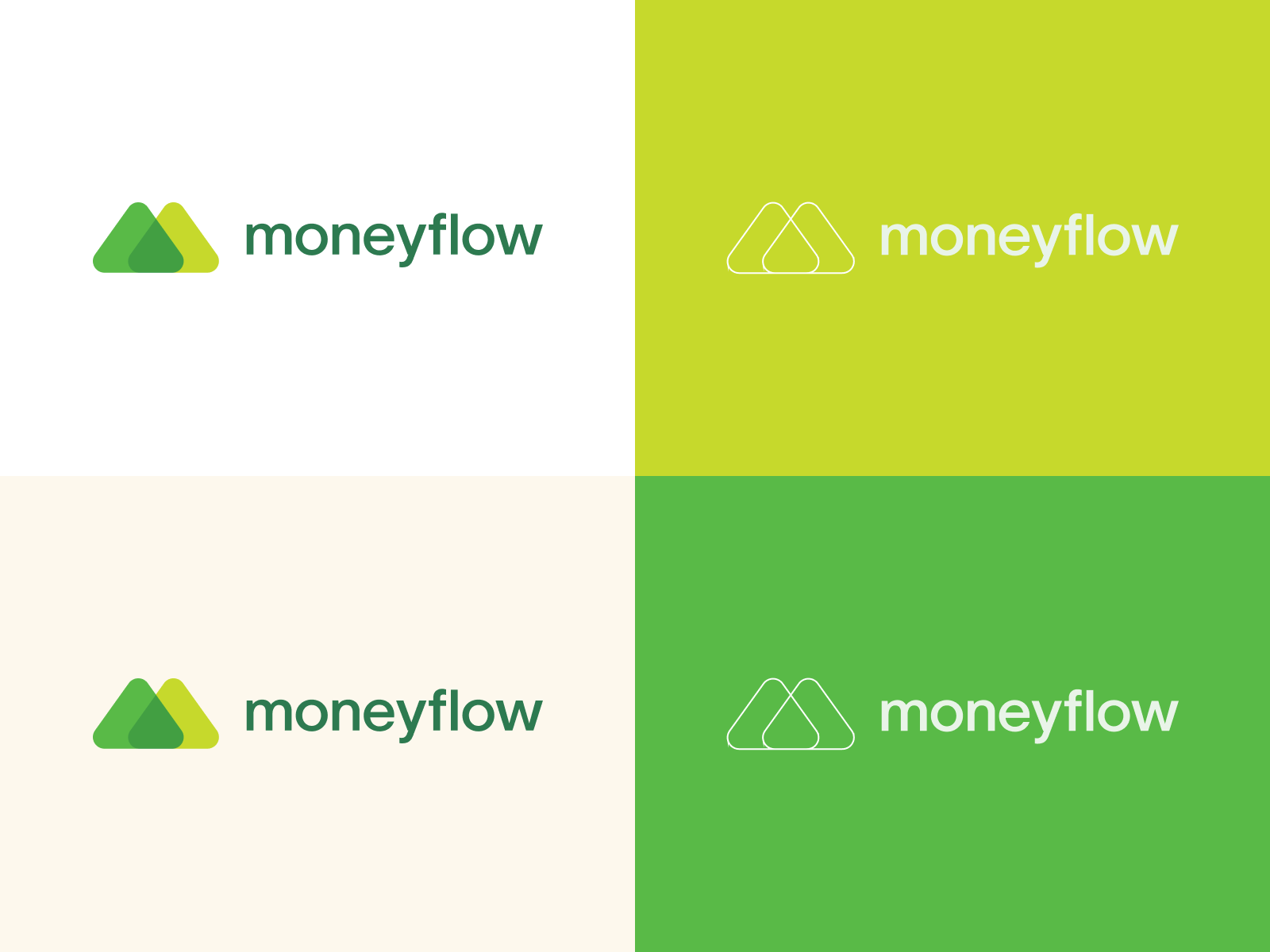
- Minimum clearspace = cap-height of wordmark on all sides
- Never recolour with non-brand colours
- Never stretch, distort, or add drop shadows
- Don't separate mark from wordmark below 24px
Mid Green · #1A5C35
Bright Green · #00E800
Light Forest · #2D7A4F
Mint 200 · #E8F5E8
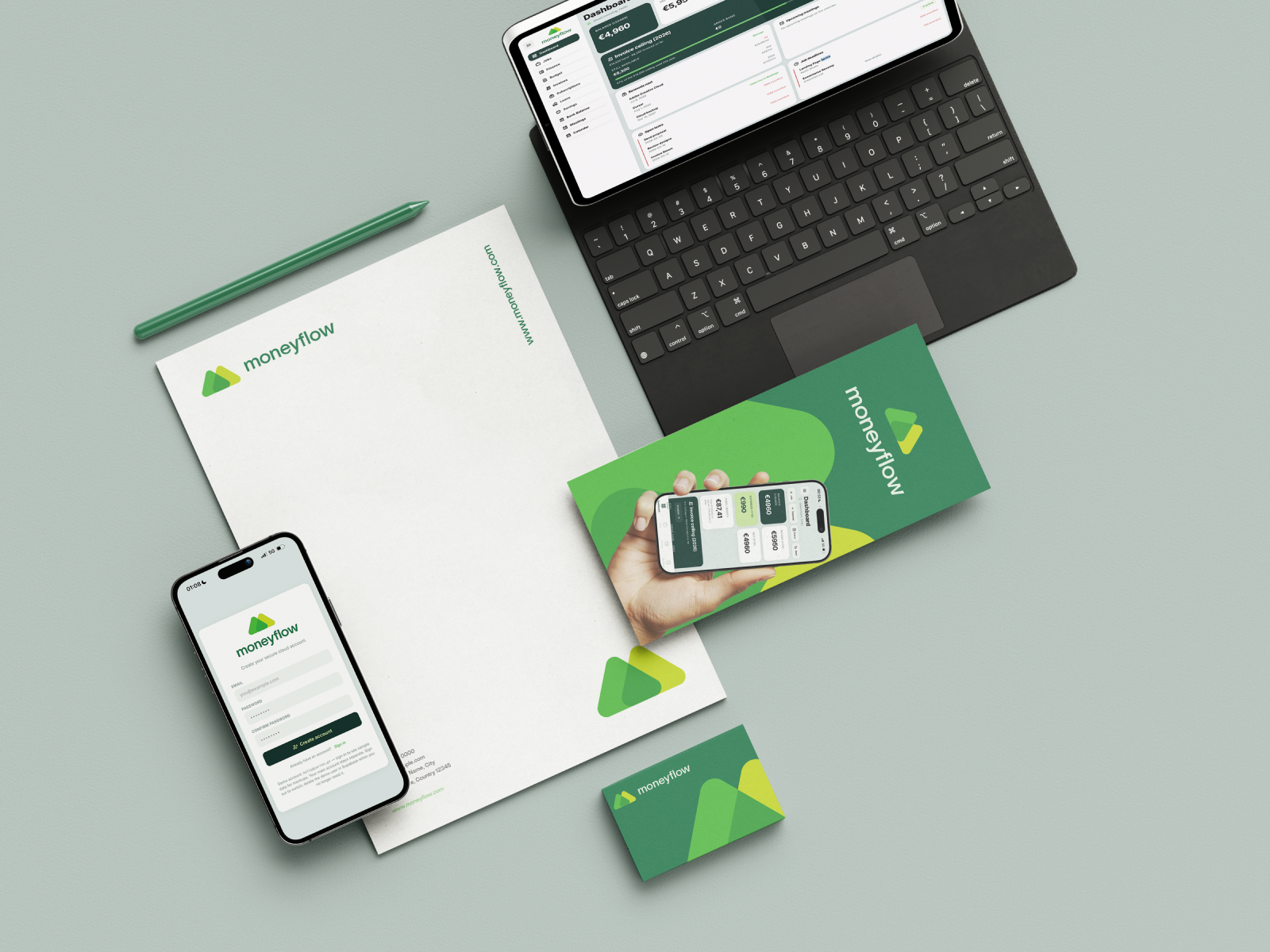
Inter at every weight. Every size decision tied to a component, not a mood.
Inter — variable font, weights 100–900, one family across all touchpoints.
Display 800 at 28–36px for page titles. Heading 700 at 22–24px for sections. Body 400 at 11–12px for descriptions. Label 600 at 9–10px ALL CAPS for column headers. Primary text #00331A, body #1A3A1A, secondary #6A9A6A, income accent #7AB800 on light backgrounds.
Display · 800 / 28–36px
Heading · 700 / 22px
Body · 400 / 12px
Label · 600 / 9px CAPS
Micro · 700 / 8px badges
2 · 4 · 6 · 8 · 12 · 16 · 20 · 24 · 32 · 40 · 48px. Radius: 4px badges, 8px buttons, 12px cards, 16px hero panels, 999px nav pills.
Stat card: white bg, 0.5px #DCF5DC border, 14px radius. Hero card: #00331A, 16px radius. Nav pill active: forest bg, lime text. Progress bar: track #0A4A25, fill #C8FB00, 6px height.
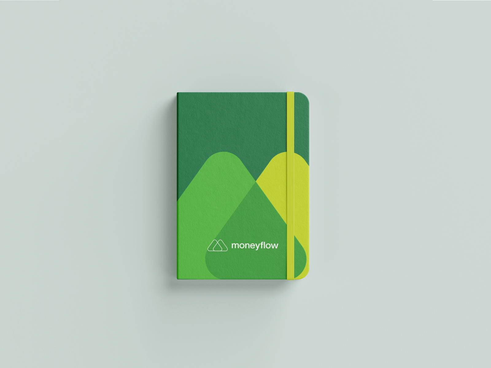
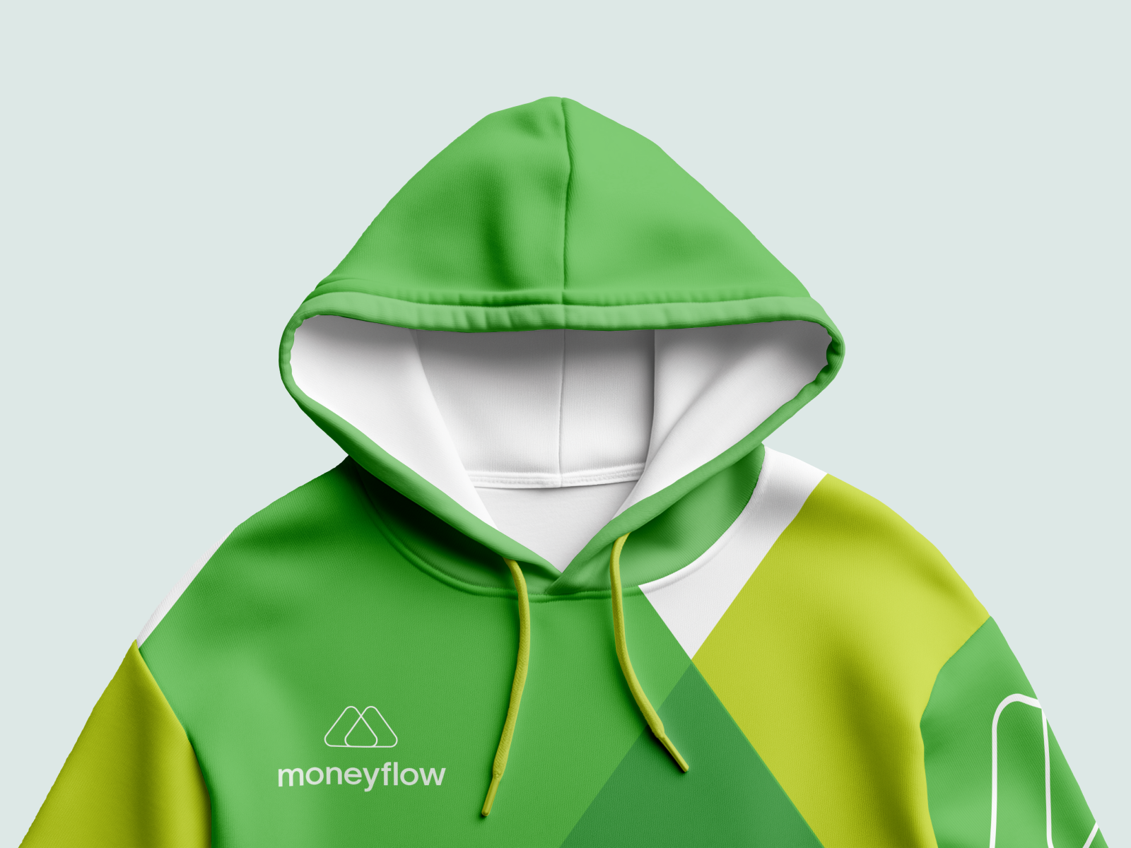
Forest hero cards and the logo mark stay identical in both modes — they are the visual anchor.
Light: page #F0FAF0, cards #FFFFFF, border #DCF5DC, income text #7AB800. Dark: page #0A0A0A, cards #141414, border #1C1C1C, income text #C8FB00. Lime accent unchanged. Toggle in topbar — moon for dark, sun for light. 200ms ease transition. Preference stored in localStorage as "moneyflow_theme".
Page · #F0FAF0
Card · #FFFFFF
Title · #00331A
Accent · #7AB800
Page · #0A0A0A
Card · #141414
Title · #FFFFFF
Accent · #C8FB00
Forest #00331A hero cards, progress bars, logo mark, and lime #C8FB00 accent colour remain identical across both modes.
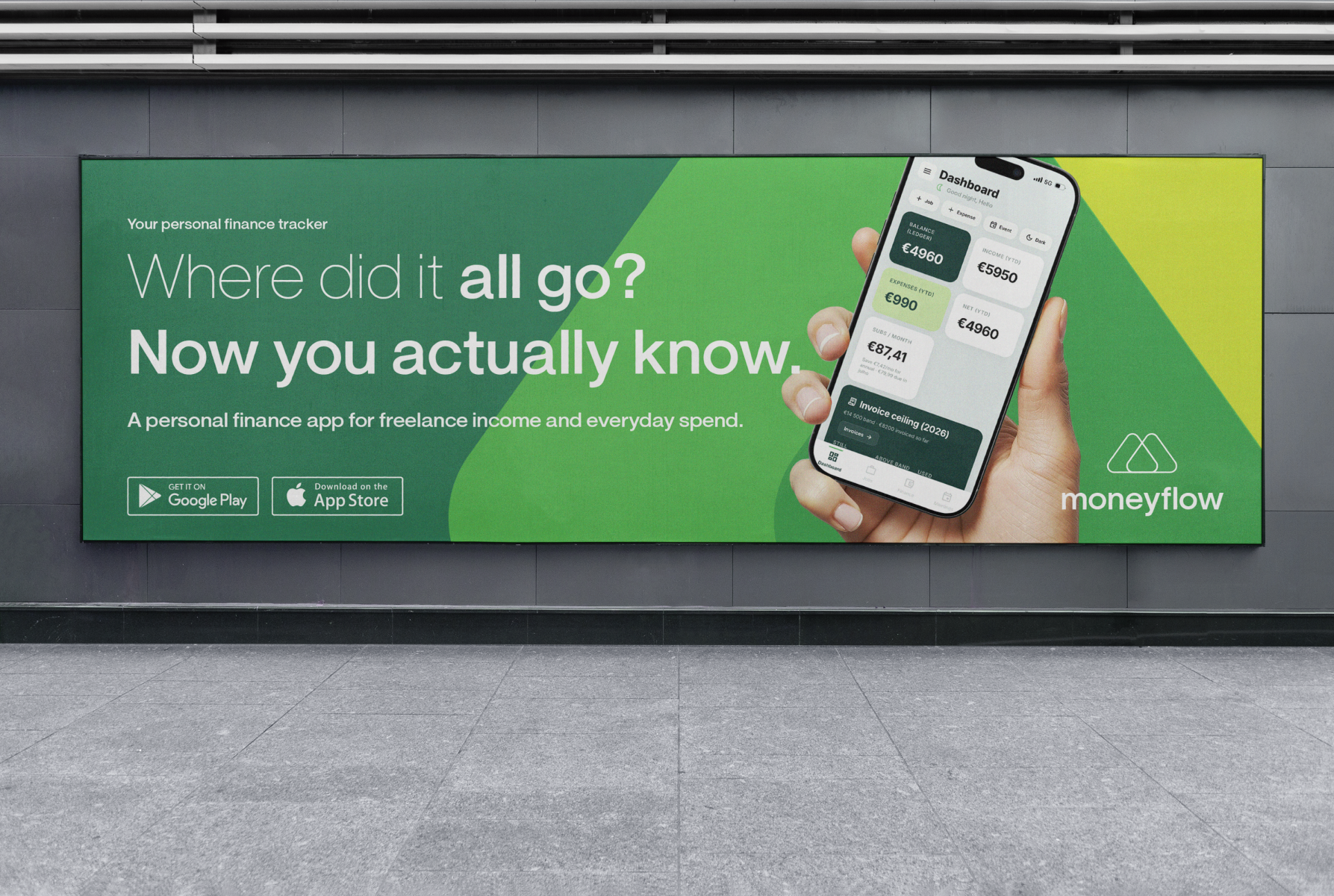
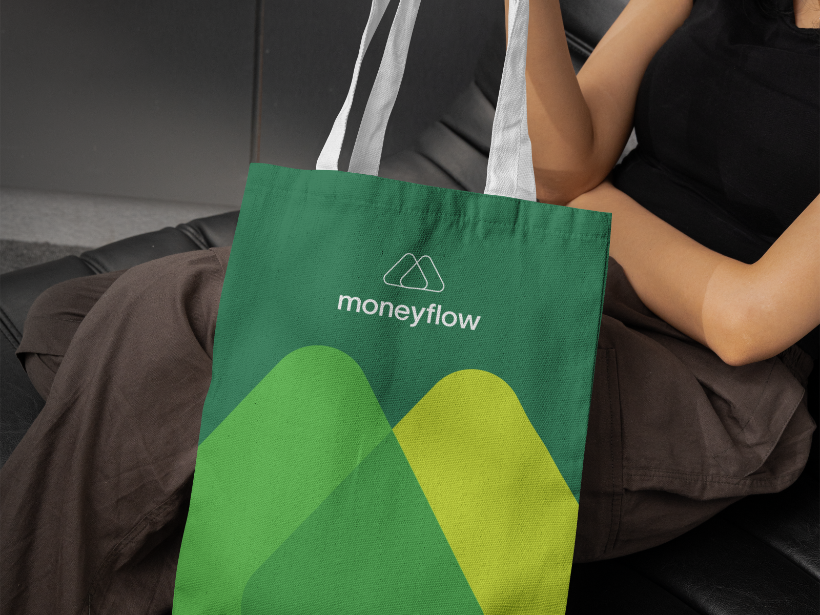
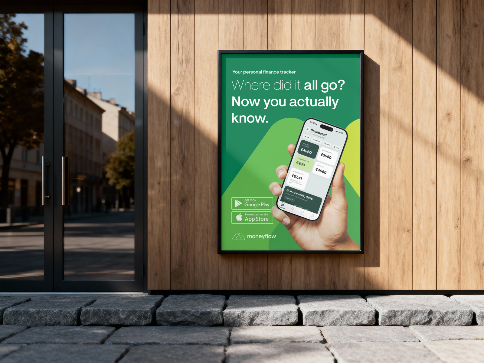
Version 1.0 — a design system ready to implement. Colour, components, and mode rules documented so the app opens clean in light mode and stays on-brand in dark. Together with the app case, this is how I ship product + identity as one system.