Client
Safeguard
Sector
Branding · Graphic Design · Web Design
Industry
Home Security · Smart Tech
Year
2024
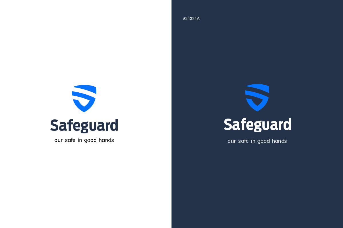
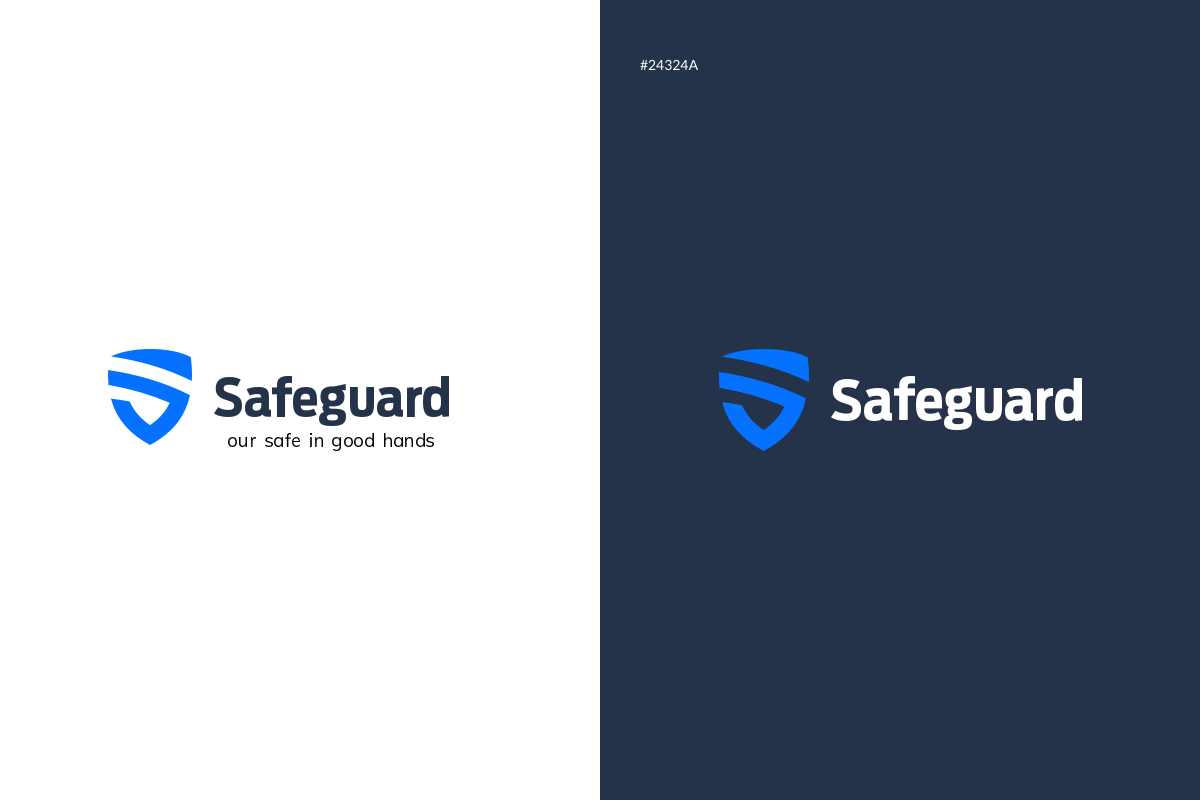
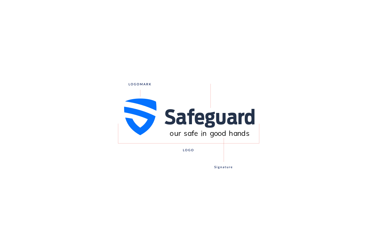
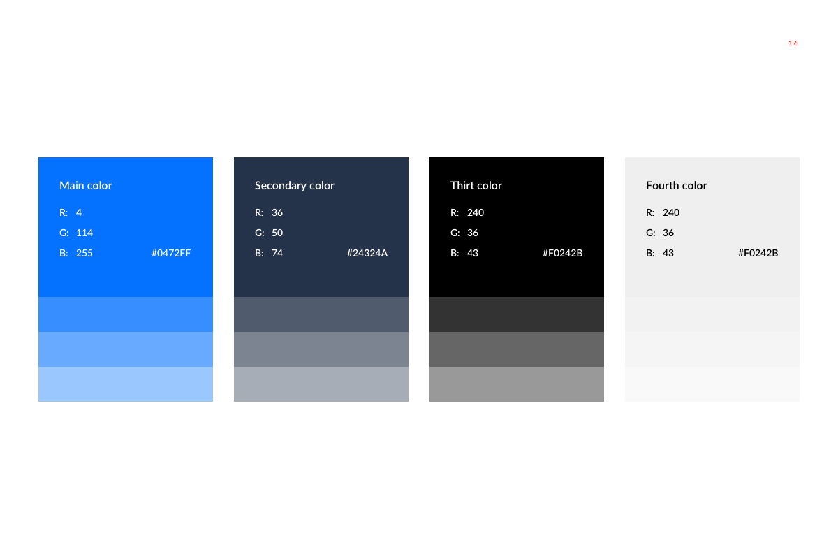
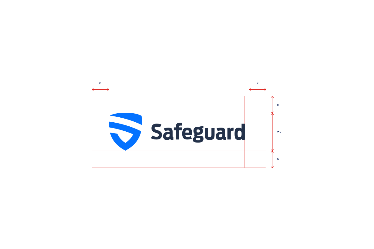
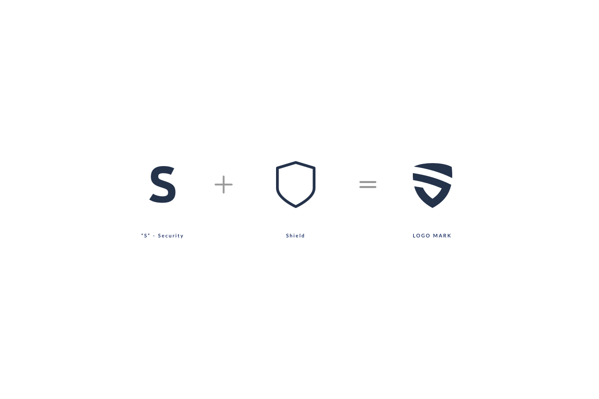
Creativity is discovering a question that has never been asked. For Safeguard, that question was how to make security feel human. The shield logo carries a stylised S in bright blue. Navy #24324A grounds the system. The tagline — our safe in good hands — turns a technical category into a promise you can trust at the door, on the box, and on the screen.
World's Smartest Home Security — trust that works, and feels like it cares.
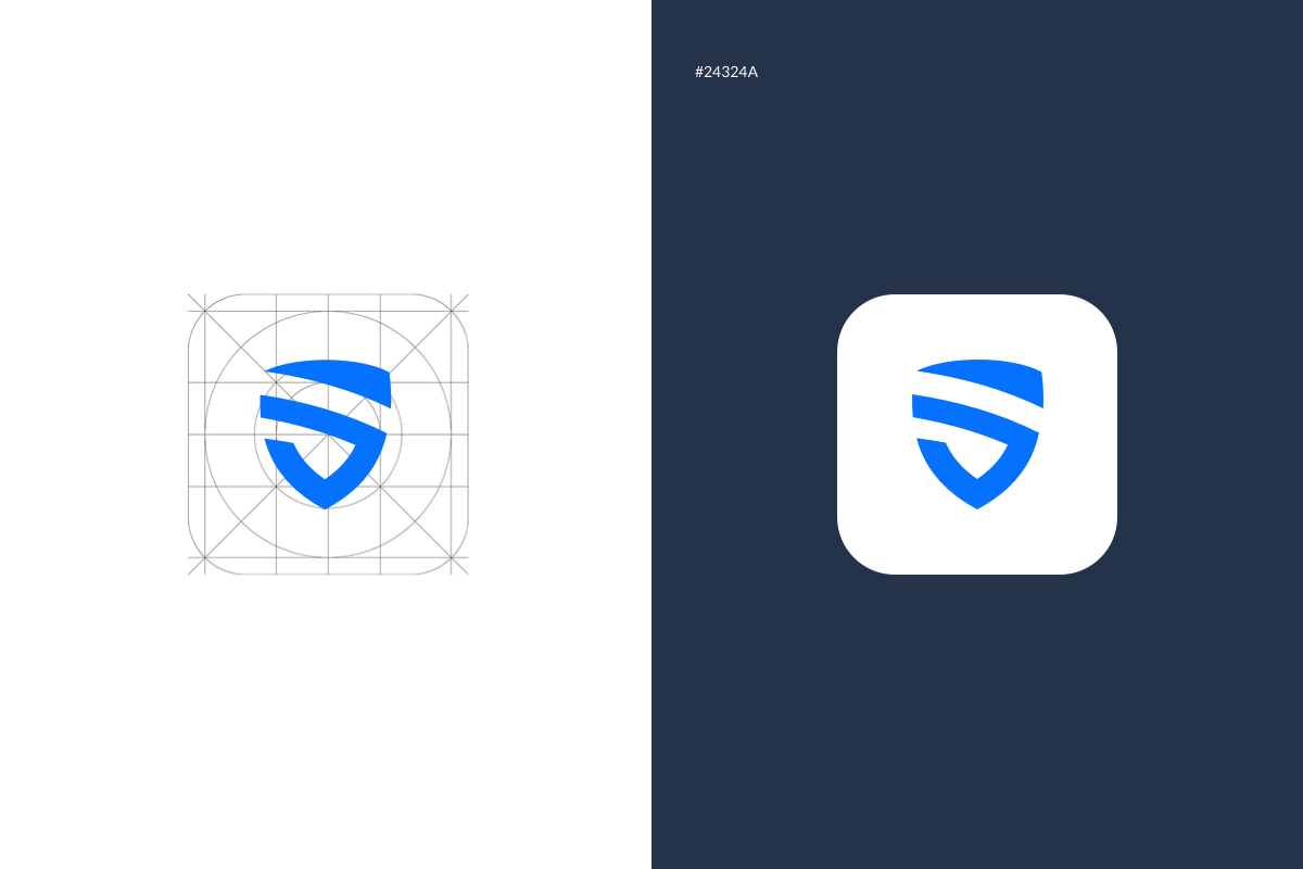
Security without coldness — a shield that protects and reassures.
Home security brands default to alarm-red urgency. Safeguard takes the opposite path: deep navy authority, bright blue optimism, and copy that speaks to peace of mind. The campaign line — World's Smartest Home Security — pairs with proof points: 300,000+ clients, simple installation, free monitoring.
Signage · Stationery · Packaging · Displays · Stands · Print · Website · Social · ID Badges
- Business cards, letterhead, envelopes, and tubes
- Product box with camera render and feature icons
- Roll-up banner for events and retail stands
- ID badges and lanyards for team identity
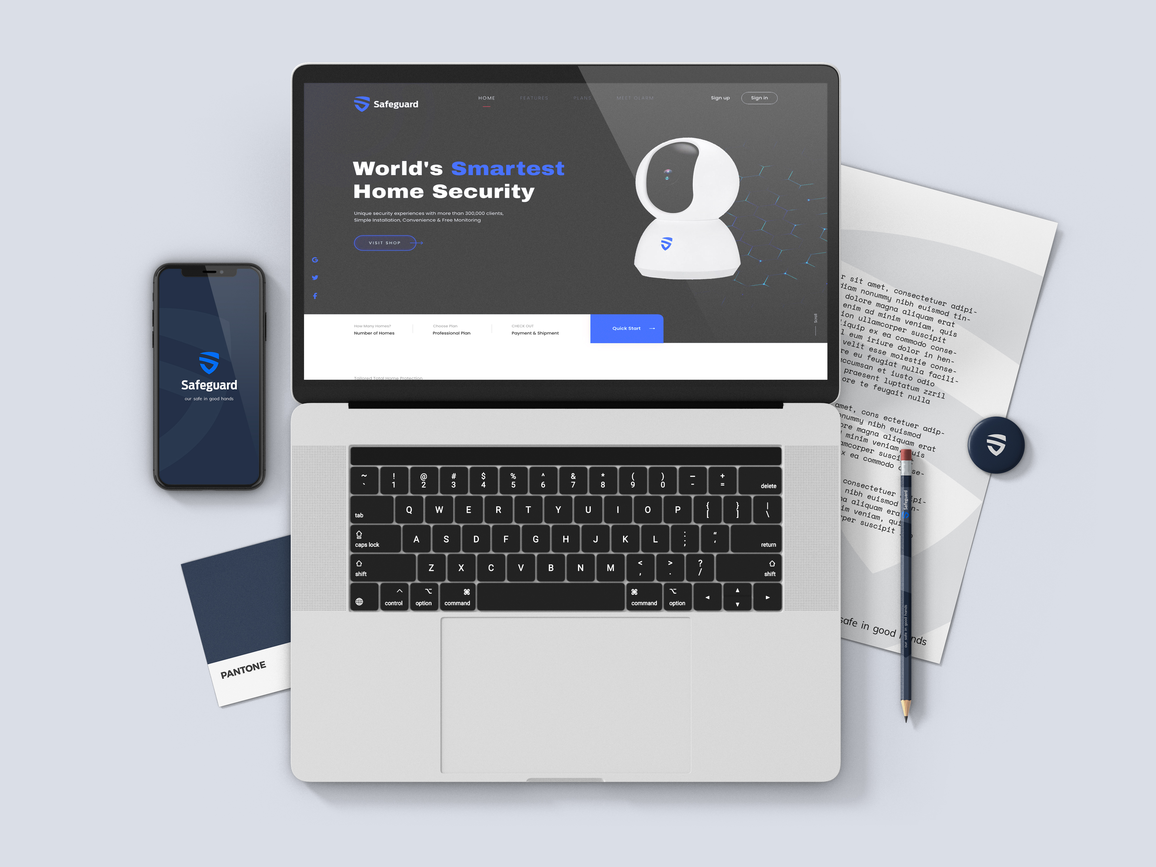
- Website homepage — dark hero, smart camera focal point
- Mobile splash screen with shield mark and tagline
- Social templates with watermark shield pattern
- Quick Start flow for plan selection and onboarding
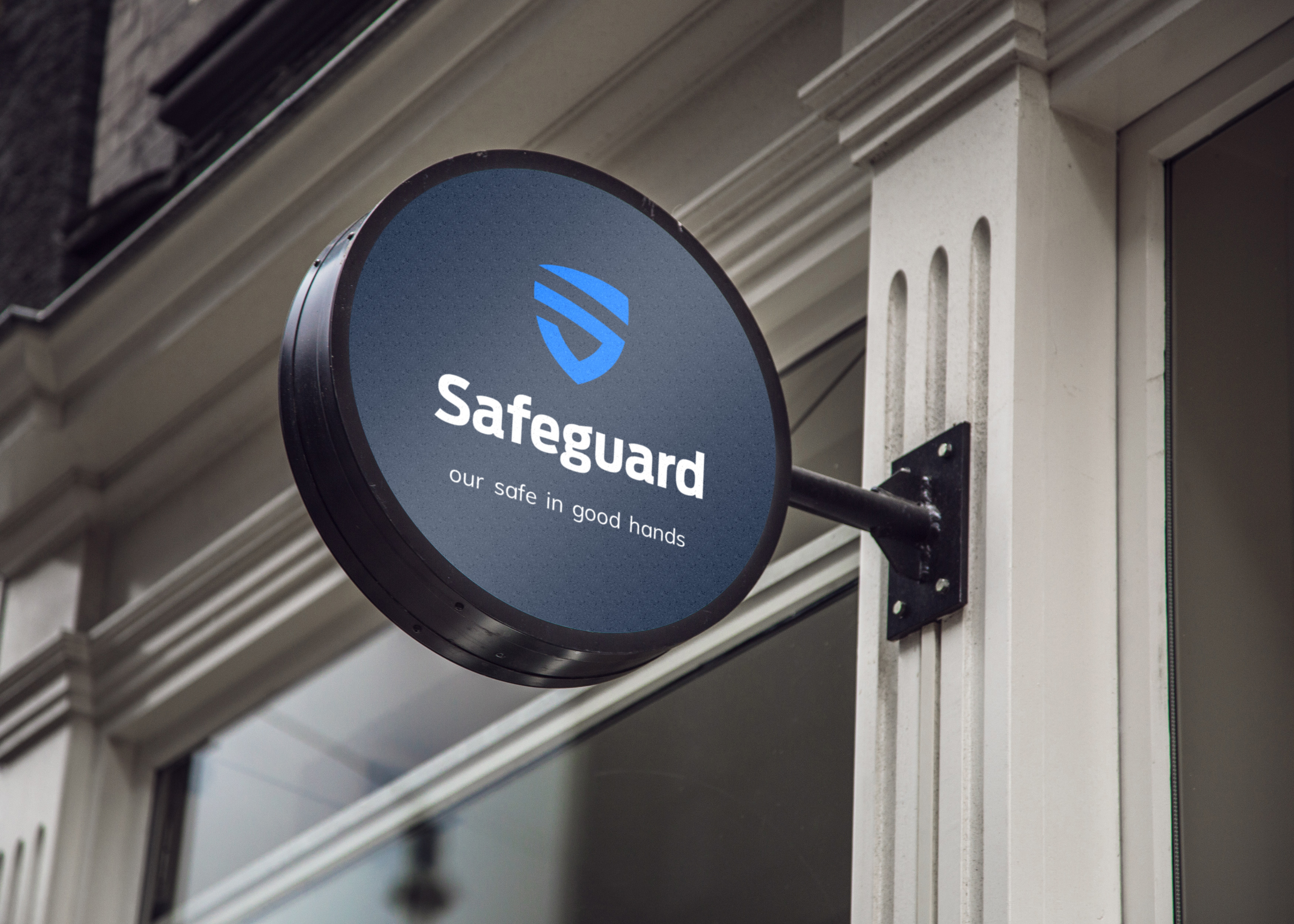
From the blade sign to the website — one shield, one promise, every surface.
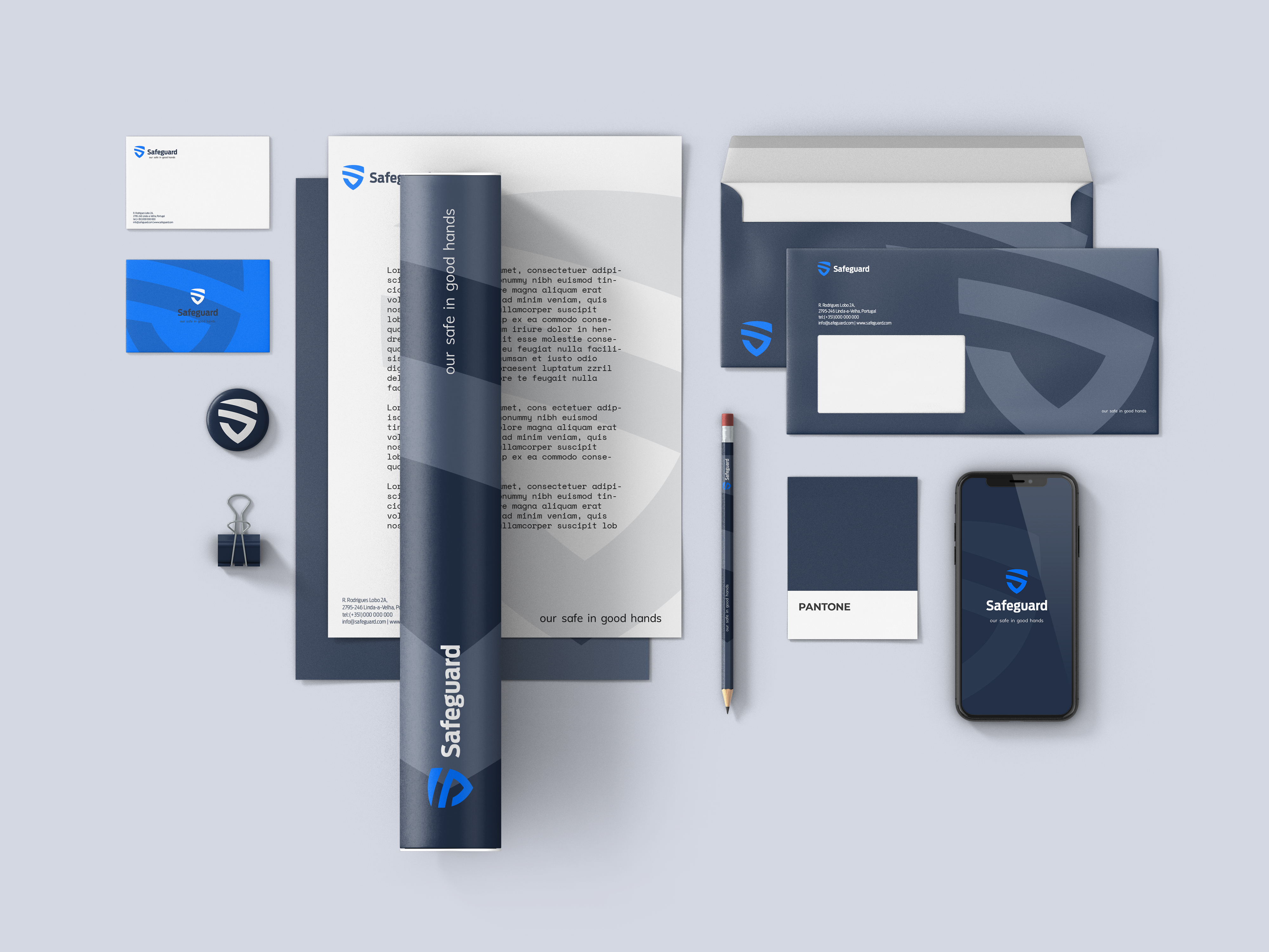
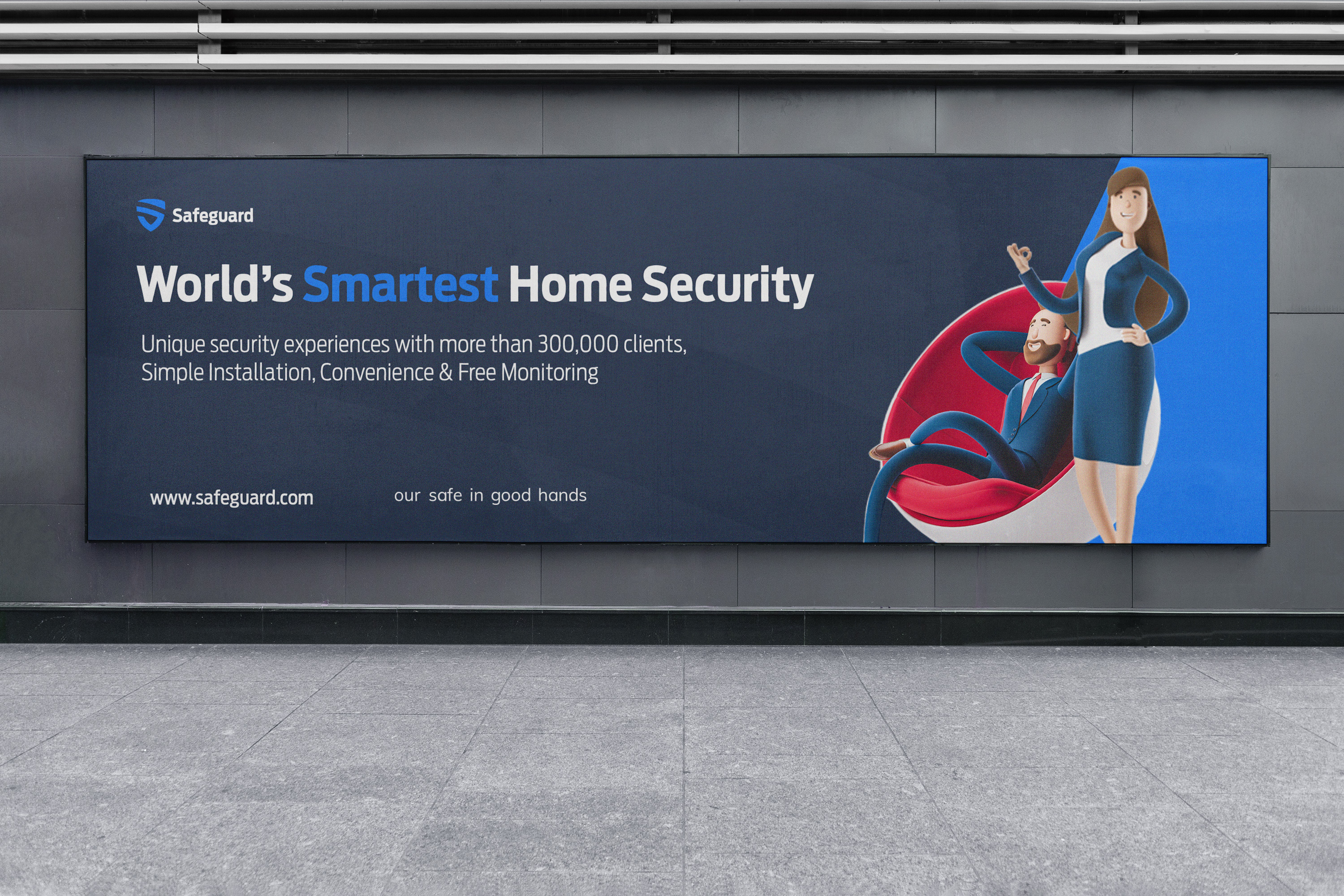
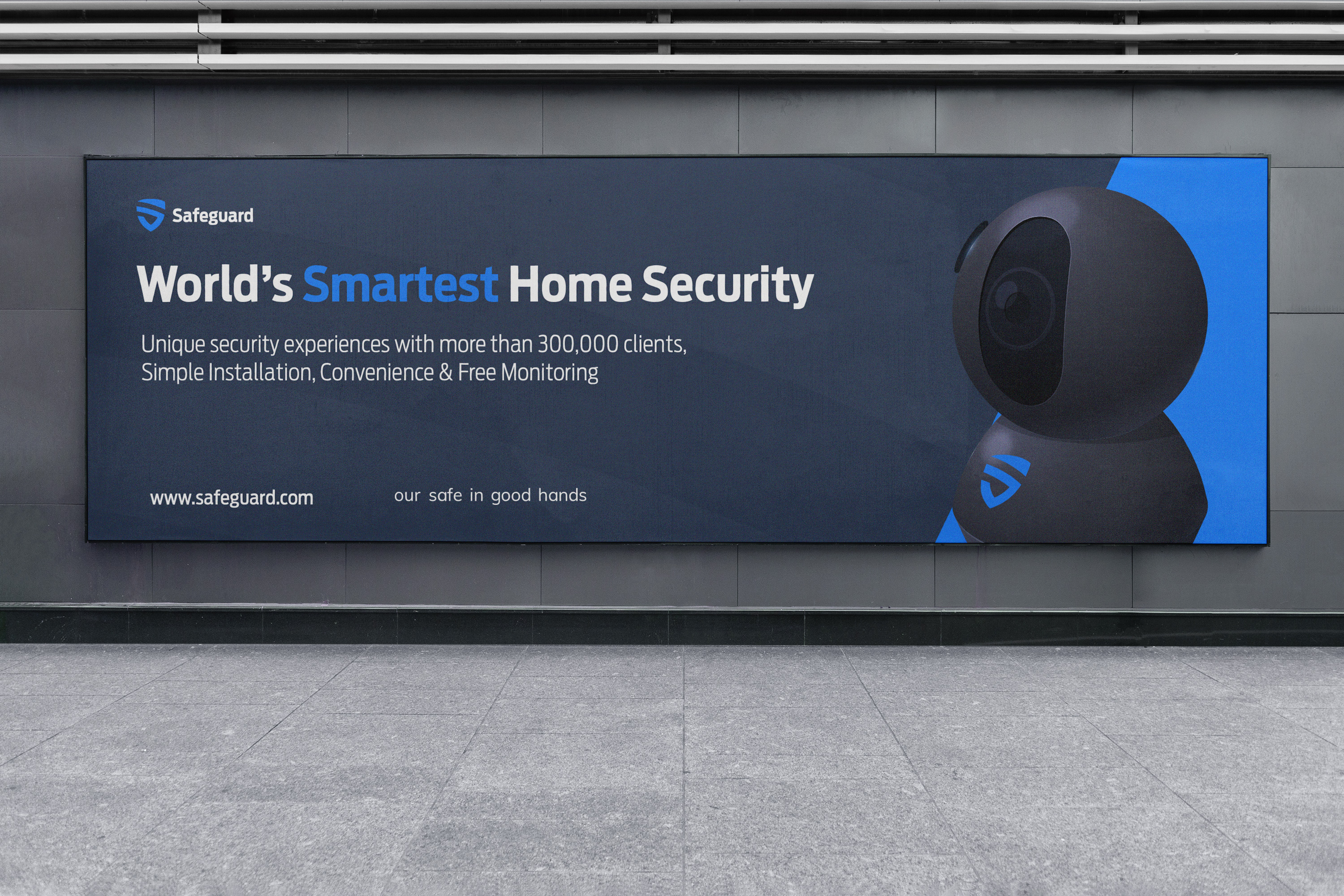
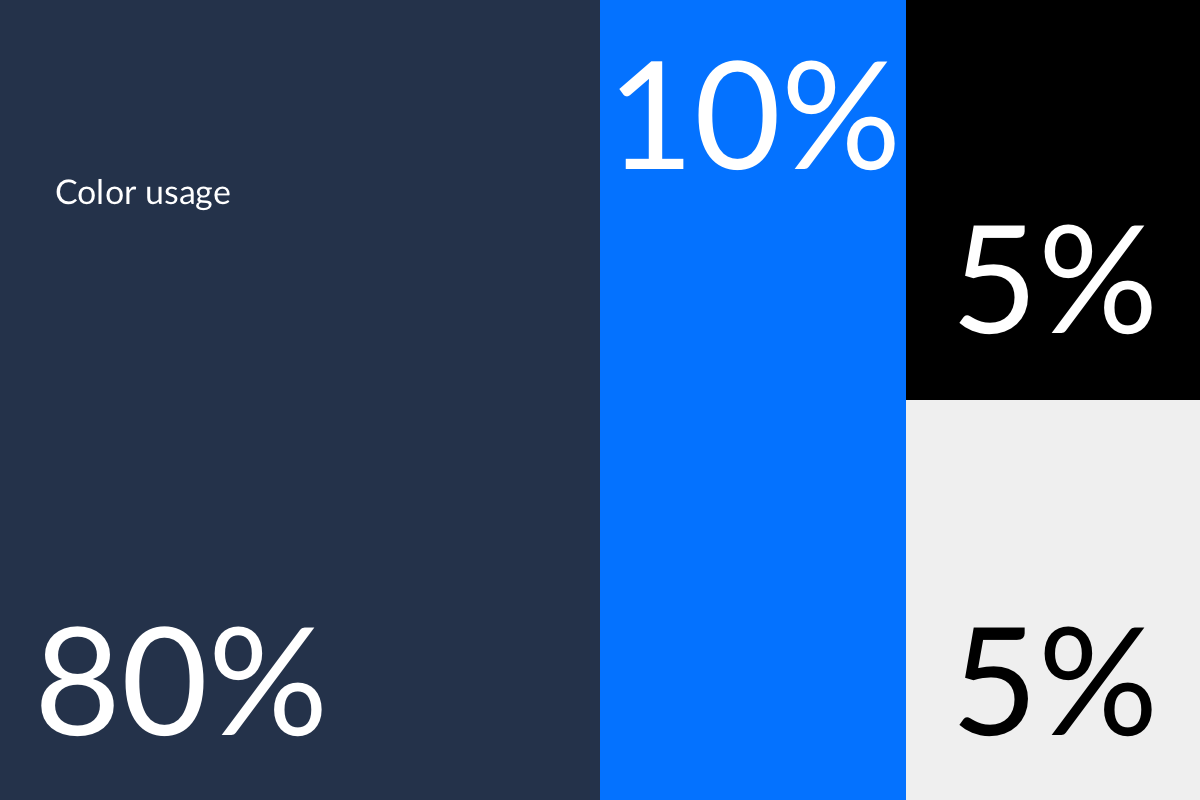
Navy authority, blue optimism — a palette that says protected, not panicked.
Primary navy #24324A carries the wordmark, signage, and hero backgrounds. Bright blue marks the shield icon, accent highlights, and feature icons. White text on dark surfaces. Shield watermarks at low opacity add depth to stationery without competing with content.
Navy · #24324A
Bright Blue · Shield accent
White · #FFFFFF
Cyan · Highlight for "Smartest"
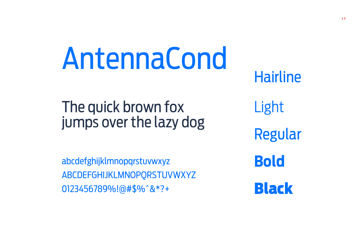
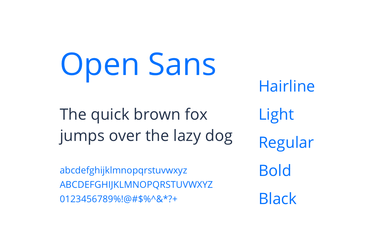
Bold sans-serif for Safeguard wordmark. Light lowercase for tagline. Clean sans for body, navigation, and product labels. High contrast on dark backgrounds.
Camera · Biometric · Shield check · App lock — four pillars on packaging communicating the product promise at a glance.
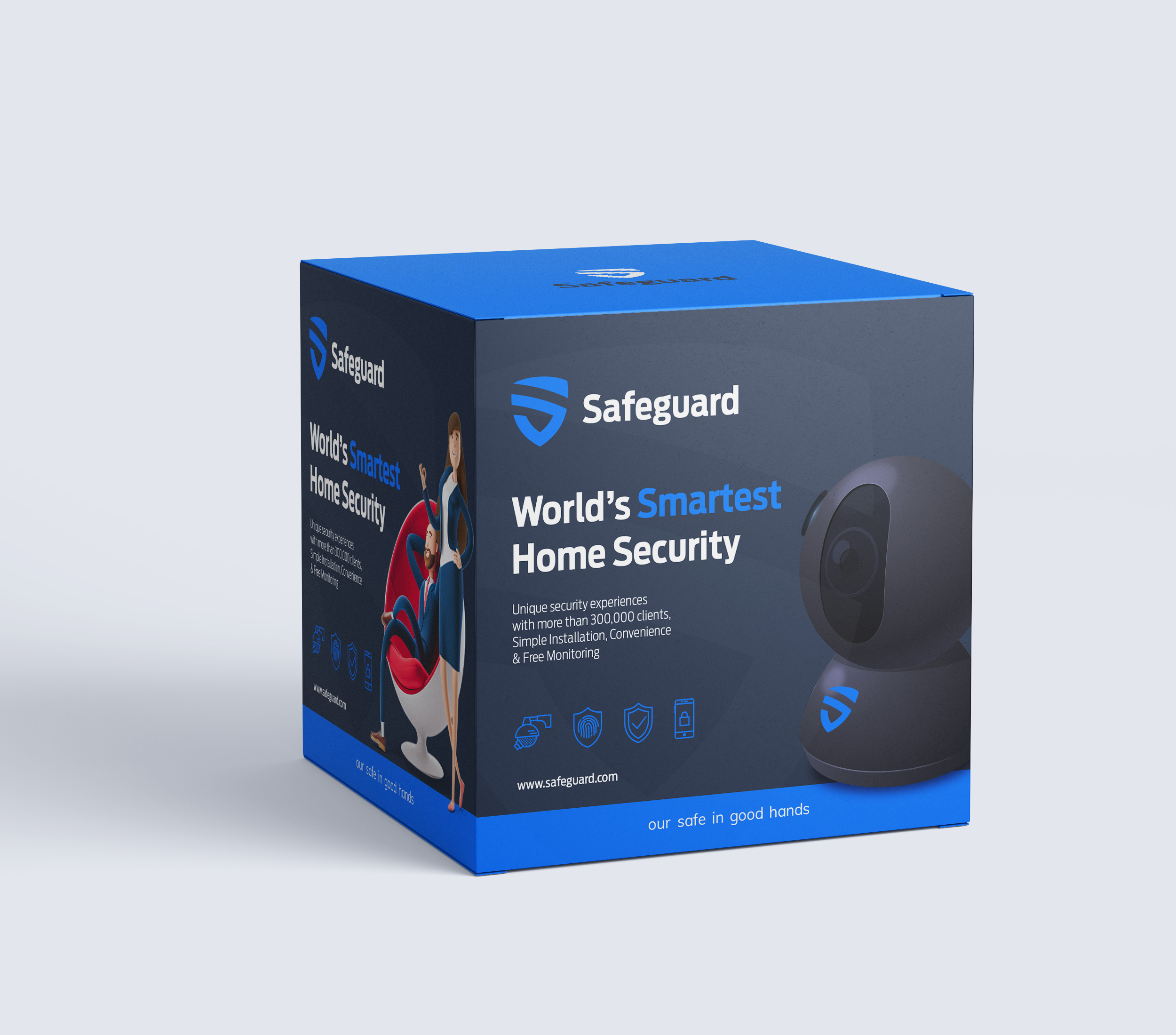
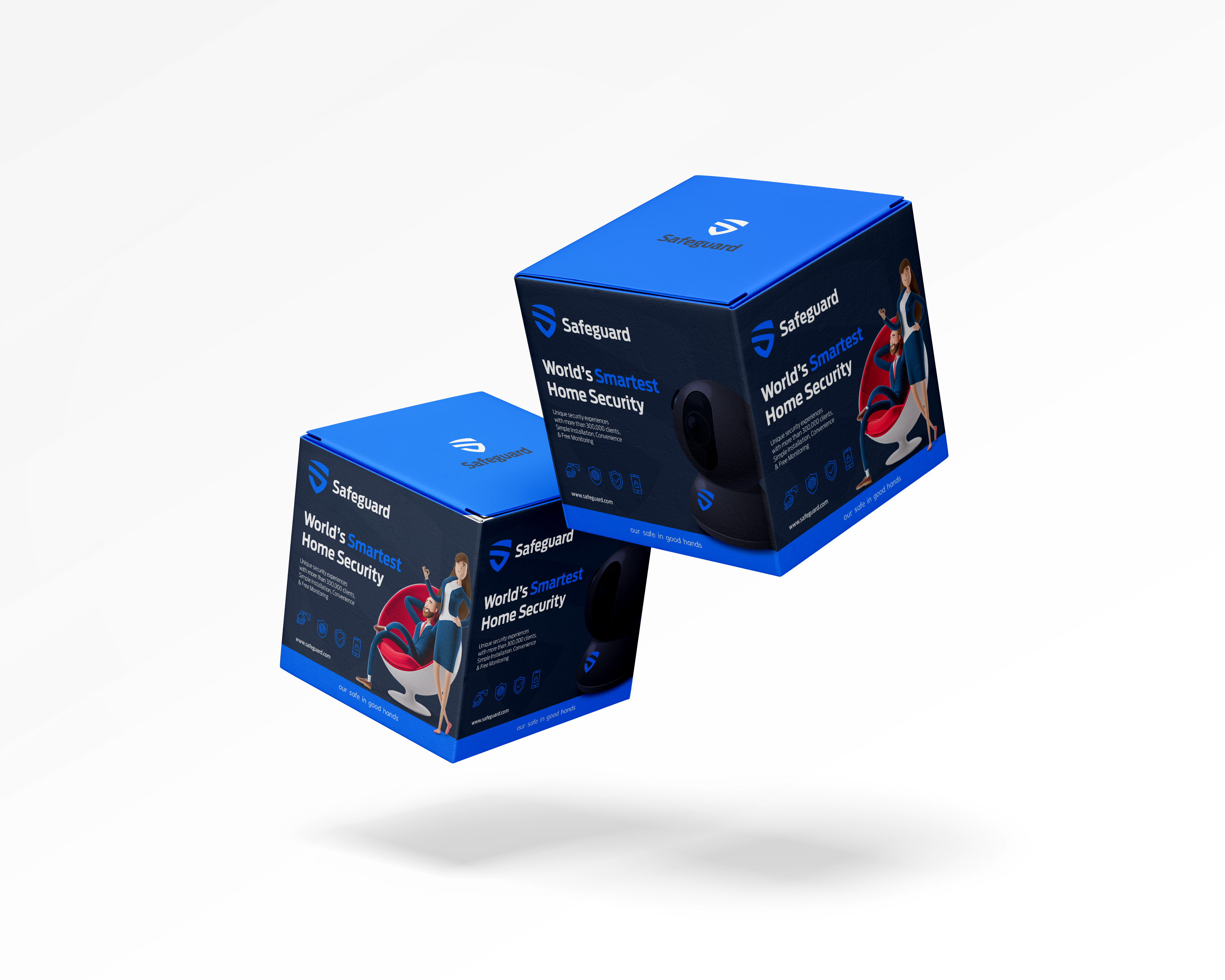
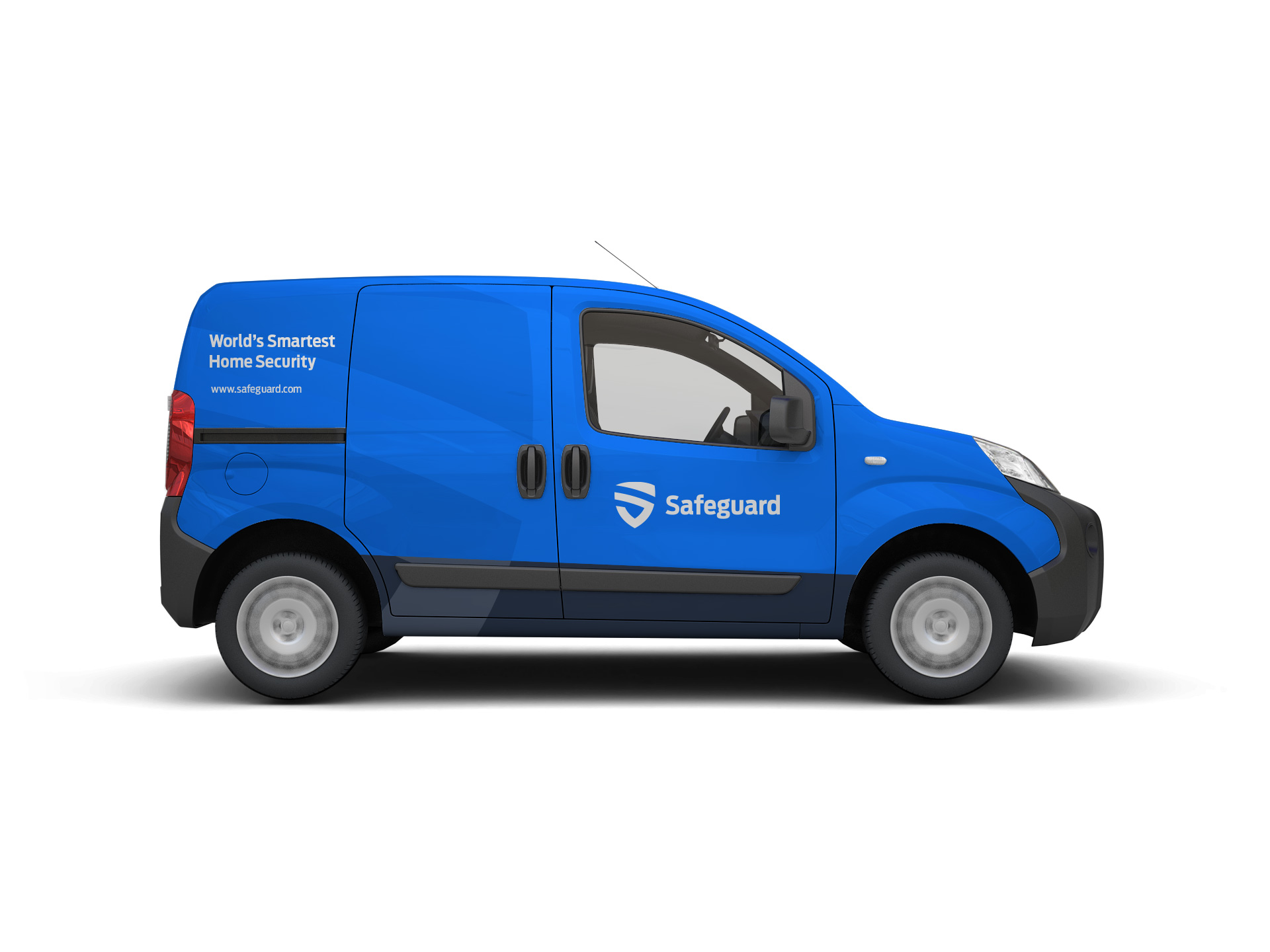
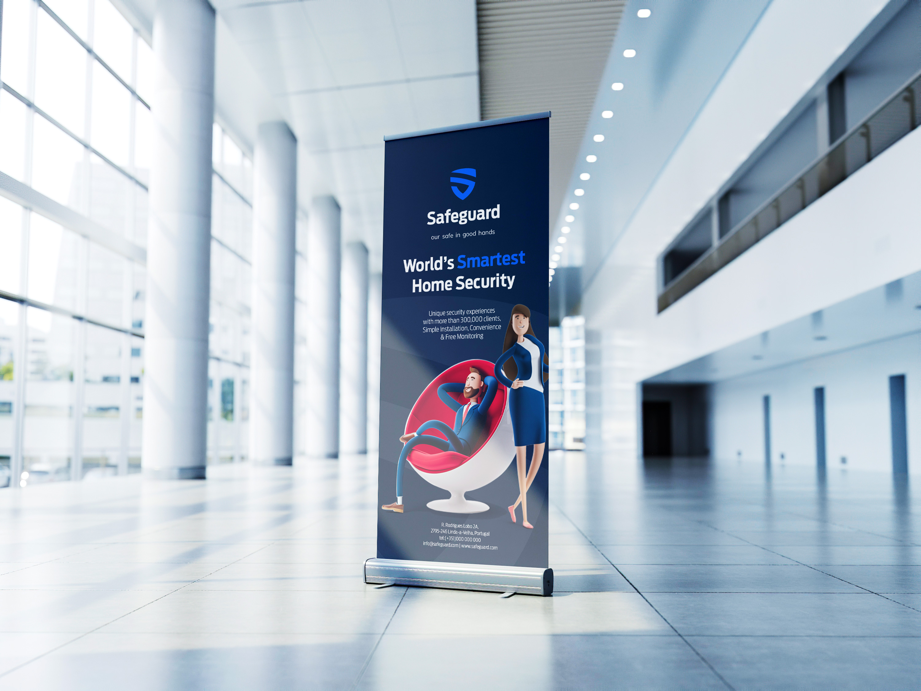
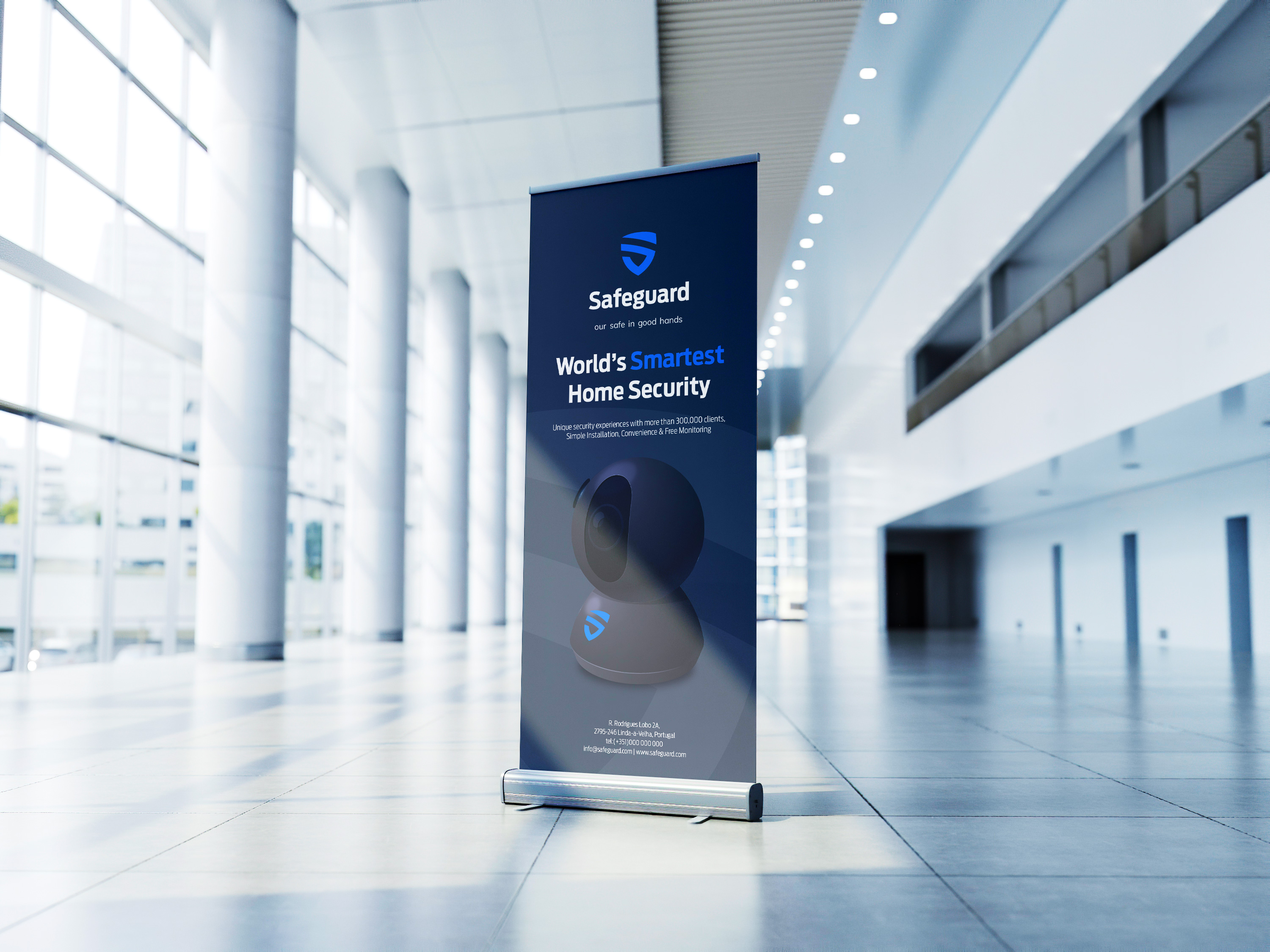
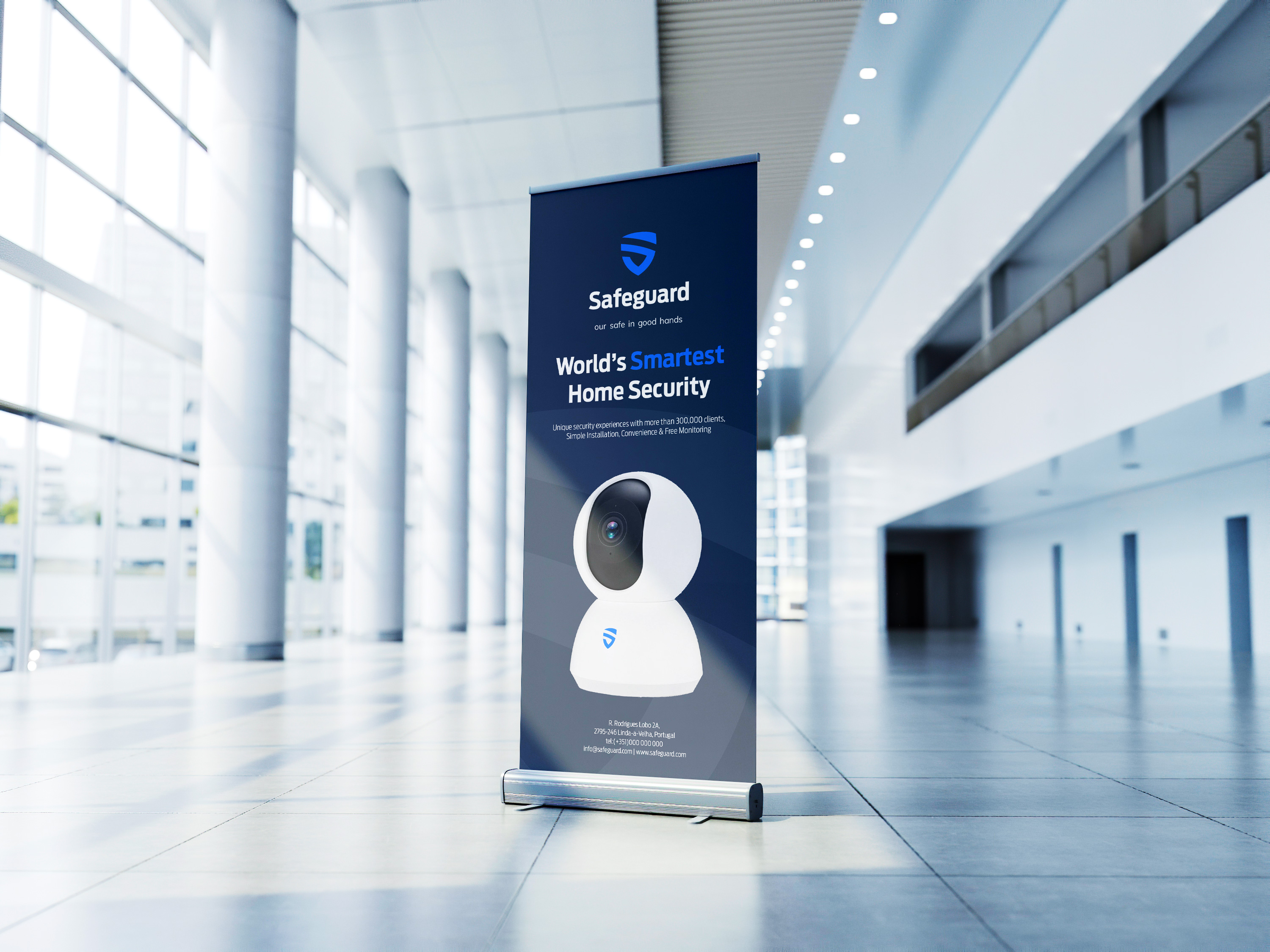
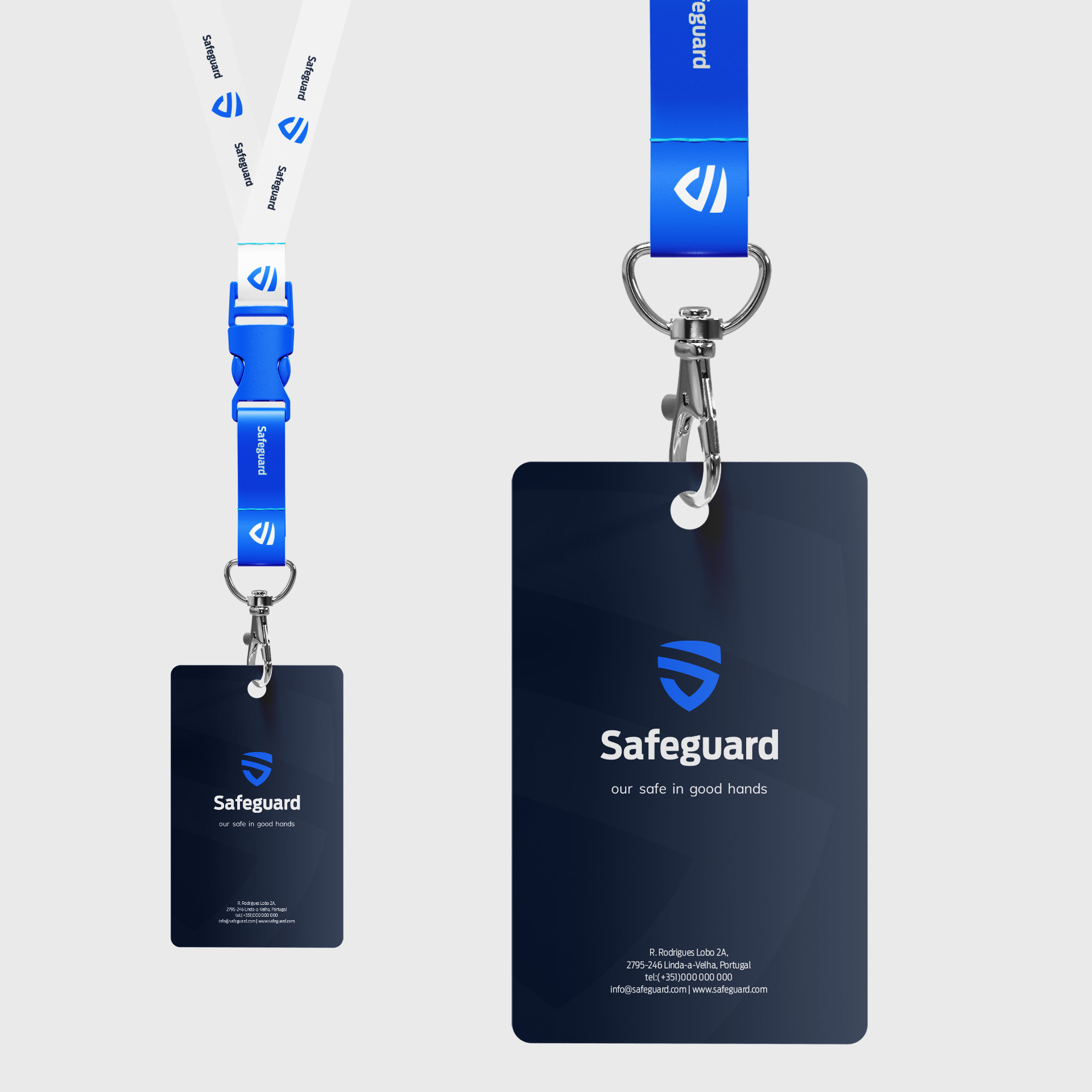
The physical brand earns trust before a word is read — the circular blade sign on the column, the navy tube in the mail, the box on the shelf with the camera looking back at you. Each touchpoint uses the same shield, the same navy, the same calm voice.
The website carries the system online: dark hero, cyan highlight on Smartest, Quick Start at the bottom. The mobile splash distils it to icon, name, and tagline. Print to digital — one brand, one question answered the same way everywhere.
From branding to packaging, print to digital — Safeguard is a system where the answer to an idiosyncratic question became a shield you can hold, wear, mail, and visit online.