Type
Concept case study
Brand
TAP Air Portugal
Role
Product design & UX
Sector
UX/UI · Mobile · Design systems
Industry
Aviation · Travel
Year
2024
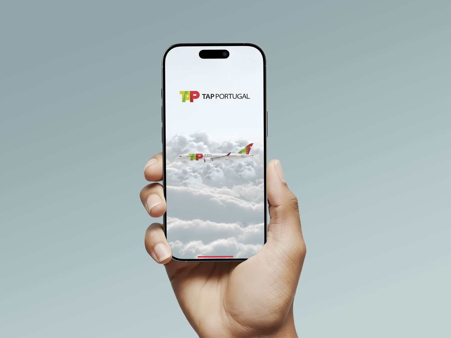
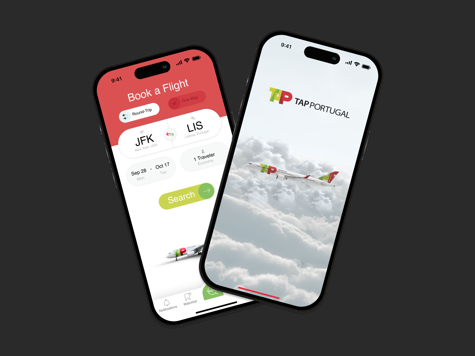
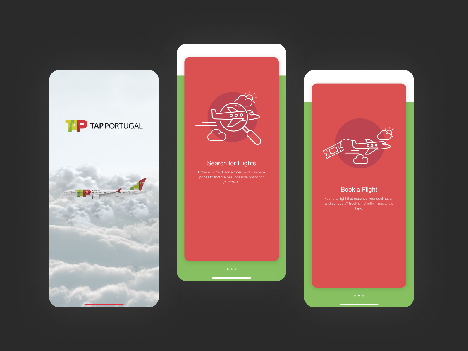
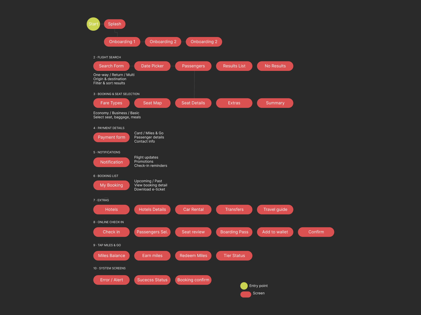
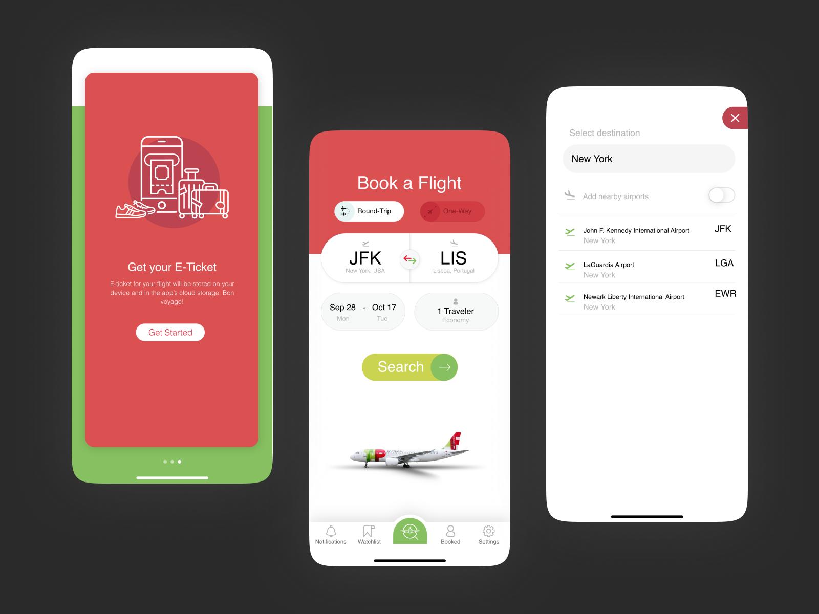
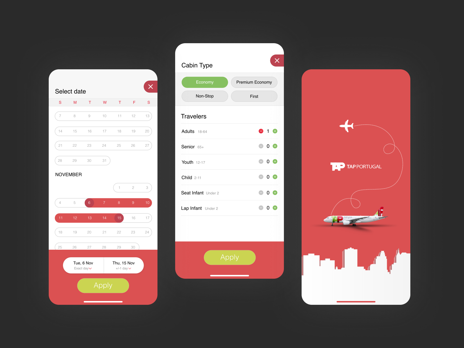
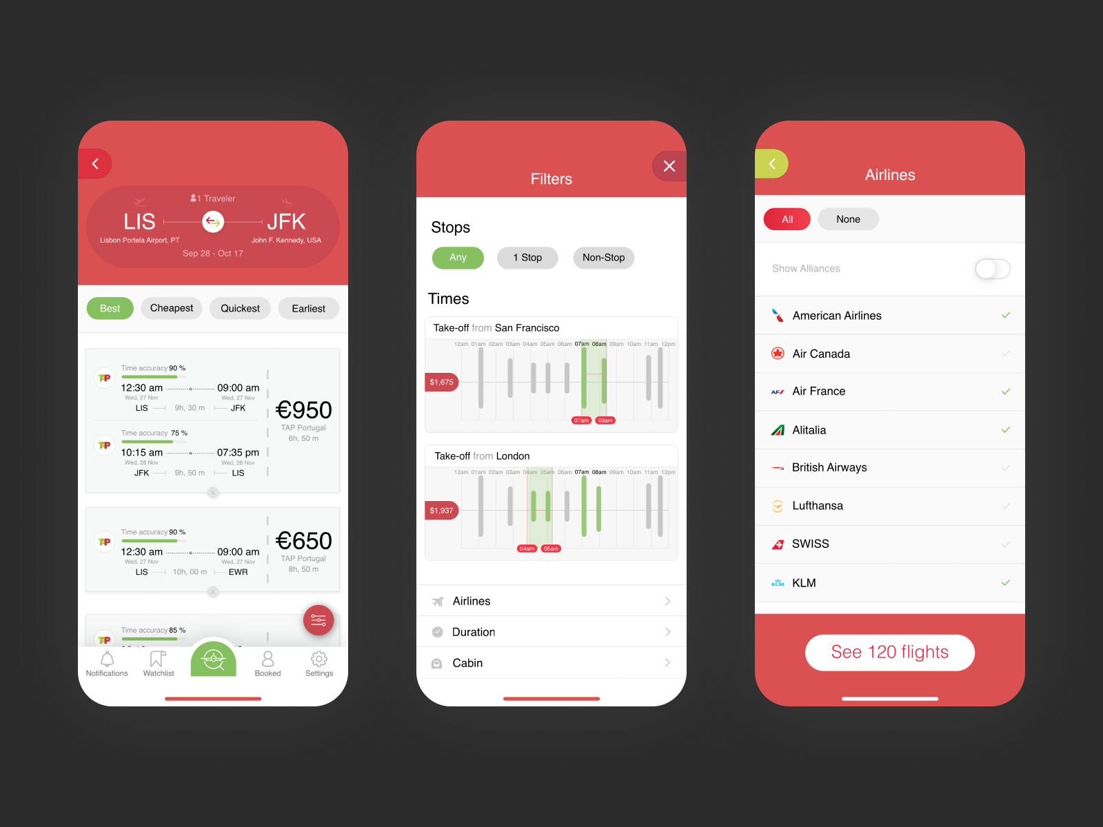
TAP’s digital touchpoints felt functional but fragmented — search, booking, and live status lived in different mental models, and the premium brand didn’t show up in the app. In this concept redesign I unified every stage of the journey into one native mobile flow, anchored in TAP’s visual identity.
Flying should feel effortless before you even board — so the system should disappear and let the journey speak for itself.
Miguel Ferreira, 34
Business Traveller · LIS→FRA Monthly · Miles&Go Gold
Books within 48 hours of travel. Expects the app to know his preferences without being asked. Frustrated by re-entering frequent flyer numbers, unclear upgrade paths, and the inability to check in from the home screen. Needs: one-tap check-in, miles balance on home, instant gate change alerts.
Understanding who flies — and what frustrates them.
Flight search results slow, hard to compare side-by-side. Booking flow required too many taps before pricing appeared.
Check-in buried 3 navigation levels deep. Miles&Go entirely disconnected from the booking flow.
- Competitive audit — Ryanair, Iberia, Lufthansa
- App Store review mining across 3 airlines
- User journey mapping — 3 traveller archetypes
- Heuristic audit of existing TAP digital touchpoints
Airline UX has unusually high information density requirements. Clarity is a design constraint, not a preference.
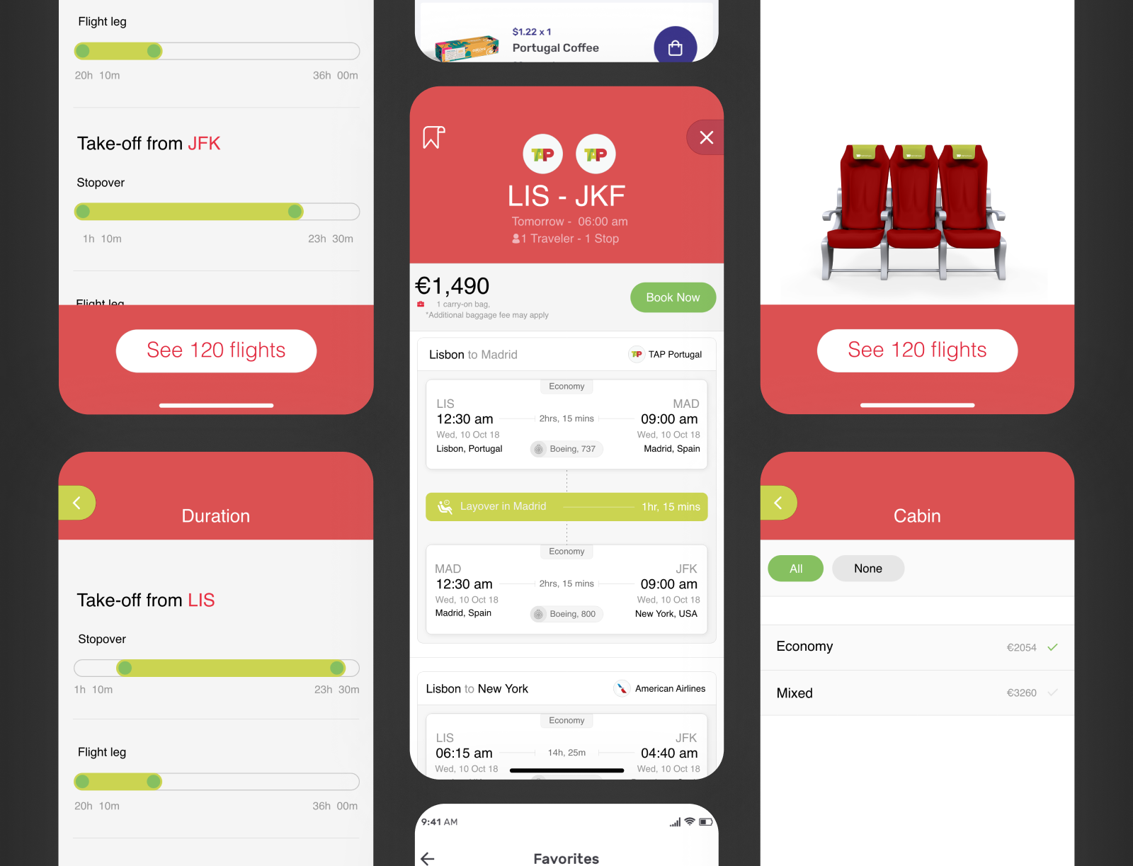
The booking flow went from fourteen screens to eight. Fare class comparison became a horizontal toggle, not a table. Price was transparent from the first result — no fees revealed at the last step. On travel day, the home screen surfaced the active trip card with live status and one-tap check-in.
Inter was chosen for its legibility at small sizes and wide weight range — critical when displaying flight data in compact cards. The Night Blue and TAP Red palette was applied systematically across all states: brand, status, and feedback, never conflicting.
A visual system rooted in TAP's identity — precise, legible, and built to carry high information density without friction.
8px base grid throughout. Primary CTA at 52px height, TAP Red fill. Cards at 12px radius, modals at 24px. Tab bar fixed — 4 items maximum, always visible.
Night Blue · #0A1628
TAP Red · #C8102E
Confirm Green
Accent Blue
Surface
Inter
Display 900
Body 400
Label 600
8px base grid. CTA 52px, TAP Red fill. Cards 12px radius, modals 24px. Tab bar fixed — 4 items max, always visible.
Transitions ease-out 280ms. Entries slide up from bottom. Cards scale to 0.97 on press. Motion is additive, never mandatory.
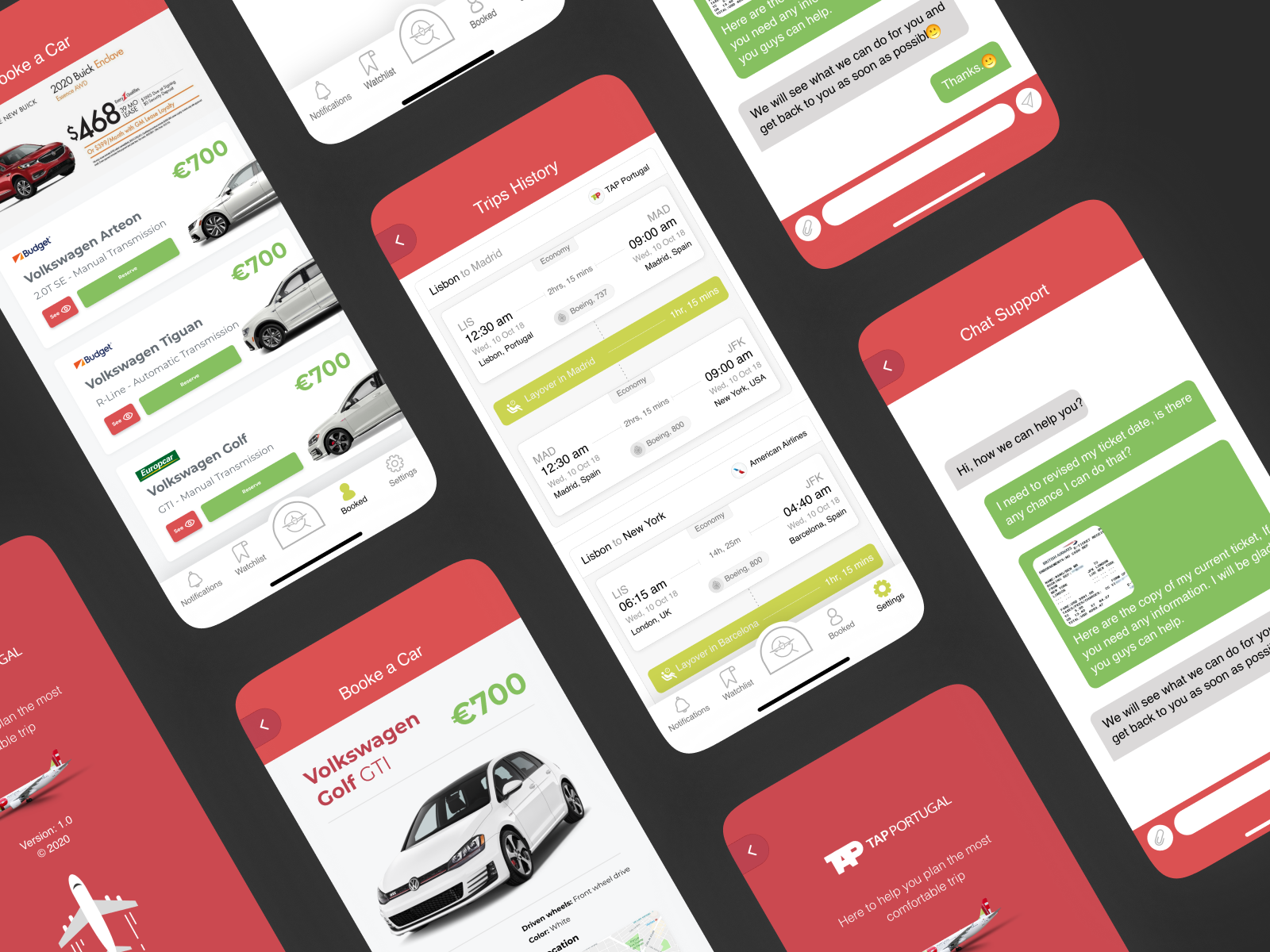
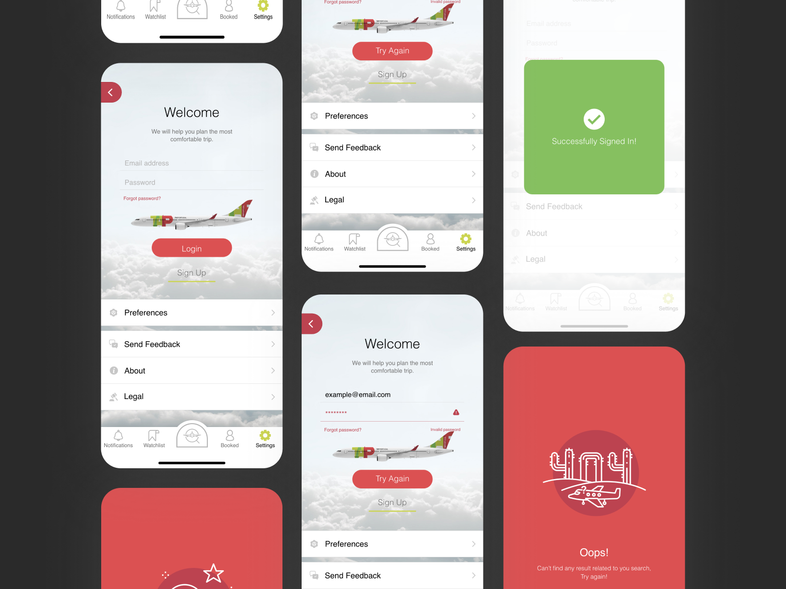
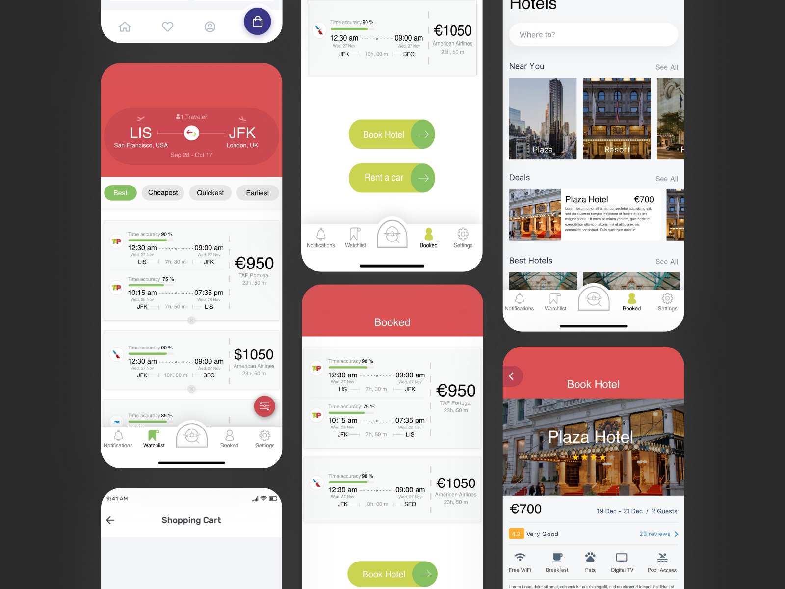
This is a concept case study: I used TAP’s brand equity as a constraint, not a decoration. The outcome is a tighter booking path (14+ screens → 8), one-tap check-in from home, Miles & Go in the same journey, and a UI system built for high information density. It shows how I approach complex travel products when brand, clarity, and conversion all have to hold at once.